Fighting for the High Ground!

What I see is that the rivers are drawn with a bit of embankments, or in a shallow valley, if you like. And indeed there is a bit of run up from flats to mountain tiles.
The effect is more likely caused by the perspective of depth. The area / tiles further back are smaller then the ones in front, and the left and right sides of a tile slant towards a vanishing point. So IMO it it all a nice graphical effect.
But I don't believe there is a more detailed elevation model. There is only the seelevel, flats, hill and mountain levels of elevation.

Now it would be very cool if the terrain is more dynamic and had more levels, like below seelevel (think Holland) and high plains (think central Turkey, or Tibet). But I don't see that happening even though terrain of a much bigger factor now.

I do find the terrain graphics very good. This video really gave a good feel of it. Except that the hills are not high enough. The difference with flat land is to small, especially if there is a feature, improvement or building on top of it.
 
@14thwarrior: It could just be a graphical effect though (although obviously I'd prefer an actual gameplay effect as well). If it were implemented via the 'slope' tiles that I mentioned earlier, a defense bonus for units on those tiles against lowland attackers would be easy enough to implement, I'd imagine. Archers could also have increased damage against the lower-elevated units; you'd have to be careful about it though, or plateaus might end up being unconquerable until Artillery (or perhaps planes, since Arties are support units now).
 
Sadly bump mapping is still very hard to do effectively even with the latest graphics cards, you really don't get a proper 3D/4D perspective because the software doesn't exist yet that can do it without sacrificing playability or realism, and expecting hence uber graphics cards - such as those used in making movies. As long as it looks somewhat realistic though, I, don't think there is much wrong with the programming. Make it look as real as possible, making it look like a photograph or like real life is perhaps still a few decades away unless you are Disney. ;)
 
I don't even "the illusion". All Tiles are clearly on the same level, with simple "rules" to explain why terrain looks elevated or not.

- Hills elevate the land and bleed slightly into other Tiles
- Rivers lower parts of the surrounding tiles a bit
- Coasts also lower surrounding Tiles
- Cliffs raise the tile next to them a bit

The rest is simply how perspective works.
 
@14thwarrior: It could just be a graphical effect though (although obviously I'd prefer an actual gameplay effect as well). If it were implemented via the 'slope' tiles that I mentioned earlier, a defense bonus for units on those tiles against lowland attackers would be easy enough to implement, I'd imagine. Archers could also have increased damage against the lower-elevated units; you'd have to be careful about it though, or plateaus might end up being unconquerable until Artillery (or perhaps planes, since Arties are support units now).

Yeah agreed we're cross posting here, so we're kinda talking across each other, but nonetheless - I think you have hit the nail on the proverbial head.

Certainly the strategy element is if nothing else an interesting idea...

In general though as Agincourt proved the terrain effect of archers is remarkable and very effective. It's a nice idea anyway. :)

I don't even "the illusion". All Tiles are clearly on the same level, with simple "rules" to explain why terrain looks elevated or not.

- Hills elevate the land and bleed slightly into other Tiles
- Rivers lower parts of the surrounding tiles a bit
- Coasts also lower surrounding Tiles
- Cliffs raise the tile next to them a bit

The rest is simply how perspective works.

You're of course no doubt exactly right. But the dialogue about is interesting nonetheless.
 
I don't even "the illusion". All Tiles are clearly on the same level, with simple "rules" to explain why terrain looks elevated or not.

- Hills elevate the land and bleed slightly into other Tiles
- Rivers lower parts of the surrounding tiles a bit
- Coasts also lower surrounding Tiles
- Cliffs raise the tile next to them a bit

The rest is simply how perspective works.

Addendum: sorry: I seriously doubt it is that simple, although I am not a programmer so it's a moot point.

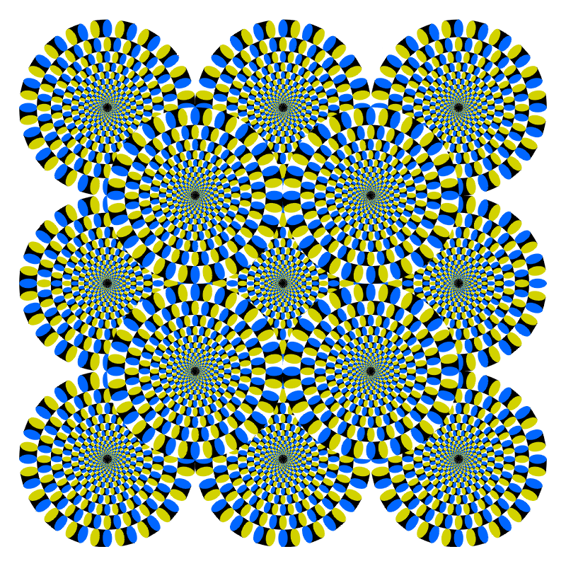
It's probably interesting to note that colour perception dimensionalises (is that a word) the screen anyway as some colours "appear more pronounced" than others. We tend to have a sweet spot in the green-yellow zone for example, that gives 3D a little hiccup when a 2d plane is involved.

there are plenty of optical illusions that emphasise this colour thing, so I wont belabour the point.

Spoiler :
rotsnake2.gif
this one makes my head bleed. ;)

The image is a gif but I can assure you nothing is actually moving. Although some people can't see optical illusions, especially those in the autism spectrum.

If you don't see anything moving don't worry that's perfectly ordinary too. Colour is a complicated genetic thing.
 
Well, I'm glad you brought that to the table, so I guess it's a question of whether I'm autistic or some people are tricked into seeing what they'd like to see. Given that I've never had anything even close to Autism diagnosed it's probably the latter. :D

But for the serious answer: Yes, of course there's an "optical illusion" going on, one that is called perspective. What I'm saying is that there's nothing outside of what I'd expect from a hex grid in perspective. It looks perfectly flat to me - aside from the things mentioned above.

The most obvious indicator is the hex grid in example 6. If there were Elevation going on on the terrain its continuous lines that can be drawn through the grid wouldn't follow the perspective curve, instead, the hex grid would bend to fit the terrain - but they are almost perfectly straight (the grid even ignores local elevation from hills), with only a slight bend towards one direction because of the perspective. (This bending is a lot more prevalent in example 5, because of the lower camera angle)

The thing that probably most irritates people is the Z-axis (the "up"-axis), because the further to the edge of the screen you go, the further it is tilted, which makes it "feel" like a slope because that's not how it works in real life.

But the hex grid is flat, that's why it leads to "false reads" when you look at the edges of the screen. It's the same effect that made people think the map could be a globe.
 
When I just look at the image as a whole, the "gears" do appear to rotate, but if I stare at one spot, they all slowly come to a stop. Freaky.
 
When I just look at the image as a whole, the "gears" do appear to rotate, but if I stare at one spot, they all slowly come to a stop. Freaky.

Same here. What the hell this picture is supposed to tell us?


What about this? Do you think this woman is turning around towards right or left? It actually has some meaning.

Spoiler :
left_right.gif
 
Same here. What the hell this picture is supposed to tell us?


What about this? Do you think this woman is turning around towards right or left? It actually has some meaning.

Omg, now THAT is freaky. She's spinning to the right, clockwise. Then I turned my head and when I looked back, it was spinning to the left! Then I was able to make it switch back and forth with a little work, switching my eyes around. Weird.
 
This image does a good job at "forcing" people out of the Perception of her spinning clockwise (which is what most people default to):
Spoiler :

spinningladyill.gif

http://thoughtslot.blogspot.de/2008/02/spinning-nude-lady.html
(concentrating on the shadow on her legs almost instantly turns the spin around for me)

I find this image from wikipedia's Article about the Spinning Dancer much more interesting though:
Spoiler :

150px-PET-MIPS-anim.gif

https://en.wikipedia.org/wiki/Spinning_Dancer

At least for me it continuously switches the direction it's spinning. :D
 
Well, I'm glad you brought that to the table, so I guess it's a question of whether I'm autistic or some people are tricked into seeing what they'd like to see. Given that I've never had anything even close to Autism diagnosed it's probably the ladder. :D

But for the serious answer: Yes, of course there's an "optical illusion" going on, one that is called perspective. What I'm saying is that there's nothing outside of what I'd expect from a hex grid in perspective. It looks perfectly flat to me - aside from the things mentioned above.

The most obvious indicator is the hex grid in example 6. If there were Elevation going on on the terrain its continuous lines that can be drawn through the grid wouldn't follow the perspective curve, instead, the hex grid would bend to fit the terrain - but they are almost perfectly straight (the grid even ignores local elevation from hills), with only a slight bend towards one direction because of the perspective. (This bending is a lot more prevalent in example 5, because of the lower camera angle)

The thing that probably most irritates people is the Z-axis (the "up"-axis), because the further to the edge of the screen you go, the further it is tilted, which makes it "feel" like a slope because that's not how it works in real life.

But the hex grid is flat, that's why it leads to "false reads" when you look at the edges of the screen. It's the same effect that made people think the map could be a globe.

I doubt somehow you are autistic, they tend to focus on detail more, and their brains are unfiltered to some extent so they see something like the exact image without the brains processing.

I know a few people though who are perfectly adequate "vision" wise who cannot see virtually any optical illusions. The brain is a strange organ.
 
Well, the fact that I wrote "ladder" instead of "latter" could be considered pretty autistic by some people.
 
This image does a good job at "forcing" people out of the Perception of her spinning clockwise (which is what most people default to):


http://thoughtslot.blogspot.de/2008/02/spinning-nude-lady.html
(concentrating on the shadow on her legs almost instantly turns the spin around for me)

I find this image from wikipedia's Article about the Spinning Dancer much more interesting though:


https://en.wikipedia.org/wiki/Spinning_Dancer

At least for me it continuously switches the direction it's spinning. :D

When I look at it from the right bottom corner, my perception starts to switch and she is spinning counterclockwise. Otherwise, it is impossible to notice that for me, and she always spins clockwise.
 
Well, the fact that I wrote "ladder" instead of "latter" could be considered pretty autistic by some people.

More likely dyslexic. Although I am not an authority on autism, but I think they would obsess over bad posts. Editing continuously.

Anyway I think the ides of colour being difficult to model in 2d perfectly with our colour biases was the point. I am sure though most programmers have done every mistake that can be made with green and red though. :)

You can try it out for yourself using say a red font and a various other fonts often you can see that some colours appear raised even though that is not the case.
 
Back
Top Bottom