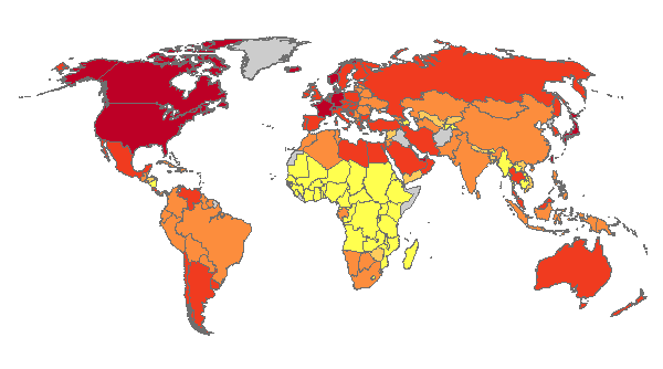
Expatriate population?
You are using an out of date browser. It may not display this or other websites correctly.
You should upgrade or use an alternative browser.
You should upgrade or use an alternative browser.
Guess the map
- Thread starter aronnax
- Start date
- Status
- Not open for further replies.
amadeus
rad thibodeaux-xs
China, Korea, and Japan would all be redder if it was (literacy).
Meteor Man
Cylindropuntia imbricata
madviking
north american scum
% Urban population?
Meteor Man
Cylindropuntia imbricata
China would be much lower. As would India.
madviking
north american scum
There isn't a scale 
Meteor Man
Cylindropuntia imbricata
There isn't a scale
Granted.
Hows about, culture? Or for that matter, power? How about score?
amadeus
rad thibodeaux-xs
Probably not; Zimbabwe doesn't have a per capita GDP higher than just about anyone at this point, especially against an oil-rich country like Angola.GDP per capita?
amadeus
rad thibodeaux-xs
In that case, China would certainly be more red than India, be it % of GDP or total value.
amadeus
rad thibodeaux-xs
Nope, Libya has to import most of its food.
In that case, China would certainly be more red than India, be it % of GDP or total value.
The colours might indicate different categories, rather than a scale.

Another guess is that it has something to do with debt of some sort.
ZeletDude
The Lion
- Joined
- Aug 16, 2009
- Messages
- 5,490
Nope, Libya has to import most of its food.
Well I had feeling it was wrong.. I just know the USA exports lots of food. hmmm.. This is a good map.
amadeus
rad thibodeaux-xs
If that were the case, I think the colors would be a little more varied.The colours might indicate different categories, rather than a scale.
I don't think that's it, either. Some countries (if I recall correctly) with high debt are shaded lighter than countries with lower debts.Another guess is that it has something to do with debt of some sort.
Maybe it's TV sets or computers per capita? Not cars, and I measuring radios per capita these days is just laughable.
Nope. Fear me?
Right ball park. It isn't per capita though.
amadeus said:Maybe it's TV sets or computers per capita? Not cars, and I measuring radios per capita these days is just laughable.
Right ball park. It isn't per capita though.
Elta
我不会把这种
Just posting to subscribe, interesting thread 
PiMan
Deity
Total number of mobile phones in the country?
- Status
- Not open for further replies.
Similar threads
- Replies
- 0
- Views
- 147
- Replies
- 0
- Views
- 453