Maniac
Apolyton Sage
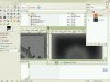
Using the latest GIMP 2.6. A DDS plug-in should be downloaded here.
File/Open... some SMAC icon
Select/By Colour : the icon
Edit/Copy
Edit/Paste as New Image
If you intend to use this icon in the future as a part of other self-assembled icons, it can be handy to save this new image as an xcf file, so you don't need to repeat the previous steps all the time.
Civ4 buttons are 64x64 pixels. But Civ4 automatically places a curved-angle frame over buttons in for instance the city screen. As a consequence the effective space you have for a button is 56x56. And if you have an icon with transparent background, one which doesn't fill the whole 56x56, you don't want your icon to touch the frame, so you need to make the final icon even a little smaller, say 52x52 at most.
Therefore, look at the size of the new image you just pasted. Take a calculator and do "length of largest side of new image * 64 / 52" (or 56, see above). Round up. I'll call this value 'x'.
Image/Canvas size: Width and Height x, Offset:center, Resize: All layers
Now please save your image as xcf. This draft is a good starting point in case you ever need to repeat the next steps. For instance if you want to change the colour.
Select/By Colour : the icon
Toolbox/Bucket Fill/Pattern Fill/Marble #1 (+shift for whole selection)
Toolbox/Change Foreground Color: to what colour the icon should have
list of HTML notations:
The next steps vary depending on what your foreground colour is.
For Build, Explore, Discover, Genetics/PK, Terraform/Believer, Enclosed & Civic colours:
For the Conquer colour:
File/Save as... : Name: ButtonX.dds; Save
Save as DDS: Compression: BC2/DXT3; no mipmaps!!!
Depending what the button is used for, an optional step is adding a frame around the button.
Download the files attached to this post.
Download DXTBmp
If you have an icon with transparent background, open ButtonBorderTransparent.xcf
If you have an icon which fills the whole 56x56 and no transparency, open ButtonBorderNonTransparent.xcf
Switch to the ButtonX.dds window
Select/All
Edit/Copy
Switch to the ButtonBorder(Non)Transparent.xcf window
Edit/Paste
Layer/New Layer...
Windows/Dockable Dialogs/Layers: make sure the ButtonBorder layer is above the icon layer
Layer/Merge Down (when buttonborder layer selected)
File/Save as... : Name: button.dds; Save
Save as DDS: Compression: BC2/DXT3; no mipmaps!!!
Another step, only if you had to use ButtonBorderNonTransparent.xcf:
Open DXTBmp
File/Open ButtonX.dds
Import Alpha Channel: alpha channel button.bmp
File/Save As DDS Texture. Same name & compression, no mipmaps...
File/Open... some SMAC icon
Select/By Colour : the icon
Edit/Copy
Edit/Paste as New Image
If you intend to use this icon in the future as a part of other self-assembled icons, it can be handy to save this new image as an xcf file, so you don't need to repeat the previous steps all the time.
Civ4 buttons are 64x64 pixels. But Civ4 automatically places a curved-angle frame over buttons in for instance the city screen. As a consequence the effective space you have for a button is 56x56. And if you have an icon with transparent background, one which doesn't fill the whole 56x56, you don't want your icon to touch the frame, so you need to make the final icon even a little smaller, say 52x52 at most.
Therefore, look at the size of the new image you just pasted. Take a calculator and do "length of largest side of new image * 64 / 52" (or 56, see above). Round up. I'll call this value 'x'.
Image/Canvas size: Width and Height x, Offset:center, Resize: All layers
Now please save your image as xcf. This draft is a good starting point in case you ever need to repeat the next steps. For instance if you want to change the colour.
Select/By Colour : the icon
Toolbox/Bucket Fill/Pattern Fill/Marble #1 (+shift for whole selection)
Toolbox/Change Foreground Color: to what colour the icon should have
list of HTML notations:
Spoiler :
Code:
[i][b]Enclosed theme: 659888[/b][/i]
[i][b]Build:		dcac34
Discover:	cadcd3
Conquer:	e02c14
Explore/Caretaker:	749c38[/b][/i]
[i][b]believer: ec5c00
PK: a4b0e8[/b][/i]
native: ff0000
gaian: 00fb00
hive: 0000ff
univ: ffffff
morgan: ffff00
spartan: 000000
angel: 675bb5
pirate: 00ffff
cult: e85454
Promotion: ffac0b
Civic:		8bb1d6
(139, 177, 214)
Misc2:		b18bd6
(177, 139, 214)
Encrypt, bg:	42e80b
Tirian metal: (150 (red) 173 (green) 214 (blue))
The next steps vary depending on what your foreground colour is.
For Build, Explore, Discover, Genetics/PK, Terraform/Believer, Enclosed & Civic colours:
Spoiler :
Layer/New Layer.../Layer Fill Type = Foreground colour
Windows/Dockable Dialogs/Layers (select the new layer) Mode : Multiply
Layer/Merge Down
Make sure you have nothing (not even the colored icon) selected at this point. You can empty your selection by 'Select/None'.
Filters/Light and Shadow/Lighting Effects/Light: Point type light; X-Pos: 0,50; Y-Pos: -0,20; Z-Pos: 1,00; Intensity: 0,90
Filters/Light and Shadow/Lighting Effects/Material: Bright: 0,80; rest 0,00
Filters/Decor/Add Bevel... : Thickness 5; uncheck 'Work on copy'
Filters/Light and Shadow/Drop Shadow: Offset X: 0; Offset Y: 0, Blur Radius: 45: 80% opacity; uncheck 'Allow resizing'
Windows/Dockable Dialogs/Layers: select the shadow layer
Layer/Layer to Image Size
Layer/Merge Down
Image/Scale Image...: WidthxHeight = 64x64; Interpolation: Cubic
For the Conquer colour:
Spoiler :
Layer/New Layer.../Layer Fill Type = Foreground colour
Windows/Dockable Dialogs/Layers (select the new layer) Mode : Multiply
Layer/Merge Down
Make sure you have nothing (not even the colored icon) selected at this point. You can empty your selection by 'Select/None'.
Filters/Light and Shadow/Lighting Effects/Light: Point type light; X-Pos: 0,50; Y-Pos: -0,60; Z-Pos: 1,00; Intensity: 0,90
Filters/Light and Shadow/Lighting Effects/Material: Glowing: 0; Bright: 0,80; Shiny: 0,10; Polished: 4.00
Filters/Decor/Add Bevel... : Thickness 5; uncheck 'Work on copy'
Filters/Light and Shadow/Drop Shadow: Offset X: 0; Offset Y: 0, Blur Radius: 45: 80% opacity; uncheck 'Allow resizing'
Windows/Dockable Dialogs/Layers: select the shadow layer
Layer/Layer to Image Size
Layer/Merge Down
Image/Scale Image...: WidthxHeight = 64x64; Interpolation: Cubic
File/Save as... : Name: ButtonX.dds; Save
Save as DDS: Compression: BC2/DXT3; no mipmaps!!!
Depending what the button is used for, an optional step is adding a frame around the button.
Download the files attached to this post.
Download DXTBmp
If you have an icon with transparent background, open ButtonBorderTransparent.xcf
If you have an icon which fills the whole 56x56 and no transparency, open ButtonBorderNonTransparent.xcf
Switch to the ButtonX.dds window
Select/All
Edit/Copy
Switch to the ButtonBorder(Non)Transparent.xcf window
Edit/Paste
Layer/New Layer...
Windows/Dockable Dialogs/Layers: make sure the ButtonBorder layer is above the icon layer
Layer/Merge Down (when buttonborder layer selected)
File/Save as... : Name: button.dds; Save
Save as DDS: Compression: BC2/DXT3; no mipmaps!!!
Another step, only if you had to use ButtonBorderNonTransparent.xcf:
Open DXTBmp
File/Open ButtonX.dds
Import Alpha Channel: alpha channel button.bmp
File/Save As DDS Texture. Same name & compression, no mipmaps...