Junuxx
Emperor
- Joined
- Sep 6, 2005
- Messages
- 1,154
Hey fanatics,
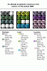
I was looking for a way to represent different resources in my Atlas Map Generator and I think I came up with a useful concept to represent them symbolically with a few pixels. Maybe YAME and MapView can use this approach as well?
The idea was to use a single letter whenever possible, and 2 when the letter is used more than once in the resource's category. This, together with color coding for categories differentiates every resource. Some redundance is in on purpose.
It's more about the concept, color coding and partitioning than the actual looks. For Atlas I will probably end up using just the subcategory colors, while MapView can maybe use some pretty shaded, semitransparent icons based on this.
Anyway, do you think this is useful? Identifiable?
Junuxx
 . I do not even see the possibility to include your one/two character terminology as this would need serious reprogramming of the parsing algorithm. Too bad...