Specialist290
Terracotta Statue Man
- Joined
- Jul 1, 2003
- Messages
- 1,335
Yeah, I think the old Plains + the modded Grassland looks best. I think I may have overdone it on the red.
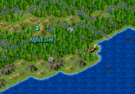
That was sort of the reason why I chose them...The Person said:The forests also look much more like a place I imagine wolves to live in.
")
They don't have to be that size. I cropped those files that Chukchi posted. Cropping unused sections from the bottom and right margins does not affect the way the game reads the bitmap just don't crop the top or left margins of the file. BMP files, uncompressed, can be very large. Monochrome graphics take up just as much file space as intricate ones. People.bmp is an excellent candidate for the chop; in this case you can reduce a 24-bit BMP from 900 kb to 149 kb.The Person said:Just make sure that the terrain graphics files should be 640x480 pixels. But it's easy to do something about that.
Yes, maybe. I'll browse through my collection of terrains and see if I can find something better.Broken_Erika said:the grassland "shield" looks ugly, mabe a tree or something could be used instead,
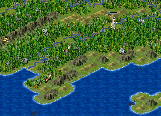
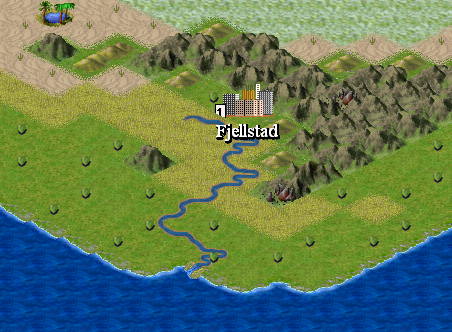
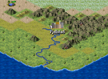
Strange that I've overlooked that. (I gotta check what I do more closely before I post it.) I'll try and see if the plains graphics looks better under the hills.Wobbegong said:One problem I see in the surface map screenshots is the mixing and matching of green-dominant and yellow-dominant terrain tiles. This is most obvious with the hills terrain (yellow) and its base texture (green). It looks, well, I dunno, wrong. A hue shift from one to the other, or even a texture overlay, using software like PSP or Photoshop may help here; failing that, a different choice of terrain.
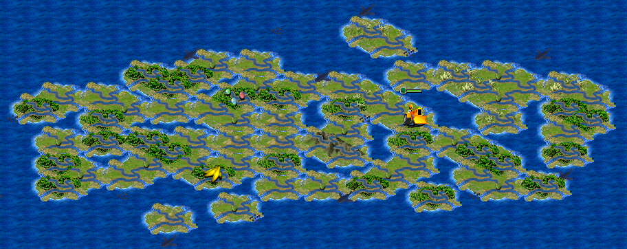
That shouldn't be a problem. I've already messed a lot with the underground map. Hopefully PE doesn't mind out messing with his map. Well, at least he'll be mentioned as the original artist of the map.Wobbegong said:IMHO the map needs some work. In some of those screenshots you have large 'monoterrain' blocks with abrupt borders. Some blending of adjacent terrain types would look better. Greater mixing of plains and grasslands would be good, too.
I didn't know that. Thanks for telling us! It's good that "old boys" like you help out us newbies the way you do. And thanks for the terrain graphics!Wobbegong said:They don't have to be that size. I cropped those files that Chukchi posted. Cropping unused sections from the bottom and right margins does not affect the way the game reads the bitmap just don't crop the top or left margins of the file. BMP files, uncompressed, can be very large. Monochrome graphics take up just as much file space as intricate ones. People.bmp is an excellent candidate for the chop; in this case you can reduce a 24-bit BMP from 900 kb to 149 kb.
We need factories, power plants, defense improvements, wonders, and other stuff that would build up under each faction's specialties.Chukchi Husky said:I don't know what improvements are needed...
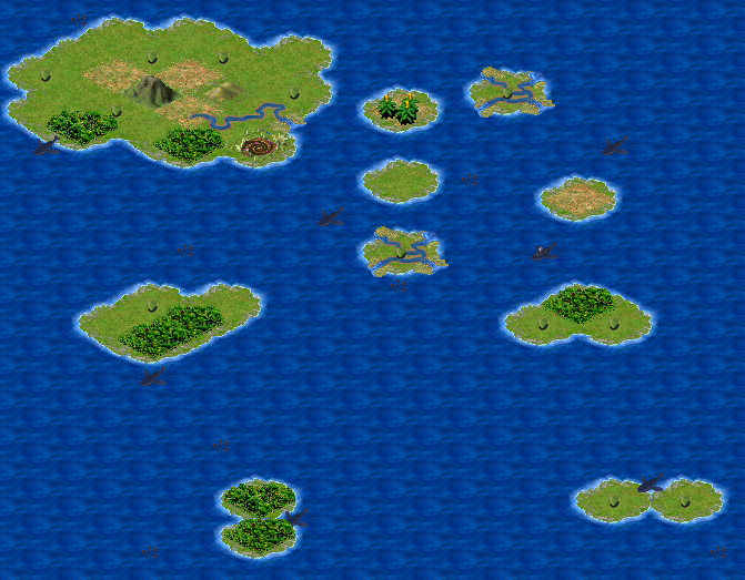
I noticed that within a short amount of time the Towelies destroy all the civs on the main continent...

