You are using an out of date browser. It may not display this or other websites correctly.
You should upgrade or use an alternative browser.
You should upgrade or use an alternative browser.
Wanted to test my art asset skills...
- Thread starter Putmalk
- Start date
I'd say the people will love it.
It's not perfect (because the contrasts are not as strong in the base images), but else it looks really good. If you can do it in the same quality for all your needed leaders, then the mod will look damn polished at the end.
It's not perfect (because the contrasts are not as strong in the base images), but else it looks really good. If you can do it in the same quality for all your needed leaders, then the mod will look damn polished at the end.
I have screenies of all my leader's doms (did them all today). I can upload the rest, if you want to see.
Some of them have outlines, that's because I only discovered how to purge them about halfway through my creations (I'm teaching myself this on the fly here XD, and the Feather option is awesome when used creatively). But some of them look really polished.
Thanks, The_J.")
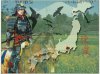
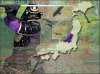
Here's Oda Nobunaga:


Some of them have outlines, that's because I only discovered how to purge them about halfway through my creations (I'm teaching myself this on the fly here XD, and the Feather option is awesome when used creatively). But some of them look really polished.
Thanks, The_J.
Here's Oda Nobunaga:
Spoiler :
Spoiler :
Attachments
Wow, that's a lot of work.
But well done work .
.
Are these historical (or at least semi-historical) images?
The last one looks a bit strange.
Oh, and since it seems that the source is for all the same (which is important: Something doesn't have to look extremly fancy, as long as everything has the same style): Please credit that source.
Edit: And let me guess (okay, obvious guess): Sengoku Jidai mod?
But well done work
.Are these historical (or at least semi-historical) images?
The last one looks a bit strange.
Oh, and since it seems that the source is for all the same (which is important: Something doesn't have to look extremly fancy, as long as everything has the same style): Please credit that source
.Edit: And let me guess (okay, obvious guess): Sengoku Jidai mod?
It makes we want to play that mod.
Now, maybe it's just me but I am quite bothered by the composition: basically, the eye does not know where to look, there are too much strong elements. It's mainly because the crows and the noise are very dark and scattered all over the place. As a result every piece of space is filled with something and it weakens the character and the map which should be your two pillars. If you look at Firaxis' images, it's all about that: a background, one vertical area on the left, another vertical one on the right.
Now, maybe it's just me but I am quite bothered by the composition: basically, the eye does not know where to look, there are too much strong elements. It's mainly because the crows and the noise are very dark and scattered all over the place. As a result every piece of space is filled with something and it weakens the character and the map which should be your two pillars. If you look at Firaxis' images, it's all about that: a background, one vertical area on the left, another vertical one on the right.
Oh, and since it seems that the source is for all the same (which is important: Something doesn't have to look extremly fancy, as long as everything has the same style): Please credit that source
There's nothing really to source. I created the generic prototype for the images (I got a blank map of Japan, I got some brushes for GIMP, and created the drop shadows myself). And since this is going to be a free mod (of course) there's no money to be had here so I'm pretty sure it's not an issue for me to use the images.
And they're not historical images...just...images of samurai I could find. You'd be surprised how difficult they are to come by. (everything is anime these days)
And yeah, Sengoku Jidai. That wasn't hard to spot I guess.

@DonQuiche thanks for the feedback.
Essentially, since I have it down to a science to create dawn of man images now, I can make ones for other people provided I have the spare time to do it - which you never know, I might since college doesn't start til late August. I was thinking about doing a tutorial on how to make these images, but it would require a lengthy explanation and it would take a while to compile. So maybe I'll get this mod out before that.
There's nothing really to source. [...]
And they're not historical images...just...images of samurai I could find. You'd be surprised how difficult they are to come by. (everything is anime these days)
Meant these images
") .
.(just in case you still know where you got them from)
But yeah, finding good source images (or other things, e.g. tech quotes) can be quite a pain.
Meant these images
(just in case you still know where you got them from)
But yeah, finding good source images (or other things, e.g. tech quotes) can be quite a pain.
Yeah I can quickly source them. They're not difficult to find once you've found them. XD
Tech quotes are annoying, I don't know how Firaxis finds them. O_O
Is anyone particularly good at icon images that would like to offer some help?
Barathor
Emperor
- Joined
- May 7, 2011
- Messages
- 1,202
Very well done! These are better than most dawn of man leader screens I see for mods and also stay true to the original games design.
If you desire a critique I can offer one, but please dont take any offense from it, because, as said, I think you did a really nice job, especially for one whos still learning the design application.
1) The edges of the samurai can use a little more refinement; especially the first one. (But, as you said, you were learning it while doing it.)
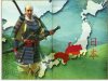
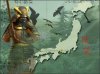
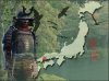
2) The backgrounds are a bit too hazy. Im guessing their transparency was just increased in front of a white background. I think they should be a bit more vibrant, either by increasing vibrancy and/or decreasing transparency. Also, they should be converted to something a little more abstract/artistic and less like realistic photographs so that they mesh better with everything else. Simply apply a filter to it using some diffusion effects and/or surface blurring. If you want to get fancier, you can also try some subtle brush stroke effects too.
3) The fading of the samurai seems a tad bit excessive and perhaps should be a little more subtle, while also slightly more displaced and not just applying to the areas below the torso. Also, an eraser with a very feathered edge can be used along the bottom of the samurai (and perhaps slightly up one of the sides) for a more artistic effect, so that the samurai dont seem to run off the edge of the image. Perhaps, it would make them seem more a part of the image rather than just being in front of the image.
4) First, pardon my ignorance of Japanese/Samurai culture. Im guessing theyre falcons, but Ill just refer to the images as simply birds. Anyway, I think theyre a bit too overpowering and perhaps they could be lightened or made more transparent. Another approach would be to use a line drawing instead of a solid mass (like the default game uses). You can try Googling for bird or any type of bird and make sure the filter is set to line drawings. You can also add the word tattoo to the search for more abstract and artistic line drawing results. Also, you probably dont want anything too abstract and minimal, because you want them to be ornate to get that tattooed effect.
5) Background positioning. I feel the composition of the last one (purple samurai) is beautiful with the entrance centered between the main object and the map (perhaps nudge it slightly to the left; if the background isnt long enough to fill the right edge, just give it a stretch or, then again, maybe just leave it as is so it isnt too obvious). For the red samurai, perhaps the background can be shifted/stretched to the left so that the branches form a background behind him and the map will be more in the open with less collision. For the yellow samurai, perhaps a simple mirroring of the background can get the nice rift between the trees centered between the two objects so that one can better admire the hills and water down below. The first one, even though the background isnt as interesting, has a nice composition and the mountain is in a good location. Also, the grass line seems nicely aligned vertically along the samurais waist and top of the horses head (which also helps view the horse since its transparent).
6) I liked that you removed Asia from the map layer. Since, for most of use, Japan's location doesn't really need any additional visual context. Since you no longer have to worry about the rest of the map, perhaps you can scale down the size of Japan slightly to help with the overall image composition. But not too much, since its such a snaky land mass. Especially since your samurai seem slightly larger. Or, I dont know, perhaps this isnt needed once you see what it looks like.

If you desire a critique I can offer one, but please dont take any offense from it, because, as said, I think you did a really nice job, especially for one whos still learning the design application.
1) The edges of the samurai can use a little more refinement; especially the first one. (But, as you said, you were learning it while doing it.)
2) The backgrounds are a bit too hazy. Im guessing their transparency was just increased in front of a white background. I think they should be a bit more vibrant, either by increasing vibrancy and/or decreasing transparency. Also, they should be converted to something a little more abstract/artistic and less like realistic photographs so that they mesh better with everything else. Simply apply a filter to it using some diffusion effects and/or surface blurring. If you want to get fancier, you can also try some subtle brush stroke effects too.
3) The fading of the samurai seems a tad bit excessive and perhaps should be a little more subtle, while also slightly more displaced and not just applying to the areas below the torso. Also, an eraser with a very feathered edge can be used along the bottom of the samurai (and perhaps slightly up one of the sides) for a more artistic effect, so that the samurai dont seem to run off the edge of the image. Perhaps, it would make them seem more a part of the image rather than just being in front of the image.
4) First, pardon my ignorance of Japanese/Samurai culture.
Im guessing theyre falcons, but Ill just refer to the images as simply birds. Anyway, I think theyre a bit too overpowering and perhaps they could be lightened or made more transparent. Another approach would be to use a line drawing instead of a solid mass (like the default game uses). You can try Googling for bird or any type of bird and make sure the filter is set to line drawings. You can also add the word tattoo to the search for more abstract and artistic line drawing results. Also, you probably dont want anything too abstract and minimal, because you want them to be ornate to get that tattooed effect. 5) Background positioning. I feel the composition of the last one (purple samurai) is beautiful with the entrance centered between the main object and the map (perhaps nudge it slightly to the left; if the background isnt long enough to fill the right edge, just give it a stretch or, then again, maybe just leave it as is so it isnt too obvious). For the red samurai, perhaps the background can be shifted/stretched to the left so that the branches form a background behind him and the map will be more in the open with less collision. For the yellow samurai, perhaps a simple mirroring of the background can get the nice rift between the trees centered between the two objects so that one can better admire the hills and water down below. The first one, even though the background isnt as interesting, has a nice composition and the mountain is in a good location. Also, the grass line seems nicely aligned vertically along the samurais waist and top of the horses head (which also helps view the horse since its transparent).
6) I liked that you removed Asia from the map layer. Since, for most of use, Japan's location doesn't really need any additional visual context. Since you no longer have to worry about the rest of the map, perhaps you can scale down the size of Japan slightly to help with the overall image composition. But not too much, since its such a snaky land mass. Especially since your samurai seem slightly larger. Or, I dont know, perhaps this isnt needed once you see what it looks like.
Similar threads
- Replies
- 0
- Views
- 251
- Replies
- 4
- Views
- 700
- Replies
- 1
- Views
- 657
- Replies
- 0
- Views
- 1K