Who we are and How we work

Here's a version with the joke. I don't quite like it though, the double line of text doesn't look so good IMO.

Do we need a flag as well, btw? And what should be on it?

MTDG_sign2.png
 
The second line of text gives it a sort of three dimentional quality. Too bad we don't have a pair.
 
We could use another font for the motto and team name, sort of to make it look auld.... :grin:
 
Just in case we need one, I've tried my hand on a battleflag:

battleflag.png


What do you think? Do we need a peace flag too?
 
:rotfl:


A scarier version of the motto:

Prepare to be administrated


A peaceful version:

Your disputes have been resolved. If you wish to appeal, you may contact The Council
 
Prepare to be administrated[/i]


A peaceful version:

Your disputes have been resolved. If you wish to appeal, you may contact The Council


I like those! :goodjob:
 
Oh man – I think that's a bit too scary!!

If our whole goal is to fly under the radar and not get attacked – maybe we don't want a provocative logo? :mischief: just a thought!

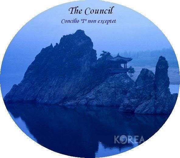
Since we know we're Korea… I cooked up a quick idea. It's a bit ugly – but someone with a better program than MS point and/or more skills than me could certainly clean this up.

Anyway, here's a draft idea to see what people think.
Full version:
Logo_1.jpg


Logo Version:
Logo_1_thumb.jpg


Here are some other images from Korea that we could do the same thing with (ie, put in a circle with our name and motto)…


Just an idea!
If nothing else, they're pretty pictures! :D
 
You are right! The scary version is funny but does not fit our approach. Your ideal world image is much more fitting. Those pictures much better hide the tiger that sleeps deep inside us... :D

There does sleep a tiger inside of us, right? :shifty:

Could someone find out the Korean signs for our name and motto? Asians around? :hmm:

edit: Actually there's no need that the signs have the correct meaning. I bet noone could prove us wrong. However it would be disappointing to find out some day that they meant something really awkward... :ack:
 
I agree we should go with the less provocative symbols, though I think there will come a time when we can unveil the scary banner. :satan:
 
I can make inquiries regarding Korean Symbology... but the few Koreans I know probably know as little as we :lol:

Projecting a feeling of tranquil introspection might serve us well in Foreign Relations. Thus, The Council appears to be benign.

Tho' I think it wise to hold a fierce banner in our basement! :devil:
 
@ Gen_W when I read your post about 'cooking up' ideas I was expecting to see a Wok image ;)

There is nothing stopping us from using multi-images depending on our state of affairs with the foreigners ... use the scary one when we are displeased :)
 
:bump:

I love the flag, General_W!

Are we adopting this as our state flag?

I agree we should go with the less provocative symbols, though I think there will come a time when we can unveil the scary banner. :satan:

Of course, the evil flag design is meant to be used only in war :D - or perhaps if we want to "persuade" some foreign diplomat ;). I can try some versions with different text later this week.
 
Perhaps we should do a flag with peter_grimes's logo, as well as 'Concilio "I" non exceptet"?
 
I like the round table thing better as well... I just wish it were easier to read the writing going around it. Maybe that's a function of my computer screen?

Oh - about that Latin motto: it's still not quite right. Exceptet isn't really the correct verb. I haven't put much effort into correcting my mistake, though. Maybe in a couple of days I'll get to it.
 
ok - dumb question, but it's a long time since high school...

what does it mean? 'Concilio "I" non exceptet? there is no i in the council?
 
Back
Top Bottom