Scaramanga
Brickhead
Just to provide a visual example, let's place Hojo on the more realistic side, Frederick as a middle ground and Pedro on the cartoony side.
We can sort of imagine Frederick and Hojo being on the same world, and Frederick and Pedro also being able to exist on the same world. But if you pair Hojo and Pedro...it looks really off, mainly due to the proportions.
more realistic.
Spoiler :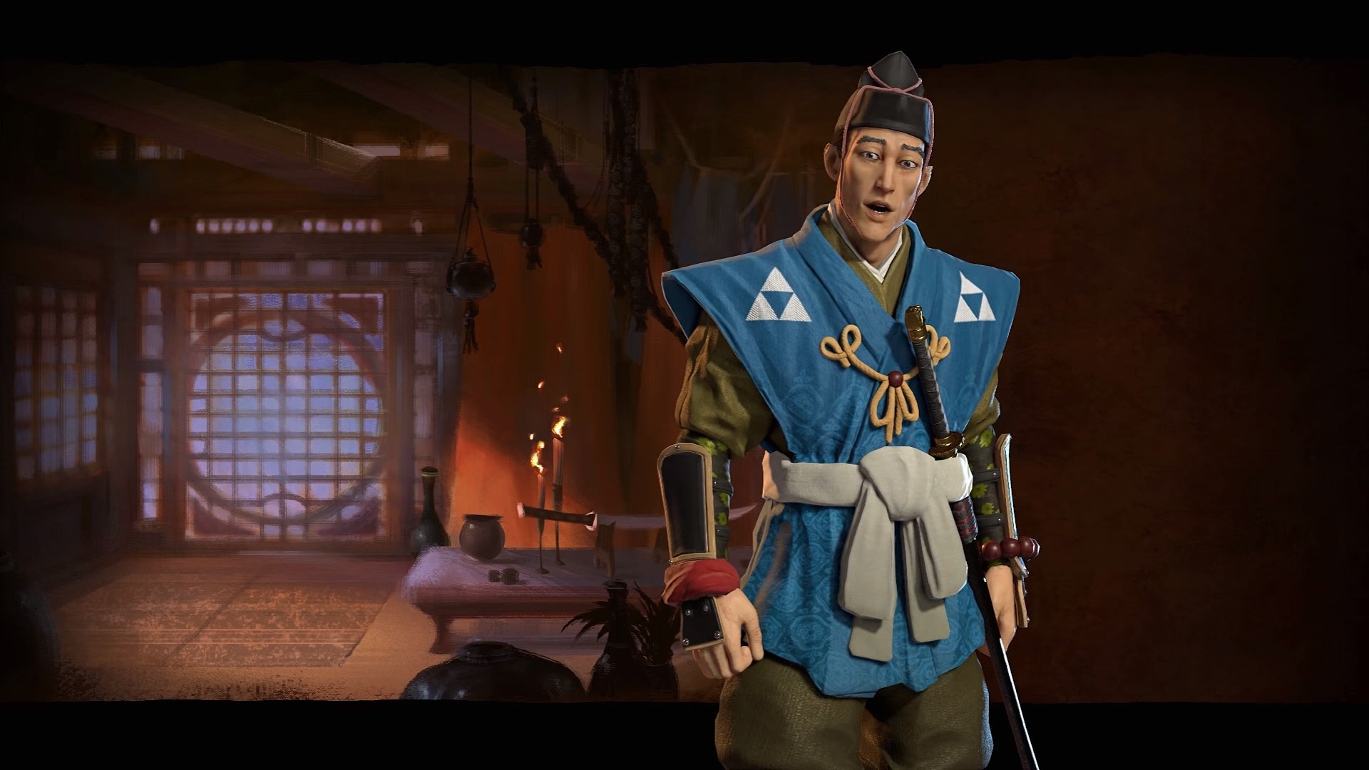
Stylized middle ground
Spoiler :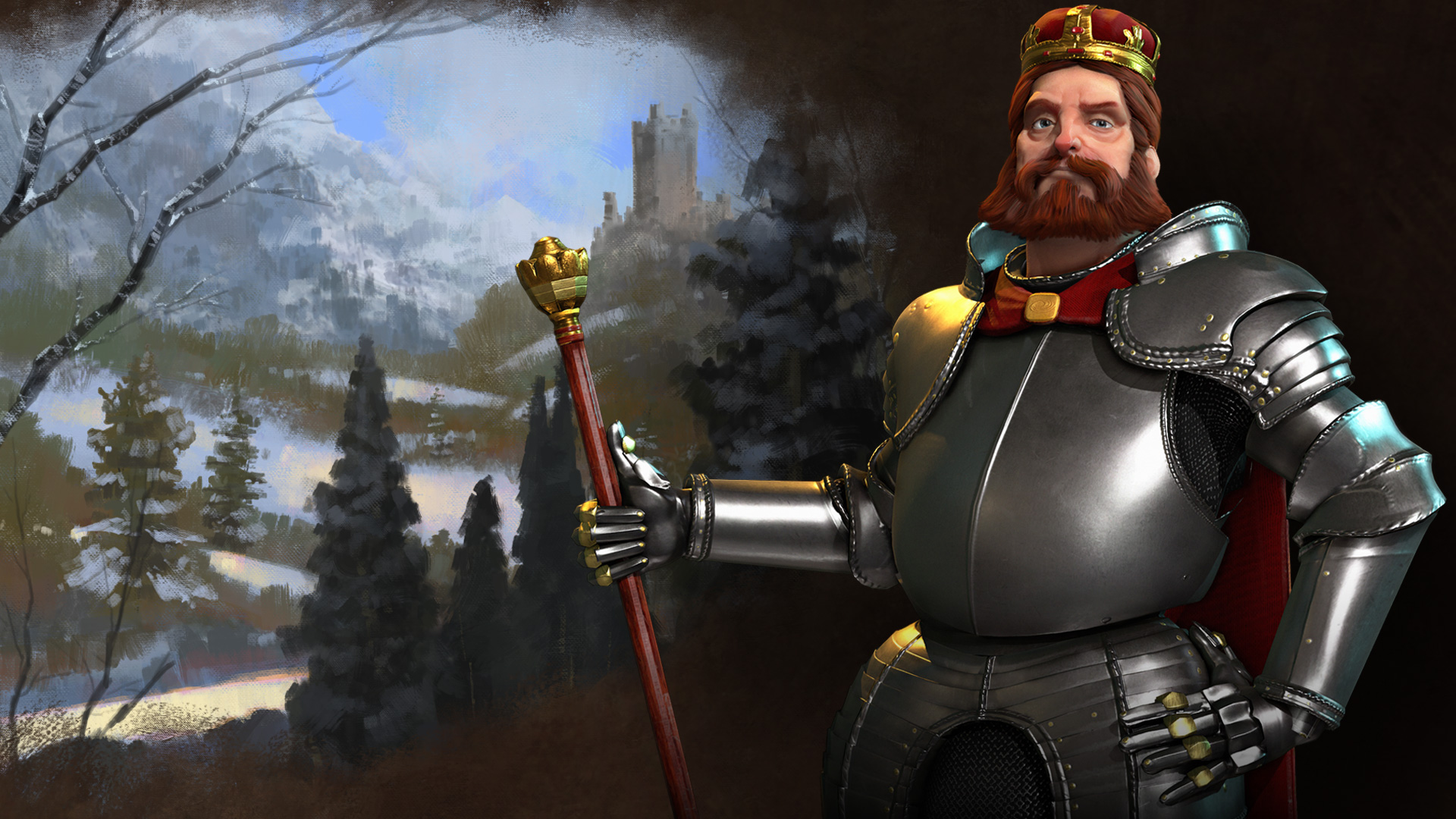
Full Cartoony
Spoiler :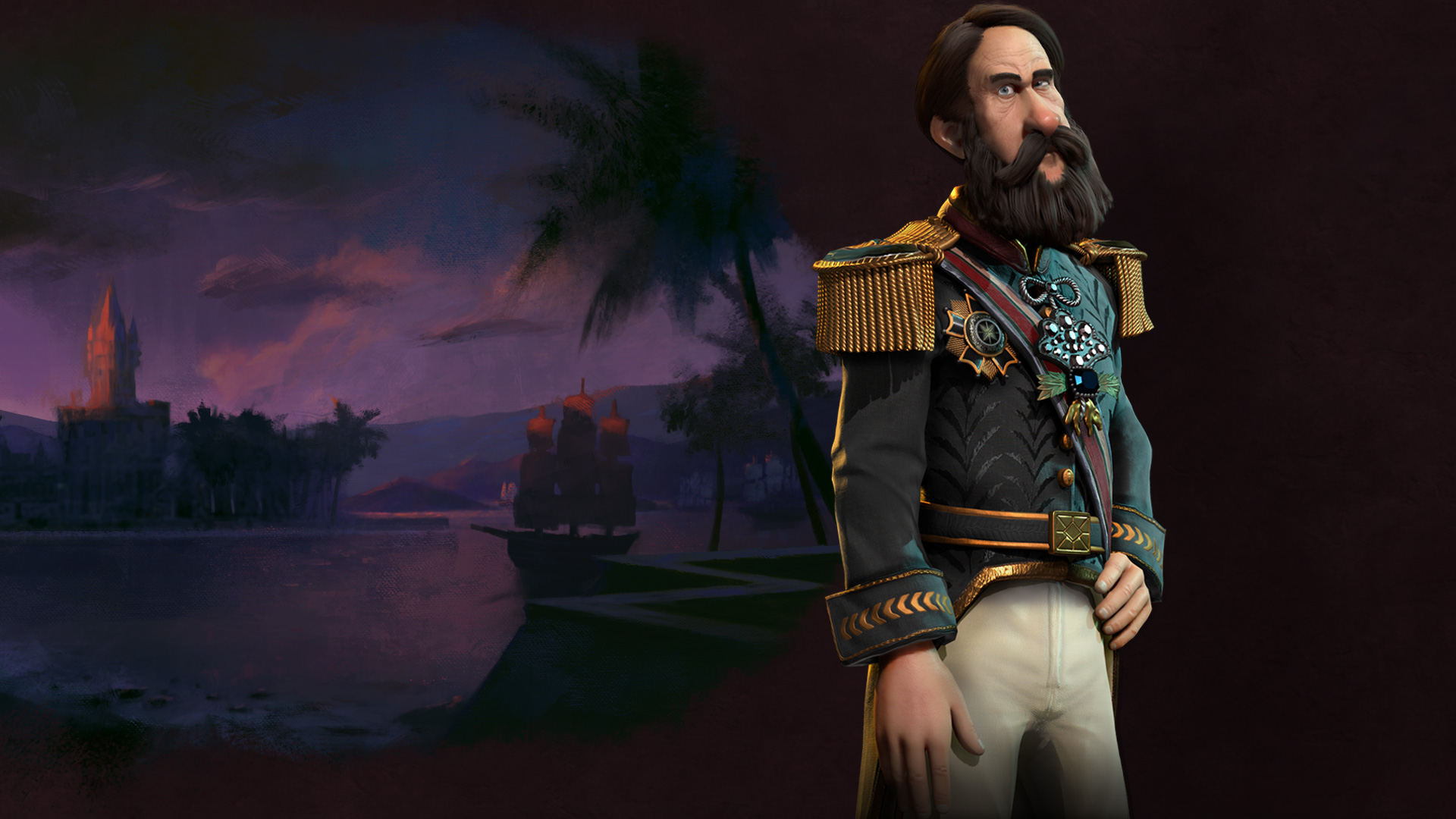
Most of the leaders fall on the more stylized middle ground, with a few a bit more on the realistic side...Tomyris, and Hojo being the less caricatured, but Pedro and Qin, man do they feel out of place with the rest. The Teddy fix bring me a bit hope in that they'll be able to bring those two along with the rest of the leaders style wise.
Well I find Frederick very realistic. Maybe you are East Asian and therefore find Hojo the most realistic.
")
Anyway, I find Pedro has Richard Nixon's nose, and Richard Nixon was a real person even though he looked like a cartoon. Bob Hope is someone else who I find looks like a cartoon. People like this really do exist, although I'm not sure Pedro II was actually one of them.
 ) features.
