Button thread

In attachement you will find a pack with all the buttons I have made, re-made using tha correction I have proposed for the buttons guide.
There is also included an experiment I have made with the "Conquer/Physics" theme, with related screenshot. I did not quite like the method you propose (:p) because the icon appears too shiny and with too much "reflection effects", it really seems at odds with the others. I have experimented a bit with the lighting settings, and I have produced a button where the effect is visible and that, at the same time, is more consistent with the other buttons.
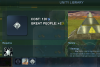
In the screenshot you can see my button on the datalink and at left in the city screen, while your button is at right in the city screen.
I obtained this button just by applying custom light settings, without adding a further "shadow layer". The settings are:
Lighting Effects/Light: Point type light; X-Pos: 0,50; Y-Pos: -0,60; Z-Pos: 1,00; Intensity: 0,90
Light and Shadow/Lighting Effects/Material: Glowing: 0; Bright: 0,90; Shiny: 0,10; Polished: 4.00

Do you like it?

I'll go with the thick circle to make you happy. ;)
Ihihih :p

I looked at the Park & Hydro Plant buttons in-game, and I did notice one small thing bugging me. The icons are perfectly square, and as a consequence look a little out of place between all the rounded corner frames and buttons. So I think they too should get their corners rounded. Probably manually before bevel is added.
That is an interesting suggestion! Probably it should be done before light too. I have already some ideas and I will present some experiments soon.

I'd love to have those xcf's too! You never know when it comes useful.
My idea was to send you the entire pack with all the supporting material when the button work is completed. I would not like to overload you with files since I think that you have already your hands full with all the Planetfall stuff :p
But if you want I can send what I have at the moment.

I see. I don't really know what those double circles are supposed to stand for. A 'degree' symbol to indicate the Thermocline?? Whatever their meaning, when the button is resized to 64*64, they just become a single pixel. So I'd just leave them out.
Yes perhaps they are a bit too small. You will find a version without the circles in the pack I am attaching. The version with curved corners will come later :p

When the base doesn't have access to fresh water, you're supposed to think of the Hydro Plant as a water recycling center. That function does belong in the Enclosed Biosphere theme.
In your shoes I would leave open the option of transferring that function to another facility in the future, it really sounds weird associated to a hydro plant, they are two completely distinct things.
 
Lighting Effects/Light: Point type light; X-Pos: 0,50; Y-Pos: -0,60; Z-Pos: 1,00; Intensity: 0,90
Light and Shadow/Lighting Effects/Material: Glowing: 0; Bright: 0,90; Shiny: 0,10; Polished: 4.00

Do you like it?

Great! :D I'll update the guide with these settings.

My idea was to send you the entire pack with all the supporting material when the button work is completed. I would not like to overload you with files since I think that you have already your hands full with all the Planetfall stuff :p
But if you want I can send what I have at the moment.

I'd prefer having your current files already. I'm sure my harddisk can handle it. :D

Yes perhaps they are a bit too small. You will find a version without the circles in the pack I am attaching. The version with curved corners will come later :p

Thanks for all the buttons!
 
New buttons attached.
As you can see in the screenshot, the "Conquer/Physics" buttons look very good with "bright=0.80". The 0.90 I initially suggested was too light. Would you please modify the guide to that effect? I have uploaded a revised "Dimensional Gate" too.

I have attached all the material I have used for the buttons done so far, please inform me when you have downloaded the file.

I will now work on adding rounded borders on full-square buttons.

Question: is it possible to modify the actual tech screen and to make the rectangles representing technologies of a different color? Instead of the actual light green and blue some darker colors could be used. This kind of buttons would look much better on a darker background.
 
New buttons attached.¨
...
I have attached all the material I have used for the buttons done so far, please inform me when you have downloaded the file.

Thanks - downloaded!

As you can see in the screenshot, the "Conquer/Physics" buttons look very good with "bright=0.80". The 0.90 I initially suggested was too light. Would you please modify the guide to that effect? I have uploaded a revised "Dimensional Gate" too.

I was waiting to see a Conquer button before doing so. :D I'll change it now.

Question: is it possible to modify the actual tech screen and to make the rectangles representing technologies of a different color? Instead of the actual light green and blue some darker colors could be used. This kind of buttons would look much better on a darker background.

It's possible. In Python/Screens/CvTechChooser.py (Plf has that file) there's this:

Code:
			if ( gc.getTeam(gc.getPlayer(self.iCivSelected).getTeam()).isHasTech(i) ):
				screen.setPanelColor(szTechRecord, 85, 150, 87)
				self.aiCurrentState.append(CIV_HAS_TECH)
			elif ( gc.getPlayer(self.iCivSelected).getCurrentResearch() == i ):
				screen.setPanelColor(szTechRecord, 104, 158, 165)
				self.aiCurrentState.append(CIV_IS_RESEARCHING)
			elif ( gc.getPlayer(self.iCivSelected).isResearchingTech(i) ):
				screen.setPanelColor(szTechRecord, 104, 158, 165)
				self.aiCurrentState.append(CIV_IS_RESEARCHING)
			elif ( gc.getPlayer(self.iCivSelected).canEverResearch(i) ):
				screen.setPanelColor(szTechRecord, 100, 104, 160)
				self.aiCurrentState.append(CIV_NO_RESEARCH)
			else:
				screen.setPanelColor(szTechRecord, 206, 65, 69)
				self.aiCurrentState.append(CIV_TECH_AVAILABLE)
 
It's possible. In Python/Screens/CvTechChooser.py (Plf has that file) there's this:
Many thanks. I will experiment with that after some more tech buttons are made.

I have attached the "Hydro plant" and "Park" buttons with rounded corners. I have added all the support material and a screenshot (where, btw, you see the Park Datalinks entry without the proper description! :p).
The corners are 6 pixels in radius on the 56*56 icon. I did them on scale on the original button before applying all the effects.
 
Oops, it seems I forgot to reply I had downloaded the buttons. :o

Anyway, I wanted to say it's also possible to change the background of the F6 screen should you so desire.
 
Two new buttons attached: the Human Genome and the Unity Library projects.
The Unity Library is my own concept (Discover theme), my idea is to include the shaken hands in all the Unity-projects buttons. Do you like it?
This time I have attached not only the buttons but the support material too.

Question: which color themes should I give to the "Hydroponics Bay" and the "Reactor"?
 

Attachments

  • unity_library.png
    unity_library.png
    331.1 KB · Views: 180
  • HumanGenome.rar
    HumanGenome.rar
    71.8 KB · Views: 127
  • UnityLibrary.rar
    UnityLibrary.rar
    109 KB · Views: 150
Two new buttons attached: the Human Genome and the Unity Library projects.

Thanks! :D

The Unity Library is my own concept (Discover theme), my idea is to include the shaken hands in all the Unity-projects buttons. Do you like it?

I don't really like the idea of using the shaking hands as the Unity symbol.
Hmm, how about using the laurels from the Planetary Council/Peacekeeper symbol? By removing the stuff between it, you get a nice area to put some other symbol in. I've attached an xcf file in which the laurels are isolated.

For the record, using a circle within a rotated square as the symbol for a secret project means there are at 64*64 resolution few pixels left to create a meaningful symbol. So I think we shouldn't stick to that circle-within-square convention for the Unity bays. Using a symbol inside the laurels, without anything else, sounds clear enough to me as a recognizable button.

Question: which color themes should I give to the "Hydroponics Bay" and the "Reactor"?

Hydroponics Bay is the orange Terraforming theme.

The Unity Reactor. Hmm, given its enabling tech Conquer/Physics red would best fit. But given its effects the yellow Build/Industry theme might fit better. I don't really have a strong opinion on this one. Go for Build??
 
Hey, I'm not a big fan of GIMP, so I tried to adapt the button guide to a photoshop template (with a bit of GIMP use to produce the initial marble pattern). So, to my eye, my results look very, very close - but especially for the bevel, I needed to do a bit of guess-work and tweaked until it "looks right".

Which, obviously, makes me biased. Instead of just ploughing forward, I thought it would be best to make a small sample of buttons and upload them - so you guys can take a look whether it's really "as good as the same".

I tried my hand at the Pholus Mutagen, the Superconductors and the Planetary Networks (basically the first three non-question-marked points on the list with different colours). And it is a quick process - it takes 30 seconds to a minute or so per button if I have a shape (like the one I directly get from the SMAC/X files).

If it looks right, then I can do more buttons (and you get three buttons immediately)... if not, tell me what's wrong and I can try to retool the process.

Cheers, LT.
 

Attachments

I made a Pholus Mutagen button myself for comparison purposes, and it confirms my initial impression: The lighting effects and bevel are much more noticable with the GIMP method (according to my probably equally biased eye of course). The Photoshop buttons look rather flat to me.
 
In case anyone cares, I prefer the one on the right. Is that the one we're cheering for? ;)
 
I made a Pholus Mutagen button myself for comparison purposes, and it confirms my initial impression: The lighting effects and bevel are much more noticable with the GIMP method (according to my probably equally biased eye of course). The Photoshop buttons look rather flat to me.
Hmmm... yeah, I compared them by directly overlaying them and looking at the differences.

The two main things: Yours is slightly bigger, meaning I missed the size (used the 52 pixel size from your guide - I basically worked through your guide in GIMP and recreated it alongside in PS). Second, the resizing made the main difference. PS has different algorithms for resizing - I've used bicubic, which should be the same as cubic in GIMP - but also smoothed out the edges a bit more. Need to experiment with the resizing a bit more, that's the main thing, or perhaps make the edges crisper beforehand (than in GIMP) to compensate for that.

Cheers, LT.
 
Just a heads-up - I haven't (totally) forgotten this thread, I'm still fiddling around occasionally, now I'm a stage where I seem to be closer to 100% recreation... but not quite. The bevels are now a bit too crisp and visible. Anyway, as a side-effect, I produced some buttons in GIMP (as reference) - so I uploaded them. They're done 100% by the guide and should be right (and if not, that may just be what I've done wrong when I tried to translate it to PS).

Cheers, LT.
 

Attachments

Thanks. I'll make one of the buttons myself too and compare them.
For the record, since you're not sure if you are following the guide correctly, are you aware Conquer buttons need different light effect settings than the other colours?
 
I made the Superconductor and Fusion Power buttons for comparison purposes.
The icons of your buttons are smaller. Is it possible you're forgetting the first step?:

File/Open... some SMAC icon
Select/By Colour : the icon
Edit/Copy
Edit/Paste as New Image
 
I made the Superconductor and Fusion Power buttons for comparison purposes.
The icons of your buttons are smaller. Is it possible you're forgetting the first step?
Ah, crap, that's it - I always kept the transparent border of the SMAC icon itself!

Thanks for checking - I feel dumb now. :blush:

Cheers, LT.
 
In case you feel like making more promotion buttons: I do not plan to add special abilities for native life. Rather I was thinking similar abilities could be given by promotions only available to native life. To make these promotions more recognizable when looking in the Datalinks for instance, I was thinking these should have the red (instead of blue) background which can be found in all Civ4 button makers I've seen.

For starters, would you be interested in redoing the Planetmind and Walk with Planet promotions with the red background? I'm afraid I can't find source files for these promotions though. :( So the icons would need to be extracted from SMAC again. The Walk with Planet icon is derived from the Centauri Preserve. The Planetmind icon comes from this pic IIRC:

Counter1.png
 
For starters, would you be interested in redoing the Planetmind and Walk with Planet promotions with the red background?
Done! This stuff is thankfully easier to do, so I can do it rather fast (unlike the satellite). :)

Stuff attached - preview images and the actual dds files... tell me if anything is wrong - or whether you need more! ;)

By the way, would that mean that native line may get its own promo line? Then it could grow again with certain promos - the return of the demon boils! Would sound and look nicer than "mindworms with combat III" or so...

Cheers, LT.
 

Attachments

  • planet1.jpg
    planet1.jpg
    4 KB · Views: 231
  • planet2.jpg
    planet2.jpg
    3.8 KB · Views: 175
  • planetpromos.zip
    planetpromos.zip
    4.4 KB · Views: 118
Thanks!

By the way, would that mean that native line may get its own promo line?

Yes. But the difficulty is inventing names and buttons for these promotions.

For instance, do you have any idea what button could be used for a 'Spore Cloud' promotion for the Spore Launcher, which could give a bonus against air units and a collateral damage reduction?

Edit: Other current native life-exclusive promotions that have unfitting buttons are Hidden, Wild and Psychic Terror.
 
For instance, do you have any idea what button could be used for a 'Spore Cloud' promotion for the Spore Launcher, which could give a bonus against air units and a collateral damage reduction?

A stylized Spore Launcher (or two of its "launch tentacles") with little fluff overhead?
 
Back
Top Bottom