Psyringe
Scout
Amazing work on the Foreign Advisor! For the first time ever, I find myself actually using the "Info" screen on a regular basis. ")
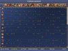
I have a problem with the "Glance" screen though. The column width seems to be fixed at a value which allows 16 columns to be displayed. When more players are in the game, it doesn't adapt. This means that in my games (which usually feature 34 civilizations) I can't see the relations of half the players. The odd thing is that - IIRC - the Glance screen worked well with about 30 civs in one of my previous games, some months ago. The columns were smaller, and the leader icons overlapped in the top row, but all the information was there.
I realize that not everybody wants to play with 34 civs - still, it would be great if the Glance screen could be made useful for those who do too.
I don't know what's the best way to solve this problem - here are the ideas that came to my mind, perhaps one of them is feasible:
A) Depict the "worst enemy" status with a line under the number, not with an icon next to the number. This would reduce the space each column takes up without taking out information. A red line under the number would be perfect for visibility, and there's enough space for it in the current layout. Alternatively, having a line with the same color as the number might be easier to do (is it possible to print the numbers as formatted text - underlined, bold, etc.?)
B) Change the worst enemy icon to something smaller (like a red exclamation mark), and reduce the font size of the numbers.
C) Enable horizontal scrolling for the Glance screen.
Can I do something to help you solve this problem? Alternatively, can you tell me what I need to do to solve it myself? Thanks in advance!
 . One thing I expect you should do is to turn off the glance smilies; have to think about the other suggestions for making things more compact.
") It's still a very informative and helpful sheet though.
It's still a very informative and helpful sheet though.