I don't know why, but on my first impression the Lapis icon, while awesome, just doesn't appeal to me, haha. I can't put my finger on why, though; I guess, for me at least, it doesn't seem to really invoke the sense that it is representing Lapis Lazuli, other than that it's blue (kinda like somebody mentioned about the Coral icon, which I also love and actually didn't see a problem with other than that the blue water in the icon blends in with the ocean on the map, haha). Don't get me wrong, I love the icon, it just doesn't seem "right". But again, that's just my opinion.
")
Since I don't mod currently, I am unfamiliar with the way terrain graphics work, but is there a way to like make the graphics "textured" rather than just a flat, solid blue-orange? You mentioned about maybe changing them so I ask because (again, in my opinion, which you are well within your rights and more than welcome to ignore
) the terrain doesn't seem to really invoke either that it's what it's supposed to be other than it's being blue.
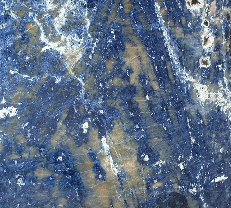
I Google searched for images of Lapis Lazuli and in most cases (such as the following under the spoiler), the stones themselves of a turqoise and a darker blue, as well as white veins and sporadic yellow spots (more closer to the color of sunflowers than the orange you currently have).
The first picture is the cover image for the Lapis Lazuli article on Wikipedia, and what most people will probably refer to if they play with your mod and then look up what it is, and in general what most people will see as a representation of Lapis Lazuli if they look it up period. Notice that with all five examples, the color isn't just "blue", but each has two different-color tones, and all have the white and yellow to some degree (the yellow changes color between stone samples, but seems more consistently light yellow rather than the dark orange of the third and fourth pictures and of your current terrain graphics).
If it's possible to change the textures on the terrain graphics to be something like the above, where there are multiple colors that ultimately make up what lapis Lazuli itself is, then I say you should go for it, because as it looks now, it just seems like a slab of blue, haha, and it doesn't really feel all that accurate to what it's intended to represent, and it kinda loses its uniqueness, which is the multi-colors (at least as far as the raw form is concerned, that is).
Haha, but again, this is just my thoughts, and you are free to take my unsolicited advice and ignore it, as in the end it is your mod, and I am still on a "You picked my luxury!" high, haha, and will enjoy having it in the game no matter the end result. I'm not intending to be overly critical or mean either, but I apologize in advance if I wrote in such a way that it appears as such.
Oh, and you said about wanting to show a produced form of the luxury whenever possible. I completely understand, though I think people are more familiar with Lapis Lazuli in its unprocessed form, but whatever.

But anyways, if you were to make a new icon that showed it in its stone form, I think that the last of the five pictures in the spoiler would be pretty sweet for that role.

I will get to the luxury write-ups eventually, (Spoiler alert: Mint, Vanilla, and Peanuts are on the shortlist and will definitely be getting write-ups, the others on the shortlist - and there are quite a few; haha, I kept writing things down on my phone one day while I was going through a supermarket, though there are others from before and after - are more iffy as to which I'll eventually choose to write about for your benefit and possible inspiration) but for now I'll end this long post and let you critique my critiques.