Barathor
Emperor
- Joined
- May 7, 2011
- Messages
- 1,202
One of the many things I love about Beyond Earth are the strongly themed and contrasting affinities -- they're nearly perfect, somewhat like the Starcraft trinity. But, to me, there's something just a little off about Purity, color-wise.
Purity rides around in solid, bulky, blocky vehicles with some ornamentation here and there which contrasts the sleek, sexy, organically-curved Harmony and the airy, delicate, pieced-together look and aggressive, sharp angles of Supremacy -- Okay, great.
The "direction" of the color schemes are great too. Supremacy with its dark, cold steel look, and Harmony/Purity in opposing schemes to represent their contradicting beliefs; cool colors for Harmony and warm for Purity.
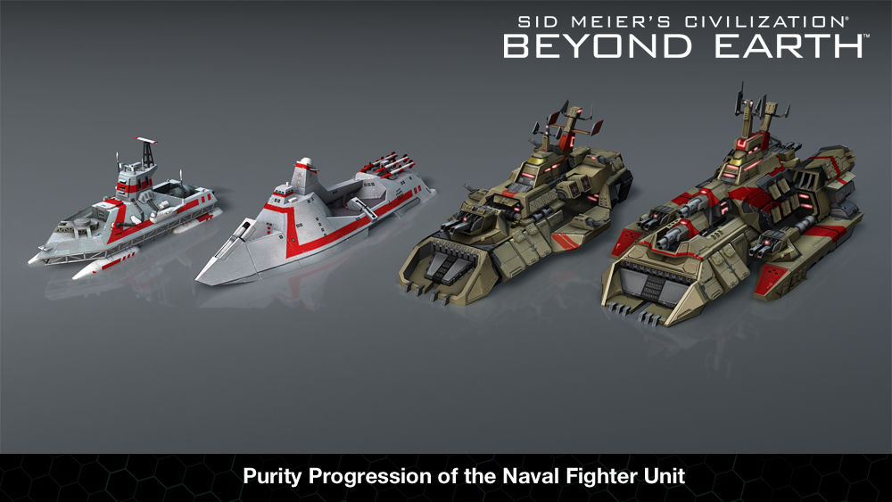
But, Purity doesn't quite hit the mark. They should look very regal and classical, with their flowing crimson banners and capes and their bronze/gold armor/plating. Yet, they look slightly dumpy with that greenish, yellow that's being used. Also, not all their units share the same base color, unlike the Supremacy and Harmony units. The most obvious one is the Lev Tank which looks very off compared to the others.
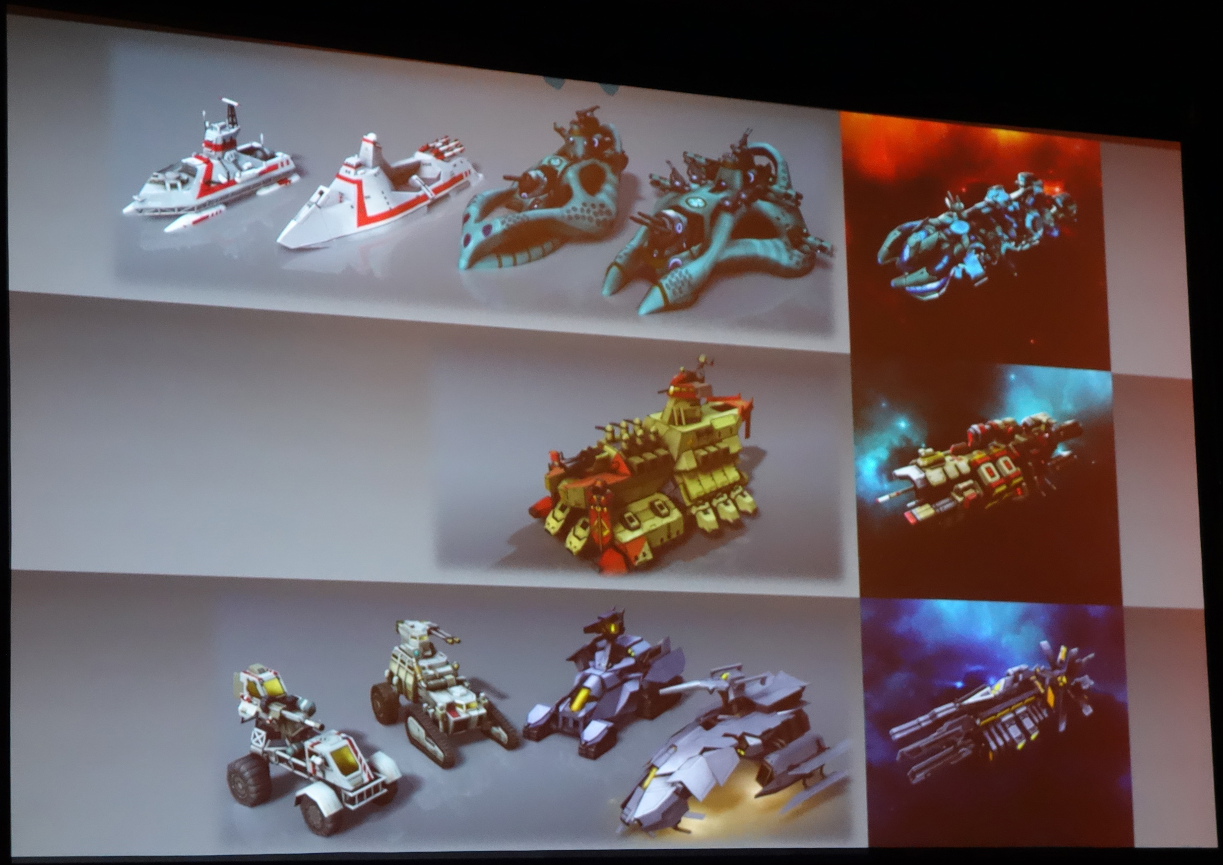
Also, if you look at some of the earlier concept art for Purity, they look much nicer and use a warmer, desaturated bronze/gold color -- it's not as greenish yellow.
Here are some of them, with different scheme examples (the last one, the AEGIS, is a little too red in my opinion)(I think the centurion in the second image is perfect):


Here are some reskins of the Lev Tank; which would you prefer most? Even if you don't like any of them, which one is closest to what you would like?
A: original
B: warmer, less green
C: much warmer, less green
D: warmer and desaturated, I call it "titanium bronze"
E: slightly warmer and desaturated "titanium bronze"
B, C, and D were just photoshopped from the original. E is from a mod I created to test another color out.


Purity rides around in solid, bulky, blocky vehicles with some ornamentation here and there which contrasts the sleek, sexy, organically-curved Harmony and the airy, delicate, pieced-together look and aggressive, sharp angles of Supremacy -- Okay, great.
The "direction" of the color schemes are great too. Supremacy with its dark, cold steel look, and Harmony/Purity in opposing schemes to represent their contradicting beliefs; cool colors for Harmony and warm for Purity.
But, Purity doesn't quite hit the mark. They should look very regal and classical, with their flowing crimson banners and capes and their bronze/gold armor/plating. Yet, they look slightly dumpy with that greenish, yellow that's being used. Also, not all their units share the same base color, unlike the Supremacy and Harmony units. The most obvious one is the Lev Tank which looks very off compared to the others.
Also, if you look at some of the earlier concept art for Purity, they look much nicer and use a warmer, desaturated bronze/gold color -- it's not as greenish yellow.
Here are some of them, with different scheme examples (the last one, the AEGIS, is a little too red in my opinion)(I think the centurion in the second image is perfect):
Spoiler :


Here are some reskins of the Lev Tank; which would you prefer most? Even if you don't like any of them, which one is closest to what you would like?
A: original
B: warmer, less green
C: much warmer, less green
D: warmer and desaturated, I call it "titanium bronze"
E: slightly warmer and desaturated "titanium bronze"
B, C, and D were just photoshopped from the original. E is from a mod I created to test another color out.


