polyphemus
join the long blue line
its just that the buttons stand out, i wouldnt mind the shape, just the color seems as if its out of the blue, kinda out of place.


")
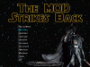
Stormrage said:LOL, Vader looks so funny today with that big red button. Its a self-destruction starter! It plays music!
Its the magic "C`mon, khhhhhhhh, push it, if you got the cojones, khhhh.." button!
Nice job, poly!
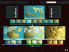
. The thing you did with the tranparency makes the text hard to read... I'll go ahead and stick with the other one. As for the world setup screen, remember to use these world screens made by sheepy for the world size, otherwise it looks great... I like the lightsabers. I kind of like Varlin's title screen better, though; it shows the subject matter better than just Darth Vader. PM me the interface files you're making, and I'll put them in the folder structure and stuff, so it's easier for modders to use, . I currently only have a bare-bones biq, though, so no screenies for a while. . We have cheapo ones...
odintheking said:Well, I'll change the buttons from green to red,