j_mie6
Deity
download thread: http://forums.civfanatics.com/showthread.php?p=12978351#post12978351
Hello!
This is a short tutorial for my new Firaxis styled button template (inspired by Irkalla's tutorial).
The only thing you really need to do is design your icon and place it in the icon layer, then do some colourising of other layers, but I will go through it in more detail:
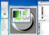
Step 1:
Firstly you will want to pick your background colour and ensure that you note down the hue of your colour (you will need it later) and then fill the background layer with that colour

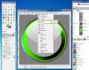
Step 2:
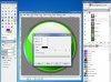
Select the Shading layer. On the toolbar select Colors, then Colorize.

On the popup menu you want to set the hue to be the same as you noted down earlier and then then the saturation to 100 (although this can vary case to case, note white buttons need sat of 0). The lightness should be darker than the original colour (keep an eye on the preview), keep a note of this value as well!

Do the same process for the darker ring layer, using the same hue and lightness as before (but saturation should be 100, unless you have a white button, then 0)
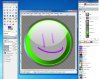
Step 3:
Draw your icon on the icon layer. If you want to emulate firaxis shadows, you can also select Filters on the toolbar then Light and Shadow then Drop Shadow and make the settings 6 for offsets, radius 15 and opacity 60 (colour black) though you can change this.


merge all the layers down and flag complete!

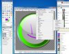
Note that this template could be used for other things, just use the applicable layers (such as the outer rim!)
Good Luck!
Jamie
Examples:

Hello!
This is a short tutorial for my new Firaxis styled button template (inspired by Irkalla's tutorial).
The only thing you really need to do is design your icon and place it in the icon layer, then do some colourising of other layers, but I will go through it in more detail:
Step 1:
Firstly you will want to pick your background colour and ensure that you note down the hue of your colour (you will need it later) and then fill the background layer with that colour
Step 2:
Select the Shading layer. On the toolbar select Colors, then Colorize.
On the popup menu you want to set the hue to be the same as you noted down earlier and then then the saturation to 100 (although this can vary case to case, note white buttons need sat of 0). The lightness should be darker than the original colour (keep an eye on the preview), keep a note of this value as well!
Do the same process for the darker ring layer, using the same hue and lightness as before (but saturation should be 100, unless you have a white button, then 0)
Step 3:
Draw your icon on the icon layer. If you want to emulate firaxis shadows, you can also select Filters on the toolbar then Light and Shadow then Drop Shadow and make the settings 6 for offsets, radius 15 and opacity 60 (colour black) though you can change this.
merge all the layers down and flag complete!
Note that this template could be used for other things, just use the applicable layers (such as the outer rim!)
Good Luck!
Jamie
Examples:
Spoiler :
Attachments
-
 Tutorial 1.jpg299.1 KB · Views: 3,043
 -
 Tutorial 2.jpg299.3 KB · Views: 1,921
 -
 Tutorial 3.jpg244.8 KB · Views: 1,858
 -
 Tutorial 4.jpg302.6 KB · Views: 1,894
 -
 Tutorial 5.jpg288.6 KB · Views: 1,801
 -
 Tutorial 6.jpg317.3 KB · Views: 1,737
 -
 Tutorial 7.jpg276.3 KB · Views: 2,934
 -
 Star of David Improved.png112.5 KB · Views: 2,617
 and thank you


") , remember you can change the opacity of the light if you wanted, to make it a little fainter, if you feel it needs it
, remember you can change the opacity of the light if you wanted, to make it a little fainter, if you feel it needs it ")