• Our friends from AlphaCentauri2.info are in need of technical assistance. If you have experience with the LAMP stack and some hours to spare, please help them out and post here.

Art Submission; New Loading Screen

Please, translate your foreign text.

He did. The English above is roughly the same meaning.
About the eras, are people suggesting that I do a different time of day as I pass from Ancient -> Medieval -> Renaissance -> Industrial -> Modern?
So it'd be Dawn -> Noon -> Afternoon -> Dusk -> Midnight?
This is assuming I do a series.

EDIT: By the way, the current loading screen in DoC right now is Sunset on Babylon by Raphael Lacoste, so I didn't think time of day was as consequential, hence my choice of a sunset.
 
About the eras, are people suggesting that I do a different time of day as I pass from Ancient -> Medieval -> Renaissance -> Industrial -> Modern?
So it'd be Dawn -> Noon -> Afternoon -> Dusk -> Midnight?
This is assuming I do a series.

If we are doing this, then please use this image for the Modern Age:

800px-Earthlights_dmsp.jpg


Don't worry; the image was created by NASA, so it's in public domain.
 
I think I'd prefer "a glimpse of the busy and vivid Manhattan at night seen from inside an glass-y apartment by a (shadow) of a successful businessman holding a wine glass"

Btw, talking about a loading screen,
Can we replace the current "black loading screen with Dawn of Man text" with images? So if you're loading a Tibetan game, you'll see a "Dawn of Man text over a background of Himalaya-Potala Palace" instead. Possible? (Changing the black background of loading screen with images)
 
It's not a black background, it's the world map with fog of war. You can move the visible area while loading turns and see your spawn site. So I think it can't be overridden.
 
I think it IS possible.

When you start a game in vanilla BTS, you get a Dawn of Man screen with information about your civ (strating tech, UU, UB, even a dynamic LH). The current DoM screen is a simplified version of that.

It can be based on the wondermovie screen. (picture and text) Put the turn counter somewhere and you are finished.
 
If been fiddling a bit with the Dawn of Man screen and it's certainly possible to include an image in it. See screenshot.

NOTE:
It's not finished yet. It's only to show it's possible and how it will look like to some extend. I will post an update when it's more polished.
Also, this is just a test image. Egypt gets a different image.

EDIT: Image deleted. Se post 32 for an improved version.
 
If been fiddling a bit with the Dawn of Man screen and it's certainly possible to include an image in it. See screenshot.

NOTE:
It's not finished yet. It's only to show it's possible and how it will look like to some extend. I will post an update when it's more polished.
Also, this is just a test image. Egypt gets a different image.

Spoiler :
attachment.php

Ooh, but now that would be an excellent place to put TD's painting in!
 
Eh, I don't like how the text and loading bar are directly on the picture. It's too distracting and a little bit hard to see, IMO. Perhaps put the picture in a central region, and the text and loading bar above and below it.
 
Eh, I don't like how the text and loading bar are directly on the picture. It's too distracting and a little bit hard to see, IMO. Perhaps put the picture in a central region, and the text and loading bar above and below it.

Don't worry. It was just a test version.

This is an improved version.
(Still a test image)

Spoiler :
attachment.php
 
Okay. So over the course of the next week, I'll be reworking the painting.
Obviously with the diverse amount of feedback in this thread, I will definitely not be able to satisfy everyone.
But, I will be able to at least address technical flaws and get some things out of the way.

I've identified some issues that I'll be working on, thanks to some of you guys:

-In atmospheric perspective, objects closer to you are darker in value, and objects farther away are lighter. I did this correctly with the city in the background, the Hanging Gardens in the middle ground and the plants in the foreground, but I failed to make the people in the foreground dark enough, and they have a contrasting value as a result.

-I will tone down the magenta in the sunset. I'll likely swap it for orange or something else though. The problem is, rendering sunsets are almost all about color saturation instead of value.
But I'll solve that to the best of my ability.

-The addition of more shadows to make it a more convincing space. Shadows are a very, very weak point of mine, so I should get the practice in.

-More color unity across the composition.
I applied two overlays over the top half to make it warm and the bottom half was meant to be cooler in temperature to achieve contrast.
I need to figure out how to unify the color though without violating the rules of color temperature in art though.

About other concerns like the grandeur of the piece:
I drew a lot of inspiration from the screens in Civilization V.
As much crap as I tend to give that game for its unprofessional Civilopedia and gross imbalance between the civilizations on a tiering scale, it has the best art in the series.
There are a lot of life scenes represented in that game that don't necessarily speak out about the grandeur of civilization,
but rather display the multifaceted nature of civilization. Some of you guys don't think it's grand enough, and I understand that opinion.
But think of it like this. If I do a series, this composition may be intense and passionate, but I've covered that niche, and the other ones could have different moods to them.
This Babylon one may be passionate, but say I do a Paris one that has a dreamlike quality or a somber London piece, I'd have covered a spectrum.
I want to depict a range for civilization and show all aspects, but this may take multiple pieces.
The dawn or morning thing does not strike me as a necessity. Our current DoC loading screen is a sunset as well, I should mention.

Lastly, I will understand if Leoreth does not want to make this the official loading screen of the mod, however, per both Charriu and my concerns,
I still would like to address that we shouldn't use Raphael Lacoste's Sunset on Babylon for the ethical reasons we touched on earlier.

Again, I have to thank you all as your input was highly constructive.
 
attachmentid=368786&stc=1&d=1390670578[/IMG][/SPOILER]

Can you make it much bigger (to almost cover all of the screen), or that's the maximum DoM box size possible?

TD said:
Okay. So over the course of the next week, I'll be reworking the painting.

just a little suggestion (or request), but I have almost zero knowledge of art so I don't know what's the technique name anyway, but could or would you rework it in a similar style of photographic-like or 3D or whatever it is called like this Raphael guy did? I'm a fan of this style of art, though I don't know what its called lol.
 
Don't worry. It was just a test version.

This is an improved version.
(Still a test image)

Spoiler :
attachment.php

I like this idea. I would like to see the following screens in the game:
*Unique loading screen for every civ (like the video of the original CiV4 but it depends on the civ)
*Unique screen for every UHV (unique video would be even better!)
*Different loading screen depending on era

When you win a UHV, there is the historical victory sound. It is good, but I wonder if hearing the civ's music instead is better or not?
 
just a little suggestion (or request), but I have almost zero knowledge of art so I don't know what's the technique name anyway, but could or would you rework it in a similar style of photographic-like or 3D or whatever it is called like this Raphael guy did? I'm a fan of this style of art, though I don't know what its called lol.

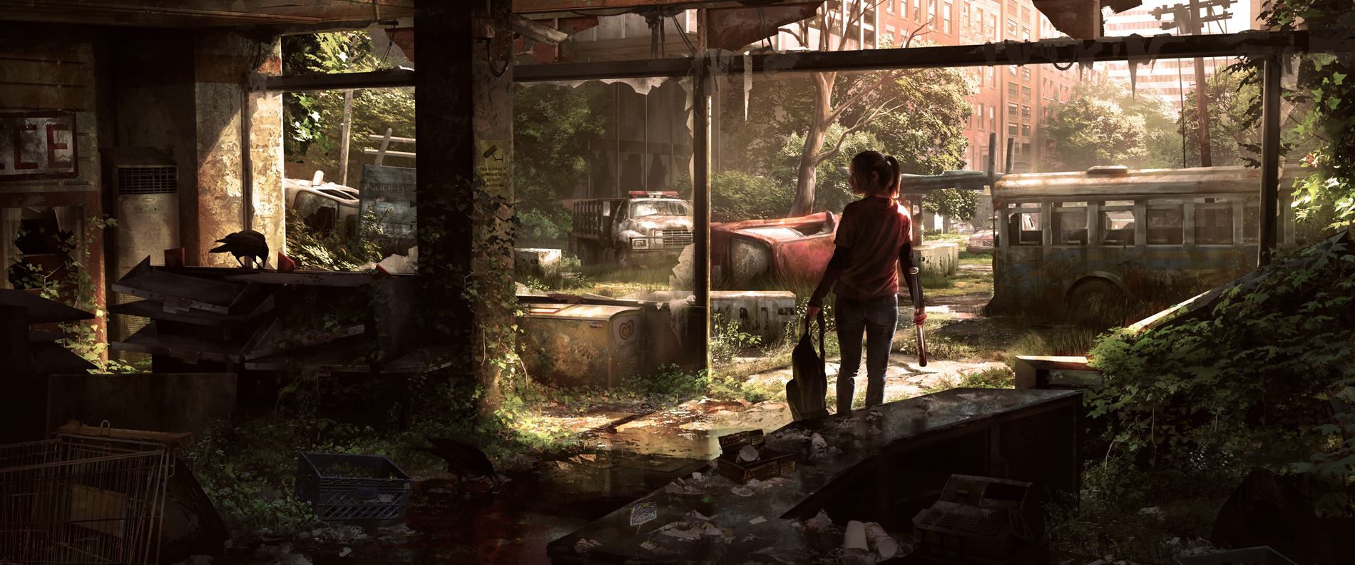
It's called concept art.

Some examples:
Spoiler :
The_Last_of_Us_Concept_Art_Crows_JS-01.jpg

Spoiler :
ac-china-3.jpeg

Spoiler :
diablo-iii-concept-art.jpg

^All of that is in the same school essentially.

A lot of it is often really tightly rendered and designed to convey a certain kind of mood or atmosphere, usually for a game or a movie.
I'm only a student artist as opposed to a professional, so it would really push my limits and might not be possible for me at my current skill level; I'm aware of my own limitations.
Compare that to the artist who did the current loading screen who was actually an art director at Ubisoft for Prince of Persia and Assassin's Creed.
 
Can you make it much bigger (to almost cover all of the screen), or that's the maximum DoM box size possible?

I put the size of the image on 800x600. It might look small because my screen resolution is 1920x1080. On a smaller screen it will be bigger.
I did a test in which I put my screen resolution to 1024x768, but then the DoM screen is too big IMO.
But the size can be adjusted.

EDIT:
This is how it looks like on a 1024x786 resolutions.
I didn't change anything to the size of the image. I only set the ingame resolutions to 1024x786.
 
A lot of it is often really tightly rendered and designed to convey a certain kind of mood or atmosphere, usually for a game or a movie.
I'm only a student artist as opposed to a professional, so it would really push my limits and might not be possible for me at my current skill level; I'm aware of my own limitations.
Compare that to the artist who did the current loading screen who was actually an art director at Ubisoft for Prince of Persia and Assassin's Creed.

Oh okay, what you did is already awesome, by the way ;)
Looking forward to your reworking ^^

I put the size of the image on 800x600. It might look small because my screen resolution is 1920x1080. On a smaller screen it will be bigger.
I did a test in which I put my screen resolution to 1024x768, but then the DoM screen is too big IMO.
But the size can be adjusted.

That looks ugly if it's that big. Can you scrap the ugly blue border btw and make the turn counter over the images instead?
 
That looks ugly if it's that big. Can you scrap the ugly blue border btw and make the turn counter over the images instead?

Personally, I like the blue border.
 
That looks ugly if it's that big. Can you scrap the ugly blue border btw and make the turn counter over the images instead?

:cry::cry::cry: No! Putting the counter and text on the image looks ugly, distracting, and as if the screen has a formatting error. The new screen is fine as it is right now! (Though perhaps the DOM text can be moved off the image as well.)
 
Back
Top Bottom