-
Our friends from AlphaCentauri2.info are in need of technical assistance. If you have experience with the LAMP stack and some hours to spare, please help them out and post here.
You are using an out of date browser. It may not display this or other websites correctly.
You should upgrade or use an alternative browser.
You should upgrade or use an alternative browser.
- Joined
- Jan 12, 2004
- Messages
- 1,312
Please refer to download page for explanations, instructions, advice etc...
Please note the original code in this program is copyright / author's rights protected: what you can do with it is subject to limitations (see fair use section).
You are welcome to report bugs in this thread, and suggest possible improvements. However,
Please note the original code in this program is copyright / author's rights protected: what you can do with it is subject to limitations (see fair use section).
You are welcome to report bugs in this thread, and suggest possible improvements. However,
I will focus on what content I want to include, not what any particular end user would desire.
If an end user wants creative content that satisfies their personal desires... they can go and make it themselves.
Last edited by a moderator:
Hi. I played with this in 3 long games and liked it. Thanks for this.
While I was playing I took some notes but I am at work right now, have a little time and I want to share my thoughts on some aspects of this mod (the ones I remember):
- Is it possible to see my influence on a city state either on the city banner or when I mouseover. Or even, on the vertical ribbon somehow? (right now I believe I have to click on the city state to see my influence, the coloring on the vertical ribbon helps but I want to see the exact number)
- Again for city states, it would be great if I could see whether the city state is friendly or hostile when I hover the mouse on the vertical ribbon. That would make it much faster when deciding which state to invest.
- I think there should be a kind of ordering of other civilizations in the vertical ribbon, for example by score. Right now it seems it is arranged by the order you meet others. (I may be wrong). I don't know if it is possible but if we could choose by what we sort the list then it would be great. Sort by gold, sort by score, sort by GPT, sort by civ feeling etc... But whether this is possible or not it should be at least arranged by score I feel.
- Again city ribbon, as game progresses number of civs and city states increase so the list gets longer, harder to manage. Maybe 2 separate lists can be made, 1 for civs,1 for city states, each clickable to unhide and hide. So one can choose which to hide or unhide. And for example if there were two separate lists, I could sort the city state list by influence, or type which would make many things easier.
If this is not possible or covers too much space, this open-hide thing could be added to the vertical ribbon as it is.
- where is the old diplo screen, it was easy to quickly look through to find the city states that you lost your alliance with, or to count how many city states you are not allied with. It is harder to do this with the vertical ribbon and you cant see their names. This can be fixed by a way to orders city states in the vertical ribbon I guess.
- I had some difficulty to find how many votes I have in the world congress. Is it because the old diplo screen is gone, or I made a mistake and didn't see where it is.
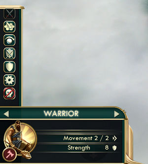
- Showing unit upgrades on units would be nice
- Maybe icons in the vertical ribbon can be a larger
These are the ones I remember right now, when I get back home I'll write the others.
I liked what you did a lot, it really makes the game more user-friendly and more fun to play since it becomes less tedious. Thanks again for your work and time.
While I was playing I took some notes but I am at work right now, have a little time and I want to share my thoughts on some aspects of this mod (the ones I remember):
- Is it possible to see my influence on a city state either on the city banner or when I mouseover. Or even, on the vertical ribbon somehow? (right now I believe I have to click on the city state to see my influence, the coloring on the vertical ribbon helps but I want to see the exact number)
- Again for city states, it would be great if I could see whether the city state is friendly or hostile when I hover the mouse on the vertical ribbon. That would make it much faster when deciding which state to invest.
- I think there should be a kind of ordering of other civilizations in the vertical ribbon, for example by score. Right now it seems it is arranged by the order you meet others. (I may be wrong). I don't know if it is possible but if we could choose by what we sort the list then it would be great. Sort by gold, sort by score, sort by GPT, sort by civ feeling etc... But whether this is possible or not it should be at least arranged by score I feel.
- Again city ribbon, as game progresses number of civs and city states increase so the list gets longer, harder to manage. Maybe 2 separate lists can be made, 1 for civs,1 for city states, each clickable to unhide and hide. So one can choose which to hide or unhide. And for example if there were two separate lists, I could sort the city state list by influence, or type which would make many things easier.
If this is not possible or covers too much space, this open-hide thing could be added to the vertical ribbon as it is.
- where is the old diplo screen, it was easy to quickly look through to find the city states that you lost your alliance with, or to count how many city states you are not allied with. It is harder to do this with the vertical ribbon and you cant see their names. This can be fixed by a way to orders city states in the vertical ribbon I guess.
- I had some difficulty to find how many votes I have in the world congress. Is it because the old diplo screen is gone, or I made a mistake and didn't see where it is.
- Showing unit upgrades on units would be nice
- Maybe icons in the vertical ribbon can be a larger
These are the ones I remember right now, when I get back home I'll write the others.
I liked what you did a lot, it really makes the game more user-friendly and more fun to play since it becomes less tedious. Thanks again for your work and time.
- Joined
- Jan 12, 2004
- Messages
- 1,312
You're welcomeHi. I played with this in 3 long games and liked it. Thanks for this.
")
It's already in the city state ribbon mouse over, and is added to city banner mouseover in version 1.2- Is it possible to see my influence on a city state either on the city banner or when I mouseover. Or even, on the vertical ribbon somehow? (right now I believe I have to click on the city state to see my influence, the coloring on the vertical ribbon helps but I want to see the exact number)

Right now it's simpy game index order. Planned for change when I find time to understand how to use the "sortchildren" function.- I think there should be a kind of ordering of other civilizations in the vertical ribbon, for example by score. Right now it seems it is arranged by the order you meet others. (I may be wrong). I don't know if it is possible but if we could choose by what we sort the list then it would be great. Sort by gold, sort by score, sort by GPT, sort by civ feeling etc... But whether this is possible or not it should be at least arranged by score I feel.
This one is a bit more difficult, I am looking into solutions such as sorting, filters and folding. There's no room for 2 lists side by side, and that would look quite ugly...- Again city ribbon, as game progresses number of civs and city states increase so the list gets longer, harder to manage. Maybe 2 separate lists can be made, 1 for civs,1 for city states, each clickable to unhide and hide. So one can choose which to hide or unhide. And for example if there were two separate lists, I could sort the city state list by influence, or type which would make many things easier.
The diplo list is back in version 1.2. Also you can easily count the city states you have relations with by mousing over you own civ icon in the civilization ribbon.- where is the old diplo screen, it was easy to quickly look through to find the city states that you lost your alliance with, or to count how many city states you are not allied with. It is harder to do this with the vertical ribbon and you cant see their names. This can be fixed by a way to orders city states in the vertical ribbon I guess.
It's under the small menu icon to the left of the huge upper right corner icons.- I had some difficulty to find how many votes I have in the world congress. Is it because the old diplo screen is gone, or I made a mistake and didn't see where it is.
Yes, this is added in version 1.2 mouseover tooltip- Showing unit upgrades on units would be nice
It's a tradeoff with the problems arising from the list getting longer late game, which you also mentionned. Ideally the icons could be scaled depending on list size, but the game's API makes that difficult, or it could be a mouse over, like already done when mousing over the tiny tech icon on the top panel.- Maybe icons in the vertical ribbon can be a larger
Dunkah
Emperor
I think a toggle for the Score Card, The Diplo Ribbon with Civs only and a third for City States would be awesome.
Put three buttons/icons on the right. Click it and the list appears Click again and it's gone. This way you could put a background behind the list to make it more clear, easy to read.
Put three buttons/icons on the right. Click it and the list appears Click again and it's gone. This way you could put a background behind the list to make it more clear, easy to read.
- Joined
- Jan 12, 2004
- Messages
- 1,312
The score card is the player score list, right ? Does'nt this already have a toggle in the option panel ? I guess I could add a toggle there for the citystate ribbon list as well, that would be easy enough. Although since it's not an existing game option it won't save when leaving the game (and I have this policy of no change to save game whatsoever).
With regards to the clarity / readability, I changed the type of font used by the civ ribbon in the later DLC versions to provide more contrast (not every little change is documented...). I would like to avoid having to add a background, that would be a huge blob on the map especially when there are a lot of luxuries available for trading. It would also defeat the main purpose I had for replacing the existing diplo list in the first place - took too much map real estate to my taste, have to constantly click everywhere to see stuff you need.
What I was thinking of doing was making the split between civ ribbon and notifications elevators user adjustable, though I need to find a way to do that. I could also reset the civ ribbon elevator at the start of each player's turn (edit: already does ), so civs have more of a chance to remain visible than city states when notifications pour in.
With regards to the clarity / readability, I changed the type of font used by the civ ribbon in the later DLC versions to provide more contrast (not every little change is documented...). I would like to avoid having to add a background, that would be a huge blob on the map especially when there are a lot of luxuries available for trading. It would also defeat the main purpose I had for replacing the existing diplo list in the first place - took too much map real estate to my taste, have to constantly click everywhere to see stuff you need.
What I was thinking of doing was making the split between civ ribbon and notifications elevators user adjustable, though I need to find a way to do that. I could also reset the civ ribbon elevator at the start of each player's turn (edit: already does
), so civs have more of a chance to remain visible than city states when notifications pour in.Dunkah
Emperor
Yes the score list.
ALl of those lists are things that I want to have access to but not all the time 100%. But I also don't want to have to go into a menu to see them. I especially don't want to go into the options menu to see them.
If you had an icon sitting on the side of the screen you could have the Score menu as a mouse hover. That is the type of thing I want to see for a couple of seconds here and there. Then put it away. But I want it readily available at my fingertips.
The Diplo menu and the City State menu are a bit more complicated and will have things I want to hover over as well, so wouldn't work as a straight hover menu. So and Icon (or Two if you split them), that when clicked on brings up your Diplo screen. I can either leave it there and continue playing or I can click it again and have it go away. Toggle on/off. Right at my fingertips, easy on off when I need it.
Currently the Notifications Elevator just goes behind the score card. Makes it tough to read sometimes. I can imagine if you did that to the Diplo List it would be really tough to read... I don't know if there is an easy fix for that.
- Joined
- Jan 12, 2004
- Messages
- 1,312
How about including the score list in the own civ mouse over ? And a minor civ icon at the end of the civ list to fold / expand the minor civs (I had that on a private build and did not like it much, but oh well  now this thing is public). I can also change the other civ mouse overs to copy what's in their diplo list entry (although I personally find it a bit verbose and prefer synthetic info)
now this thing is public). I can also change the other civ mouse overs to copy what's in their diplo list entry (although I personally find it a bit verbose and prefer synthetic info)JoeyFandango
Chieftain
- Joined
- Sep 14, 2013
- Messages
- 25
"NoCitizenWarning", heh, no wonder it took me so long to locate the option in the .ini files. Not sure if I would have figured it out at all until I read your changelog for 1.2.
One thing I've found out while trying the mod is that the icons in the unit panel are vertically misaligned when using the game's small interface option:
This is on 1680x1050. It might behave differently on other resolutions.
Lots of cool ideas there, keep up the good work!
One thing I've found out while trying the mod is that the icons in the unit panel are vertically misaligned when using the game's small interface option:
This is on 1680x1050. It might behave differently on other resolutions.
Lots of cool ideas there, keep up the good work!
- Joined
- Jan 12, 2004
- Messages
- 1,312
Well that's interesting because the DLC modifies neither panel layouts (large: UnitPanel.xml or small: UnitPanel_small.xml). Are you sure it's specific to the DLC ? Does the misalignment appear between icons that would normally be hidden by the "show more" button and those that are not ? (I can't see your picture from this slow connection)One thing I've found out while trying the mod is that the icons in the unit panel are vertically misaligned when using the game's small interface option
Thank you for your reply.
Is it possible to put another list to the left of the screen, a shorter one to lighten the list on the right side Maybe the list on the left would be for city states and on the right one the rest.
One other thing, maybe ideology symbols can be added to the vertical city ribbon.
Is it possible to put another list to the left of the screen, a shorter one to lighten the list on the right side Maybe the list on the left would be for city states and on the right one the rest.
One other thing, maybe ideology symbols can be added to the vertical city ribbon.
- Joined
- Jan 12, 2004
- Messages
- 1,312
Finally got to take a look at the picture, I had misunderstood: the icons are too high. This is controlled by changing line 38 in UnitPanel.lua "206-24" to "260-38" this will lower the icon stack (the icons are not smaller as envisaged initially, forgot about this). Will be included in next release...One thing I've found out while trying the mod is that the icons in the unit panel are vertically misaligned when using the game's small interface option
The idea is that the right side of the screen is for external events / diplo / info about other civs, the left side is for internal empire control: city list, unit list, unit panel commands...
Yes I understand the idea, but it is obvious that we need more space. Don't get me wrong, what you had done is great. I am just trying to find ways to improve it and I believe natural civ players will be able to distinguish which side covers which aspects of the game.
Right now there is too much information on the right side and none on the left. All I say is that if somehow one could show some of the information on the left of the screen then it would be much easier and more user friendly.
JoeyFandango
Chieftain
- Joined
- Sep 14, 2013
- Messages
- 25
Thanks for the info and for fixing the unit panel too. That was fast.
There's no way I can make this DLC compatible with every mod out there. Try disabling DLC components, for example in this case remove the TopPanel subfolder from the UI_bc1 folder.
Thanks. I removed TopPanel from other mods and now they all work with each other.

Your top panel is much more useful, since it shows extra resources that player and AI has, as well as AIs gpt, so you don't have to visit each leader to see if they have anything for trade. Oh, and I really dig side panel,
for organized planing. Actually, cities won't show boarder growth and info like they did, but it's not a game breaker like messed up top panel, so it's ok.
I mean, you can always click on a city and see what you need.- Joined
- Jan 12, 2004
- Messages
- 1,312
You have it correct, this UI DLC won't show up on the DLC startup menu because that list is hardcoded in the game engine (or queries a DLC tag which I have not discovered).I downloaded and extracted the folder to the DLC folder.
However when I go into 'DLC' on the startup menu, I don't see it.
I checked and it's in the DLC folder.
Am I missing a step someplace?.
The side bar / ribbon is only displayed when options - interface options - "single player score list" is UNchecked (so the two don't overlap, and it also gives a convenient way to disable it).When I go into a game I saw a lot of overlapping lettering on the top bar so that it's indecipherable and there is no sidebar information.
I'm also using WHowards UI mods so perhaps there is a conflict.
This UI DLC affects base game UI, so it is not friendly with other mods which do the same. But it's modular, so you can try disabling conficting modules by removing the corresponding subfolder from "UI_bc1".
Similar threads
- Replies
- 7
- Views
- 1K
- Replies
- 4
- Views
- 815
- Replies
- 5
- Views
- 359
- Replies
- 2
- Views
- 391