ruff_hi
Live 4ever! Or die trying
I would just go with the smaller palette and not offer user defined colors. You know my motto here ... They can just like what they are given.
In poking around it today, I solved one past issue: how each city needs to be placed on a different layer so they overlap visually instead of merging together. As often happens, time away from the problem gave me a chance to look at the problem with fresh eyes, and the solution is so simple it's embarrassing: assign the layer based on its location on the map so that overlapping/adjacent BFCs are on different layers.
So I created a 6-tile grid and assign the layer based on the x and y coordinates of the city itself. Problem solved--and I no longer need to store the layer with each city. This also decreases the data requirements.
") I think this is easily one of the most useful features of BUG. I just wish I had more time to take it to the next level of planning discussed in this thread.
I think this is easily one of the most useful features of BUG. I just wish I had more time to take it to the next level of planning discussed in this thread. Luckily, it was a very easy fix. I also added a HotSeat fix at the same time, so I think it's fully MP-happy now.
Hi, how do I use the city-planning feature? What shortcuts are used?
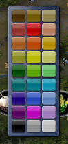
Feel free to suggest a different set of default colors. I can of course show the whole palette, but I think that's a) overkill and b) not organized well. So many colors are barely distinguishable as you say, and it takes up a lot of screen real-estate.
Note: The borders of two cities with the same color will merge into a single area if they touch currently, just like your cities' cultural borders do. I have the fix for this and am tidying it up now so that won't happen. Plus you'll have more colors to choose from.