Panopticon
Utilitarian
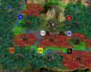
I have to say that I REALLY like the ambience of that cityset.

")
(one day, I need to redo the reactors...)
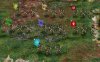
Personally, I feel the art would fit perfectly as Scout Infantry. The heavy gas mask, the dirty armour, the kevlar vest (opposed to a more military body armour), the very contemporary machine gun and the haphazard assortment of equipment... I think that looks a lot like the very first military unit you can get after a crash with your landing pod.So it would be better to use in the early game when there are fewer objects around affecting performance. Plus the unit wears a heavy gasmask, which indicates an early tech level.
Sounds good. Any ideas where to move the NextWar unit then, or how to reassign the other infantry graphics? I just grabbed models from any available source, so it's not like there was any grand plan when assigning the current infantry graphics.

IIRC all infantry units have unique art at this point. So I don't know, any suggestions what unit to use it for? Or what special ability - as promotions can change unit art!
I think nerve gas troops would be a good fit for the NextWar cyborg as well... and feel very Hive-ish. I'd almost say the NextWar gas mask cyborg as nerve gas unit (extra plus against infantry? causing little amount of collateral damage?) would make a good UU for the Hive, sounds just like what they'd use (perhaps instead of the straight infantry unit).Probably too late, but the gas mask would also fit for any special ability involving the use of gas, if we should ever have the desire to add such an ability back (SMAX had VX and the soporific one)
Well, the NextWar cyborg graphic always reminded me of a masked Hivelike security person.
If you're happy with how the faction flags look, I'll make flags for the SMAX factions (sans Fungboy...).
As far as I can tell... no. I just left it there, because it was in the folder already.space grid_background.jpg - is that file necessary?
I've noticed that without mip maps, the flags can display some Moiré-like effects which I find irritating (I also sharpened the mip maps a bit to make them look better), but I forgot that esp. lower-spec PCs sometimes display the mip maps as main graphic. I've removed the mip maps from the logos, but also attached an extra file where are all the icons *with* mip maps (perhaps you can link to it in the FAQ or something like that in case somebody else is irritated by the effectPlease save the flag files without mipmaps! Like buttons I don't think the incredibly little reduced graphical resources required by using mipmaps here validate the reduction in graphical quality.
") ).
).Done and attached (plus the other SMAX factions - do you want one for the Cybernetics as well?), I've also included the files for the faction colours. They're pretty much the SMAX colours, but I've changed them a little bit to make them work better (Caretakers less green to differentiate from Gaians, Drones a little darker to differentiate from native life, Pirates a bit darker to work better with their secondary colour on the flag). If you want a different skull, not the SMAC skull, I try to find another one.The native life flag doesn't work because it doesn't make sense for hidden nationality units and partisans. Therefore could you please make a skull which works with the new flag nif?

 @ Keeper.