Help improve the expansion pack!

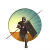
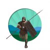
That image is a bit too small and doesn't appear to be the right time frame. Light Infantry should look from WWI/WWII era combat.

Ok, I'll look for a bigger image from that era. Wasn't exactly sure of the era or the size that was needed. If I can help with anything else just let me know. Thanks!!
 
I found this image. It is harder to find good images from that era.
WW I Light Infantry.jpg

This image is larger - if it isn't large enough could you give a size frame I need to look for. Thanks!
 
This is the size of the icon it's replacing:

attachment.php


The one you linked above is rather good, since it has a white background (easy to crop out). An alternative way to come up with this artwork is to look around the modding downloads and see if anyone has made WW2 unit skins. Any reskin of the Infantry will usually come with a matching icon.
 

Attachments

  • Infantry.PNG
    Infantry.PNG
    52.7 KB · Views: 622
Light Infantry. It came out pretty well, but still not quite as Art Deco/Lempicka styled as the rest of the modern units.
 

Attachments

  • LightInfantry.jpg
    LightInfantry.jpg
    48.2 KB · Views: 197
Sneaks, these icons are terrific, and will definitely raise my enjoyment level. I'm about to start my first game with them. Thanks a lot.
 
Heres the PSD

I'm pre-emptively making icons for an extra UU/UB for various civs, as I assume we will eventually hit the point where we give every civ 2 UU and 1 UB/UI
 

Attachments

I present possible UB/UIs for every civ that does not have one:

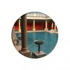
Rome - Baths
Replaces Garden
No river requirement
+2:c5happy:

Greece - Acropolis
Replaces Castle
+3:c5culture:

Germany - Autobahn
Replaces Roads
+1 :c5moves:

Spain - Plaza
Replaces Garden
No river requirement
+1:c5culture:
+2:c5gold:

France - Chateau
Replaces Castle
+1:c5gold: on Plantation resources

Ottomans - Central Dome Mosque
Replaces Temple
+1:c5culture:
+1:c5science:

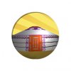
Mongolia - Yurt
Replaces Monument
+2:c5food:
 

Attachments

  • Autobahn.jpg
    Autobahn.jpg
    29.2 KB · Views: 160
  • Baths.jpg
    Baths.jpg
    53.2 KB · Views: 189
  • Plaza.jpg
    Plaza.jpg
    57.4 KB · Views: 181
  • ChateauIcon.jpg
    ChateauIcon.jpg
    58.9 KB · Views: 164
  • Acropolis.jpg
    Acropolis.jpg
    57.3 KB · Views: 167
  • Yurt.jpg
    Yurt.jpg
    48.8 KB · Views: 162
  • CentralDomeMosque.jpg
    CentralDomeMosque.jpg
    51.4 KB · Views: 159
The quality of your icons has steadily improved. :goodjob:

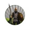
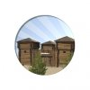
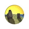
Agreed; Sneaks, could you revise the first batch? The pioneer fort looks, well, cartoonish, the Stones and Mill are pretty flat (they could use more contrast between foreground and back- or midground), and the levy is kind of hunch-backed.

Thanks for these, btw. I put *way* too much time and effort into the icons when I do them and I'm still never satisfied.:p Now I don't have to feel guilty about letting Thal down.:lol:

:goodjob:
 
Possible Levy replacements:
 

Attachments

  • Levy2.jpg
    Levy2.jpg
    58.7 KB · Views: 165
  • Levy3.jpg
    Levy3.jpg
    57.2 KB · Views: 167
  • Levy4.jpg
    Levy4.jpg
    58.1 KB · Views: 232
New Pioneer Fort
 

Attachments

  • PioneerFort.jpg
    PioneerFort.jpg
    58.3 KB · Views: 184
Right Levy looks pretty good large, but middle one definitely looks best as a smaller icon. Great work!
 
The levy psd has a motherlode of layers in it to make any combo of icon and background you want.

I'll get to fixing the Jelling Stones at some point, but I just cannot fathom a decent way to set up the icon that won't look awful for 2 big gray slabs of rock.
 

Attachments

I'll get to fixing the Jelling Stones at some point, but I just cannot fathom a decent way to set up the icon that won't look awful for 2 big gray slabs of rock.

I think just making the ground around the stones a lighter green would help tremendously.

These revisions are much improved: thanks for doing them!

Oh, and I prefer the middle levy too.
 
The biggest thing was remembering what the hell I used to do for photoshop filters for icons.
 
I tried something similar. The issue with the stones is that the flat color palate just always make them look like 2D items in a 3D scene. I'll fiddle with it further tomorrow.
 
Layer groups can be helpful for project organization (folder icon in the layers window). It's an easy way to manipulate multiple layers at once, like the group of UU/UB icons in the project.

Another tip: a 4-icon wide grid is easiest for the final file when you import your modmod to the game. This size is important because:

  • One icon size is 45px.
  • DDS file resolutions must be multiples of 4.
  • Icons must be in the same position for all files in an IconAtlas (reading left to right, top to bottom).
  • Resizing the canvas vertically is easier than horizontally since nothing needs to be moved.

I do 4x1 images for the other sizes, and 4x4 for the 45px resolution. I transfer the 1-icon files over to the 4-icon version, which only takes a few seconds, so it's not important to use the final file as the working-canvas.
 
Back
Top Bottom