Nasuellia Mods

Ow, I love this idea of putting the unrest icon on the production icon spot!
  • If a settlement is in unrest, I believe building anything there is not possible anyways, which means that this icon might also be overlayed/replace the "currently building" part of the banner on the right side.
 
Where are the settings like this one? I don't see them. I could just be dumb or blind.
added a setting to show leader portraits instead of civilization symbols
 
Where are the settings like this one? I don't see them. I could just be dumb or blind.
added a setting to show leader portraits instead of civilization symbols
In the game options, an extra Add-ons section is added. That is where you find mod options.

1744052529270.png
 
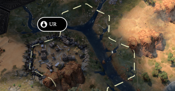
I found another independent banner bug. This was a new game, turn 4. I attached the autosave (no mods needed this time, I removed that one). I discovered the settlement with the scouts search ability (one step south west, than search). I remember that I also did that with the previous bug report for the same issue. Maybe it's related to that ability?

Edit: I reloaded that save and discovered the village again, both by search and by walking towards it, but can't reproduce it.

1744052584319.png


These are my mod settings (yes, I went back to civ icon :)):
1744052764147.png
 

Attachments

Last edited:
I have this. Section for Finwickle, Leonardfactory and Trixie and nothing for this mod

1744052773000.png
 
I have this. Section for Finwickle, Leonardfactory and Trixie and nothing for this mod
Are you trying to find the mod options from the main menu? This mod doesn't have the options in the main menu, only during gameplay.

And thanks for using my mod as well 😄
 
@Finwickle Uhm this is gonna be another head-scrather, I fear. With your save-file and the same mod-settings as you posted, I move straight south-west and discover Scythian Neapolis which appears just fine. Tried with the "search" ability as well.
1744058022639.png

Next time you stumble on it take a look at the console, last time there was a clear error about an unreachable path.

By the way, thanks for helping RDomico! You're the best.
 
Hi, thanks for this mod, I like several things about it, and your most recent update added some options that I like (like keeping leader portraits and IP colors), but could you please add an option for hostiles to be identified by constant red border? The white fluctuating stuff just doesn’t stick out enough for me to quickly glance across a large area and see all hostiles. The other thing is coloring of the religious icons showing when it has been converted to something different. That helped me somewhat keep track of settlements that I have already converted once (for the relic)…I understand that particular color isn’t a true indicator for what I’m looking for (since it could have been converted from someone else’s religion) but if you can can up with a way to track that, that would be even better, thanks!
Hey there!
In regard to the religion icons, I fully agree that some sort of additional information is needed, I also used the old red tint to track what I already had converted once before, I will think of something, I have some ideas leveraging the animations I already have, and I'm thinking of a specific relic icon. I'm just not all that sure I will be able to implement it in the near future because I'm a bit burned out, My free time has been nothing but working on this mod (and the others) for the last month, and I need a bit of a break (other then fixing gamebreaking stuff).
In regard to the border: my hostility indicator is not for independents only (like vanilla is), it's universal, and as such, a red border would not work at all given that leaders can have a red color-scheme; I also find it incredibly ugly, to be entirely honest. I don't plan to add a border like that any time soon, sorry about that.

I appreciate the feedback and the engagement!
 
Registered on site just to give feedback for your excellent nasuellia-alt-unit-flags-and-bars mod. Thank you putting in the effort and bringing us this gem!

I especially appreciate that you have made so many features customizable. I switched around and tested all combinations just to find one I like the most. It's great.

With all the icons inside the city banners now and the border around it, the banners however have grown pretty large for me. Some random points regarding that, I hope you could consider:
  • Maybe make it optional to remove the town/city icon from the settlement name banner? The icons are small and similar enough that I never actually end up using them for reference. Rather I mostly just know which of my settlements are cities and which not. Maybe a more usable solution without making the icons take up even more space, would be to use the border around the banner only for cities. It makes the banner really pop out and makes it larger, which would also signal that it is a more significant settlement
  • It would be great if instead of the logo, the left most part of the settlement banner could be assigned for the pop counter. Usually the ownership information is signaled by the color of the banner anyway and the logo itself is there only for the aesthetic value.
  • If a settlement is in unrest, I believe building anything there is not possible anyways, which means that this icon might also be overlayed/replace the "currently building" part of the banner on the right side.
  • If there is just a single religion in a city, perhaps it would suffice to output the religion logo just once - and show 2 logos only if they are different?
  • Maybe it would work visually to reduce the size of the main border enough so that it would share the border with the population/building circles? Right now the circle borders are inside the main banner border, just adding more padding to the main banner and making it larger than it has to be. A lot of the banner is just empty background that is blocking the map. If they shared the border more, it would allow making the entire banner slightly smaller
  • I also did not hate the floating smaller icons below the main banner, but I understand this is very subjective. It does not also COMPLETELY clash with the visual style - the military units banners also have these small dangling floating things with the unit technology level - or whatever that numeral means
  • Editing this post to also agree with Sandman38 above, who requested a red border or something more visually distinct to identify hostiles on the map. The current pulsating thing is not very noticeable at all (maybe too low opacity?) and the flipping danger icon is nice, but does not really pop up at you, screaming "danger" :)

Anyways.. just my 2 cents. Thank you for all the hard work you have put in
Thanks for your kind words, and I'm glad you like the mod overall! It's only natural to have different taste / needs, every brain is different (thankfully or we would be lifeless automatons), and I do hugely appreciate the feedback! This mod has been made much better by several contributions in the recent past!
  • Agreed on the setting to hide the settlement-type icon, I actually originally wanted to make it optional to begin with but totally forgot about it! I will add the option with a future release!
  • The pop counter on the left is something I actually tried at the very beginning of development and I wasn't a fan of it, opening with a number was quite distracting, but I will consider it for future versions!
  • It's a neat idea but it wouldn't be consistent, you can have a town in unrest, which would still need the icon, but wouldn't be able to be shown in the same place as in for a city because it has no production meter at all, I prefer all icons to appear in the same place.
  • I was tempted to do something like that to save horizontal space, but I ultimately decided against it because, wait for it... I prefer consistency. More importantly I am posponing changes to the religion icons for now, but I will likely do make some changes at some point in the future.
  • During development I tried something like that: a thinner banner, but still with the larger meters protruding. It was a trickier than I expected to get it right, and didn't look al that great. Maybe I will revisit the idea and also attempt to make a "compact" mode that tries to reduce the overall banner size.
  • The key difference is that my promotion / tier indicator is styled like the rest of the unit-flag, while the original small icons below the banners were not: no border, background, flat monochromatic icon, even their placement was all over the place, I hated them and they're never coming back to haunt my dreams! :)
  • All things are of course subjective, to me an alternating skull icon with an overshoot animation totally does scream "danger"! But I understand: many have asked for the red border, and I'll give you the answer I gave to everybody else (look at my reply to Sandman38 about this).
 
Take that break, the mod and us users will be here when you get back. No need to burn yourself out on a hobby project.
Ahah don't worry I am used to obsessing over stuff, truth is, I have nothing but fun with it. I will certainly postpone further development in terms of features, but I do want to fix that messed up independent banner as soon as I encounter the issue! That irritates me to no end!
 
I've had a consistent issue with the independent powers being entirely in black and white (the bonus colors option is on). I tried disabling all my other mods and ran the save file with only the alt-flags one, however the color issue was still there. The hostile glow is also white

Edit: Figured it out. I had to switch the city icon from civ to leader and back to civ. My banners had the leaders faces while civ was selected too, and doing this fixed both issues
 

Attachments

  • Screenshot 2025-04-07 at 11.35.29 PM.png
    Screenshot 2025-04-07 at 11.35.29 PM.png
    891.5 KB · Views: 14
Last edited:
Also I would really love it if there was an option for hostility that has both the glow and the icon swapping. I find them both really cool.

Edit: However, I feel like the glow needs to be red again. Currently the white glow makes it really hard to tell which independent powers are hostile at a glance. A red glow and the skull would help a lot.
 
Last edited:
@saimnaeem hey there! Thanks for joining the thread! The issue you were having sounds very much like the settings-initialization hiccup that others have pointed out. I will investigate it!

In regard to the option for both hostility indicators at the same time, I would need to synchronize them. I will consider it for future versions.

I am not going to introduce a static red border though, look at my recent replies to others about this topic. I believe that most people asking for this have been reaching that conclusion a bit too quickly: in fact my glow is not white at all, it's faction-colored. My hostility indicator is not just for independents like vanilla, it's global / universal, and as such I need a different principle to be consistent. A red border would look like vomit on half the palettes, and be invisible as well as ambiguous on some (imagine red themed leaders).

In any case thanks again for chipping in!
 
The easiest way to debug independent villages is to start a new game in modern era, when all map is discovered. I still get 1-2 villages with the banner bug.
 
The easiest way to debug independent villages is to start a new game in modern era, when all map is discovered. I still get 1-2 villages with the banner bug.
Yeah I already identified the issue and fixed it. Will publish a hotfix when I can! ;)
 
@saimnaeem hey there! Thanks for joining the thread! The issue you were having sounds very much like the settings-initialization hiccup that others have pointed out. I will investigate it!

In regard to the option for both hostility indicators at the same time, I would need to synchronize them. I will consider it for future versions.

I am not going to introduce a static red border though, look at my recent replies to others about this topic. I believe that most people asking for this have been reaching that conclusion a bit too quickly: in fact my glow is not white at all, it's faction-colored. My hostility indicator is not just for independents like vanilla, it's global / universal, and as such I need a different principle to be consistent. A red border would look like vomit on half the palettes, and be invisible as well as ambiguous on some (imagine red themed leaders).

In any case thanks again for chipping in!
No worries. I absolutely love your mods. Their aesthetic just makes me drool in a way that improves my overall game experience. I'm excited for what you'll come up with over the next while!

Going back to the hostility indicator. I recognize the value of having a universal indicator based on faction color, but don't you think there should be something slightly different for the independent powers? They have the blandest color palette, with black and white, and I feel like lacking a color indicator really makes it hard to distinguish them at a glance (though the icon swapping has had a huge impact). Maybe a reddish glow for just the independent powers, since they're the faction you are most likely to see hostile? Or maybe even a change in color for the independents faction color if theyre hostile (that might be too far of a jump).
Definitely not a static border though, I really like your execution of the "glow" a lot better than vanilla.
Glad to make you drool! LOL.
Jokes aside, the problem with doing a total color overhaul for independent powers is that Fireaxis likely reserved black&white for them specifically, any other color combination would be at risk of conflicting with future leaders, so that's not doable.
In regard to making an exception to the rule just for them, and giving them a red glow, I find that it could be quite confusing for players: a hostile indepependent is likely the first hostile a user encounters, a red glow would be at risk of teaching the user that hostiles have a red border (that's precisely what vanilla did to me the first time: I was expecting a red border on hostiles, not just a special case for minor factions). I also really dislike inconsistencies and exceptions. I also have no issues whatsoever seeing those black/white glows, frankly. Not to mention that the skull-swapping is there too as an alternative, which is not color-reliant.
With all that said: a bagillion people keep asking me this, so I made a note on my issue tracker to try and think of another solution.
EDIT: oh by the way I think I fixed the settings initialization issue you reported, thanks for that!
 
Back
Top Bottom