Dancing Hoskuld
Deity
Original image is fine but button is ferrets!
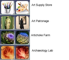
The Archaeology Lab I disagree since the original looks more like the original "virtual man" and less like a clip art.
The Antelope Hunter I would rather keep as a painting as opposed to a photograph.
I try to make all the animal images a painting/illustration and not a photograph. As for the Hopscotch that is WAY too modern for the prehistoric era.
The Barley Farm maybe, but I think they look equally as good.
I like my beaver one better. Its hard to tell the new one. If its a muskrat or a beaver. Plus its a photograph too.
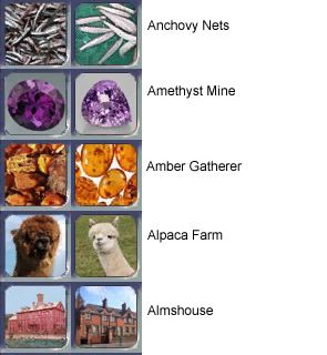
The Amber Gatherer looks too much like the Amber Mine. The one i have is more raw looking amber. Non-polished version. I made sure it and the jade gatherer have the unpolished forms for the gatherers so you could tell them apart.
His Bearberry Farm is distorted and squished.
The Antique Shop I think look equally good to each other. Note I grabbed the current one from one of those "ville" games.
Also which Anno ones do you dislike?
It's not about looking at the original image. You can clearly see here that it looks like corn. In the game... not so much.I don't see any ferrets. Here is the original image.
You're kidding right? You didn't even DO the art on this one and you're unable to see a quality difference on that one? It's about a 5000% improvement. Most of these are not THIS much better but this one is incontestable. I mean, you complained on new ones about the flat white background so on the old one you LIKE it? And there's nothing about the old building that suggests anything more than 'building' to say 'antique shop'. Maybe if it's blown up to 500% its size there's something there that might... I dunno.The Antique Shop I think look equally good to each other. Note I grabbed the current one from one of those "ville" games.
I do see what you're saying here and made that point myself - it was just to reduce fuzz and make it a little easier on the eyes was the reason for that one but I figured THIS one would be received this way and I can't blame you for your take on this one.The Archaeology Lab I disagree since the original looks more like the original "virtual man" and less like a clip art.
At this resolution you can't tell the difference between a picture and a painting - I'd have guessed the original was a picture as well. What you CAN tell is that the background on the first doesn't have enough contrast to the foreground. I think I do like the framing on it a bit better on the first tbh but the lack of contrast lends it to behind a little harder on the eyes to sort out.The Antelope Hunter I would rather keep as a painting as opposed to a photograph.
Again, you really cannot tell what is a pic and what is a painting at this resolution size. All are pixelized to the point its impossible to tell the difference. Pictures also generally have better contrasts making them more perceptible at this res.I try to make all the animal images a painting/illustration and not a photograph.
Ok, with this one I would agree so if the colors were starched out to white with the contrasting black background it would be more era-neutral right?As for the Hopscotch that is WAY too modern for the prehistoric era.
The originals look like colored textures, not objects. I don't dislike them as that but I can understand wanting to give the plants some definitions as plants and not a swatch of vaguely texturized color.The Barley Farm maybe, but I think they look equally as good.
So's the original. I saw the original on the same search that found this new one. She wanted to replace it because the one we have looks like a T-Rex head at this size and resolution. I didn't see it at first though I certainly didn't see a beaver. But today, as I looked at this thread I saw it... it's VERY pronounced. To the point it looks MORE like a T-Rex head than it does a beaver with it's reflection.I like my beaver one better. Its hard to tell the new one. If its a muskrat or a beaver. Plus its a photograph too.
Problem with unpolished gemstones is that they look like indistinct rocks. This makes them unable to be told apart from each other and many other buttons frankly. You'll notice the gatherer has multiple distinct amber stones (even though they are polished) whereas the Mine has one very large amber stone.The Amber Gatherer looks too much like the Amber Mine. The one i have is more raw looking amber. Non-polished version. I made sure it and the jade gatherer have the unpolished forms for the gatherers so you could tell them apart.
Hmm... looking at the original I can see that it's been resized on the X measurement. That could be fixed of course since apparently you're saying the berries are classically spherical.His Bearberry Farm is distorted and squished.
Mentioning the why on these would be fair. An overall 'don't like them all' is not. Equally true that it should be stated by the artist why she felt they needed adjusting in the first place I think thoughI understand that. Some icons I had no idea what they were until I saw a larger image of them for some I did not make, so I understand you. However most of these I just don't like.
") .
.No plan to but they should be up to discussion individually at least.Again please don't put them on the SVN.
The Amber mine is a single stone. No confusion between the two. Bland rocks are easily confused with many other buttons.Again the shiny amber buttons is too close to looking like the Amber Mine.
We don't have enough resolution for that button to work to be anything more than too busy as it is is all.And the corn has all the types of corns rather than a single yellow corn. Much more representative of how original corn looked.
You're saying a silhouette of a person looking at a painting doesn't say an Art Shopper or Appreciator any more than a simple statue?I agree with this but the new image doesn't look any better.
Of course it is. But the new one you can tell it is in the game as opposed to a reddish cloud appearance the old one takes on. Even here you can so clearly see that the twist in the original artist (the caveman)'s middle finger makes the image a little confusing as opposed to the very clearly outlined hand (with far more contrast) in the second.
Who can tell the difference between a Llama and an Alpaca in the first place? Better not to look like a floating ... erm... in a pool at medium resolution.It needed to look different from the Llama. With the Llama white its hard to tell in the picture provided if that's a llama or alpaca. At least with one brown and one white its easier to tell.
Ok, this point is quite valid BUT it just says neither pic is acceptable because the soap maker as we have it looks like roof shingles or a wall (I see a wall, a brick wall. NOTHING that suggests soap.)its not just era appropriate its the fact these upgrade into similar buildings too. Such as the Soap Maker to the Soap Factory. The Soap Factory has soap that looks like modern soap, but the soap maker makes soap that looks more like tofu since that's what ancient soap looked like. Not the fancy bars we have now.
Ok, too creepy... I'll lean with you on that one. The fact that it's clockwork is very obvious and there's even gears in the background but you're right he's a little creepy.I did not make that one so I don't know. But the one he gave looks too creepy to replace the parrot.
Maybe we should put these together as a modular file since now I know a file outside the FPK can override one inside the FPK, just so y'all can download it and see the differences in the game since here it's VERY deceiving how necessary the original needs adjustment. At this size they all look fine. In the game... most of them do not.
@DH: I think we've sorted out some things that can be done with your button and it's not sized correctly which would be the first problem you were having there.
 I'm sure TB can show you how to identify my buildings/resources from looking at my Module (or the resources/faustmouse modul).
putting a button together is NOT laborious art.
Maybe we should put these together as a modular file since now I know a file outside the FPK can override one inside the FPK, just so y'all can download it and see the differences in the game since here it's VERY deceiving how necessary the original needs adjustment. At this size they all look fine. In the game... most of them do not.
I realize its easy to be blinded to what an image may come across as if you've seen the image in a larger state. Once you have you can't see how it looks to someone who hasn't. In many cases, this is the issue - the image doesn't come across at that size (and particularly on Medium graphics where the resolution fuzzes a bit (more if DXTbmp was used)) as what it looks like at a larger size at all and instead looks more like something else entirely or is otherwise completely unrecognizable. We have far too many buttons that are unrecognizable for what they depict when you look at them in the game and this effect of the designer having seen the larger image making it more possible for them to see it at the smaller size and resolution and incapable of seeing what it looks like to someone who hasn't seen that larger clearer image is what I consider the culprit. At larger size, 95% of the buttons you've got in there are perfect selections. It's at the smaller size and res that they fall apart and that's tough for any designer to accept - I know. I blame CivIV limitations to some extent. It would be nice if we had a LOT more resolution limit to work with! It unavoidably pixelates even at this microscopic button size we have! This means that a LOT of images that would otherwise work may very well not due to the degradation.The rest I prefer much more. I hate to be stuborn on this but I really want to hold my ground on this.
I'm not trying to say you don't put a lot of thought and time into these efforts... just saying such a search effort doesn't compare to what the original artist must've done and isn't anywhere near as impressive as many of the other modding skills you possess. The amount of time we take on something isn't half as valuable or judgement-worthy as the amount of skill it takes to do so.4. For me is was. I am a perfectionist when it comes to these and it always takes me longer to pick out the art then it takes me to code the buildings. Making the button is easy though. You got to know I have a whole set of standards I try to follow, rnaging from existing buttons such as do they look similar to another button, is it era, do they look in the same style as others like it, etc. Also I try to avoid colors like pink because it just makes it hard to find the pink buttons when there is a missing button.
As I said I didn't like it either but I respected the reason it was asked of us. And it's not about happy or not. In many cases here I can't understand your reasoning for not seeing the quality difference except that perhaps you can't see them in-game yet. What's perhaps a little disturbing is not that you're standing up for your work but that you're patently stating that there's no improvements in here when I think its quite clear there are. So in a sense it's just coming across as "this is my territory - butt out!" rather than an honest evaluation of the differences with cause for preferences given. Only a few were given the benefit of rationale for opinion.I know standing up for these is not making you happy, but having to share an FPK with you did not make me too happy either.
Well I CAN have a modular file and MLF control file be ignored for the SVN and not have a major problem in my settings with that so a modmod would be fine. But if included in this manner, I'd beg you to consider them from a perspective of in-game comparisons. (Particularly on Medium graphics settings.)If you want it as a modular file that is by default turned off then that's fine. I can live with that. However I would much rather it be in the modmod section.

How's this for Art Patronage?
How is this representing someone appreciating or about to purchase art? (patronage) I mean, its certainly a piece of art. (and a nice one at that - a good pic for something I'm sure but I'm missing the message imo)

I'd not considered that meaning of patronage. That's why I was asking of course. To Patron - to Fund or support. Ok so that pic might say THAT a bit more.Patronage is the commissioning (ie. funding) of someone artistic by someone wealthy. That is exactly what the picture shows.
I agree that on a button you will not be able to tell that patronage is being represented. I don't see why that's important. The quality of the image is more important in my opinion. The mouseover tells you what the button represents, and it's silly to effectively attempt to make the image render the mouseover redundant. Even Chinese or hieroglyphics couldn't represent Art Patronage in a 55-pixel-square box!
If you can find an image that conveys more information, without losing quality (or era-appropriateness), then go for it. But more "informative" images tend to be of lower quality, and images that replaced the mouseover (not that it's possible) would be very poor quality indeed.
I'd not considered that meaning of patronage. That's why I was asking of course. To Patron - to Fund or support. Ok so that pic might say THAT a bit more.
I know what you're saying here... but a pic says a thousand words right? The more they can communicate the label the better. With the meaning you just stated (which is not at all what I was thinking it meant) it has some bearing.

12. The one you give is much too cartoony. So mine I want to keep.
13. Its actually hard to tell yours is a mouse. So I would like to keep mine.
14. With the dark background its hard to see its a chimp at all. So I want to keep mine.
15. While not as much contrast Mine is at least the ancient breed of the angora sheep that I wanted to make sure was shown. There were not many pictures of this breed and thus was the best I could find. Thus I really, REALLY want to stick with this one.
16. I considered your image with picking the Ancent Embalmer but chose against it for mine due to the white back ground and its actually hard to see yours. So I highly advise against using yours.
As you can see this batch was "no, no no". But its just the order it fell in.
I don't have much time so I will do a little bit at a time. If you want me to bend then you have to compromise too.
2. I think they are equal. So I will give in if you have to have this one. Approved. I actually like Hydro's more since the street on Whisperr's looks to modern witht he white stripes and the short cut grass.
4. I think both suck and we need to find a 3rd option. I like whisperr's.
5. I like mine a lot better since you can see the flower better. I actually rejected your image when picking out the original. So no to this one. ALso Think Hydro's looks better and is more recognizable as an artichoke, but maybe it's different in the game. So a rework of this would be good.
I think Whisperr's has more contrast. Slighly...
7. I seem to remember you image before. I think it was used for the botanical garden. So i think not to be too confusing from a previous button replacement. Otherwise I think they are equal. I like the red leaved tree a lot more then the pink leaved.
8. I think the new picture is too shady. I know you probably say mine is too bobby, but at least the apricots look bright. A compromise would be a bright looking single apricot. IF you can find an image of one. Yes, what hydro said.
9. Approved.
10. I still think the original looks better since it resembles the original Di Venci image and less like a clip art. So no. I'm with Hydro here. It looks very good (at least here). So if necessary, we could rework it to make it less blurry in game.
11. About equal. I think mine has more of a contrast though.
12. The one you give is much too cartoony. So mine I want to keep. Hydro's is so dark and hard to recognize, while I think Whisperr's is too cartoony as well.
13. Its actually hard to tell yours is a mouse. So I would like to keep mine. I can see the mouse easily but I think Hydro's looks better. When it is to blurry in game, I'd think a rework would be best.
14. With the dark background its hard to see its a chimp at all. So I want to keep mine. Shouldn't be to hard to change the background to a lighter blue. BUt beside the dark background i like Whisperr's more.
15. While not as much contrast Mine is at least the ancient breed of the angora sheep that I wanted to make sure was shown. There were not many pictures of this breed and thus was the best I could find. Thus I really, REALLY want to stick with this one.
A good reason. and only the upper park of the sheep looks a bit weird, the rest is ok. But I remember that this one was really bad ingame.
16. I considered your image with picking the Ancent Embalmer but chose against it for mine due to the white back ground and its actually hard to see yours. So I highly advise against using yours. They both are a bit "too full". But I can imagine it's hard to get the whole embalmer on one small pic :/
As you can see this batch was "no, no no". But its just the order it fell in.
19. Again I want to stand by the amber gatherer to look different from the amber mine. I would rather it have opaque amber than shinny amber. Agreed. But Hydro's original picture is a lttle bit too stuffed IMO.
20. I think we need a 3rd image of a brown alpaca that looks less like poop.
I like both
21. Approved.