Poll: For Civ VII, which art direction style do you prefer?

For Civ VII, which art style do you hope for (leader portraits, builds, map, etc.)?


  • Total voters
    205
Status
Not open for further replies.
Yeah, maybe “grimdark” wasn’t the best word, but that is what I meant by that.
I see, thanks for the clarification. I wouldn't at all describe the colors in Civ 5 as drab or excessive in any way. I wonder if not all the saturated colors in games and social media have made people more alienated from the natural colors you see out in the real world?
 
I see, thanks for the clarification. I wouldn't at all describe the colors in Civ 5 as drab or excessive in any way. I wonder if not all the saturated colors in games and social media have made people more alienated from the natural colors you see out in the real world?
So this isn't specific to you by any means, but I've noticed a trend among people advocating for the Civ 5 style or more "realism" in general for the graphics:

There's a constant attribution to enjoyment of the Civ 6 style to some act of manipulation or subterfuge by popular culture. Like in this thread, you've referenced exposure to "smart phones, modern games, and social media" a couple times as explanations for why bright colors or stylized graphics are popular. The corollary to this line of reasoning is that only your choice is the logical one.

Again, it's not just you making these comparisons and I don't mean to attack you. It's just a common theme I see here. Why can't we accept that, hey, some people just like bright colors and stylization, without implying that these fans aren't as serious or intellectual or whatever?
That is a good point. The "smart phone" hypothesis of mine was something that just hit me, but when you get a hunch, sometimes it is better not to share it.

There is certainly a tendency in humans to attribute things they don't like to outside forces and less-than-good motives for psychological reasons. It is of course very prevalent in conspiracy theories, but also happens a lot in other situations like political discussions.

I agree that the "realism side" here seems to do this more or exclusively in this conversation. Or maybe it was just me. I am quite passionate on the topic of art style in these games, but I apologize if I insinuated that other peoples preferences for more stylized art was less serious than my preference for the opposite. That wasn't my intention when I wrote this. At least not consciously.
 
Oh my gosh did I just witness a calm and polite disagreement get resolved on its own? Nice.

I’m a fan of mild stylization (i.e. Poundmaker, Suleiman, Eleanor, and others), but what I want most is consistency. Civ VI’s leaders range from portrait-accurate to caricature. Stylization is a spectrum, and I’d prefer if Civ didn’t move around in it so much in a single game.

It would also be nice to see a vivid painting-like style (as suggested by others), maybe even drawing little cues from the leader’s culture in their art?

Whatever the style, make each leader’s diplomacy screen background bigger. The mass of black dead space is just immersion breaking to me. Why am I talking to Teddy in the void? And why does the void have a little portal to the White House?

In all fairness, it looks a lot better in pre-release trailers and such. And, it could very well be an issue with the way my computers display it. But, for me, the background art is too small.
 
Last edited:
I disagree with this. In the dichotomy between realism and "cartoony", Civ 1 and Civ 2 both kept a middle ground, where some of the depictions go for realism and some are more stylized. How much this was a deliberate decision or not is hard to guess.

..... snipped a bunch of great images, thanks! ...
Sorry for the misunderstanding. I agree with everything you wrote about the *map art style*. My comment was directed at the *leader head/body art style*. Nearly all of the iterations have depicted the leaders in a more stylized, exaggerated manner. Your point about the low resolution of Civ1 is consistent with this. Only Civ5 changed the depictions of the leaders; I liked some of them very much. All of them looked more like humans with conventional proportions. Upon reflection, that's probably my preferred approach for the most fair, lifting-up way to represent leaders from a variety of cultures and geographies.

I have fewer strong feelings/preferences about how the map should be represented. Each of the games in the franchise have strengths and weaknesses in this area. I would be happy if Civ7 borrowed from any of them, building its own point of view.
 
something i think might be cool is if on the larger scale, we operate with hexes, while on the smaller scale they get cut in thirds to form rhombuses. but also that kind of tessellation would maybe look a bit weird, idk. some variant of larger tiles getting split into smaller sub-tiles
Triangles, perhaps? Hexagons naturally tessalate down into triangles. Think of the side of a TIE fighter.
I think what I was getting at (above) was that you keep some form of grid for lower level, close-up things, but you ditch a grid and just go for a point and node method for city placement and terrain features.
What you're doing, in effect, is throwing a fine grained hex / rectangle mesh over the entire planetary map and using that for city placements. Then as you zoom in, the cells in your mesh get bigger (because you're closer) and you can start to see things like districts, tank brigades and eventually settlers and builders. This would also give you some amazing controls over terrain appearance too. It's like drawing with a fine marker after only ever having used crayons.

I should also say that I would really love to be able to have my own livery / heraldry for the Civ I decide to lead.
My flag would be like this:

Sanmichaelo_flag_small.jpg
 
If one looks at the "30 years of Civ" videos, one would see that nearly all of the iterations look more or less cartoony, like a caricature. Civ5 took that in a different direction, as did BE. Civ6 moved back to the cartoonish style, which surprised players who first entered the game with Civ5. I voted for "cartoonish", just because that's consistent with the franchise.

Certainly more than a few opinions that have floated around here have come from the significant amount of new players that Civ 5 being on Steam brought in. i.e. I loved the new movement in 6 (best in the series!), but quite a few people thought it was too slow. Of course if you had played 4 or earlier, most units only moving one space is no surprise; and having all units, in the right terrain, be able to move two spaces is still fast.

Civ 5 and 6 are definitely harder to read than the older games. Especially Civ 1-3 which are in 2D. But did you find Civ 6 easier to read than Civ 5? I didn't, and for both games I need the simplified map to plan cities and other aspects related to resources. Overall I found Civ 5 a little easier to read than 6, but that may just be because of my greater familiarity with it.

I think you're on your own there!! Hills aside, 6 is way easier to read than 5.

I've been wondering if we even need tiles. Just give every object a roughly circular footprint that can't overlap with objects of the same class. Adjacency can bee determined by many X are within a certain radius.

I remember in a video on the development of Civ 4, Soren and Dorian talking about how they tried to remove tiles from the game, but eventually realised that in a turn based game, tiles are crucial. That if you get rid of one, you kind of have to get rid of the other.
 
I disagree with this. In the dichotomy between realism and "cartoony", Civ 1 and Civ 2 both kept a middle ground, where some of the depictions go for realism and some are more stylized. How much this was a deliberate decision or not is hard to guess.

In the case of Civ 1 the resolution was so low, that the finished product doesn't look overtly realistic or "cartoony" in the end. This is par of the course for many games in 320x200, which often are open to interpretation. But have a look at the mountains and forests in this example. They are clearly going for a "photorealistic" satellite look here, like in Civ 3 and Civ 5.
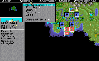

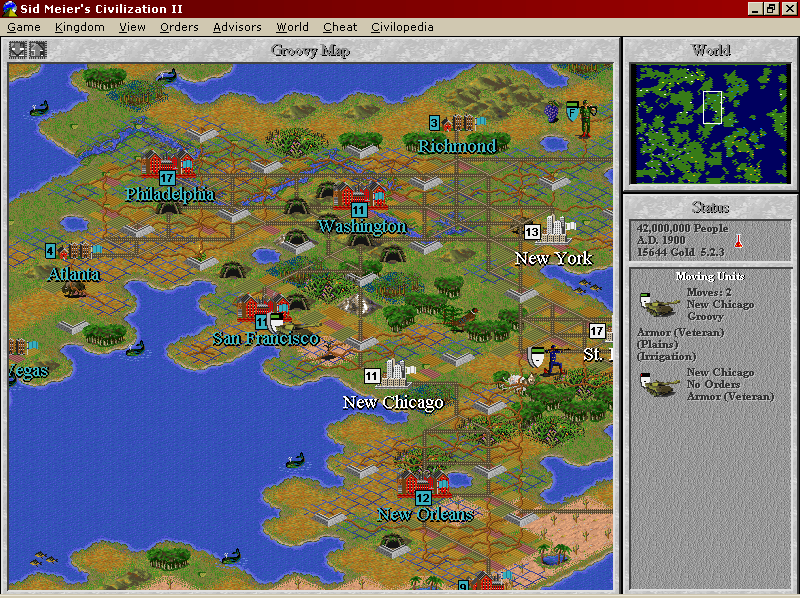
In Civ 2 the main map did get a little more abstract and unreal look than in Civ 1, with clear representations of cities and units standing out from the terrain by being depicted in a different angle. The way the units and cities are drawn could be described as "cartoony" or just stylized, but if cartoony, it is a very moderate cartoon style that respects proportions. On the other hand the game used a lot of FMV with real footage or 3D graphics, increasing the realism.


Civ 3 went for a very realistic style, with the exception of the leader graphics, which were caricatured, though not in the excessive way that they were in Civ 6. The terrain and the units have a very realistic look to them, as far as what the confines of the technology and overall abstract representation allowed.
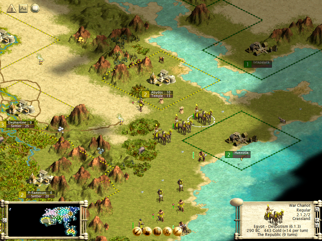

Civ 4 mostly went in a more "cartoony" direction than Civ 3, but in a far less excessive way than Civ Revolutions or Civ 6.
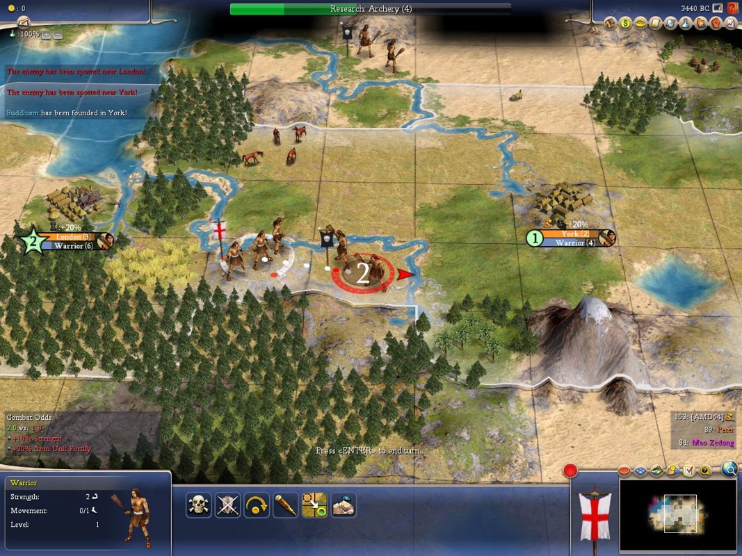

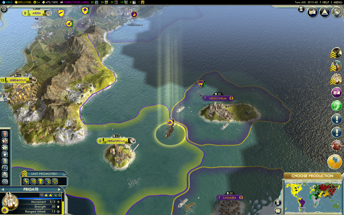
Civ 5 went for a more realistic look which was very stunning when it was new, and which I think still looks very good.


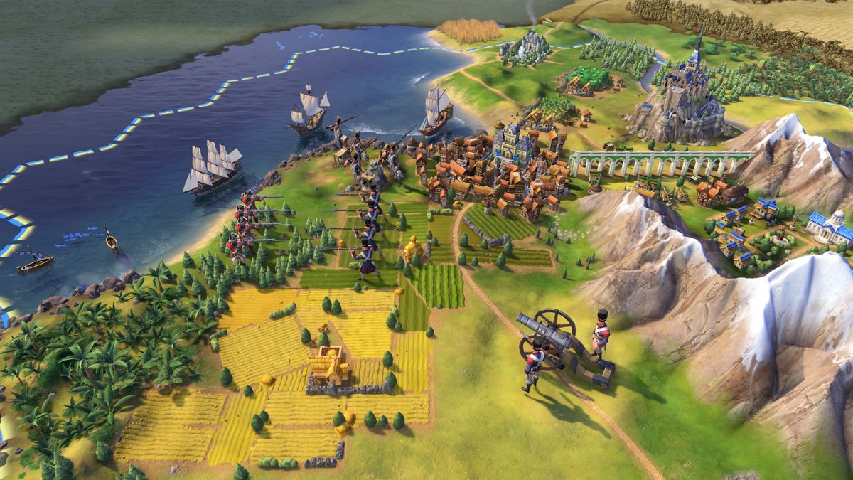
And then there's Civ 6 of course.

I just want to say, thanks for linking all of these. I've already said I prefer VI, but I just wanted to go over what I think the differences are.
  • Civilization - very saturated. Necessitated by the 2D pixellated style of the time. Still love seeing it (less of a fan of playing it these days 😅).
  • Civ II - pretty high levels of saturation. Kept a lot of the overall style of the original Civ map aesthetics, but started doing more sprite work with the cities and whatnot.
  • Civ III - a complete shift, and you can immediately tell the saturation was nuked. Into the ground. The sea pops nicely, and the mountains obviously stand out, but the grass is a camo-mud green and it obscures the base of all the mountains, leading to an interesting almost "mossy" effect. The sand is similarly drab and uniform.
  • Civ IV - refined the style established in III. There's more variation, mountains are mountains now, but you can tell from the city banners and such that this was building on III, rather than being a pretty substantial shift (as III was from II). I'm not against it, but you can see the weakness in the default (serif) font, and some of the colour choices used to contrast both 2D UI elements and 3D elements like the units.
  • CiV is interesting. It's kind of a shift on a number of levels, but the saturation is pretty much the same as in IV and even III. There's a ton of variation to grassland hexes (though some mountains once again have the gradient issue at their base), and most important the entire UI has a feel to it now that really sets it apart. The font choice, the border styling, and the enhancements to unit selection really help bring the game aspect of the game forwards without eclipsing the art style underneath.
  • Civ VI - another pretty complete shift. You can see it most in the leaders, but even in the map, everything has been redesigned. Colours pop, mountains have sharp-enough but still fuzzy gradients at their base to make it a clearer distinction from hills. The borders are more hard-edged in-keeping with UI design over the past decade (vs. CiV's more bubble-style icons and rounded corners everywhere). I like this myself, but I'm sure there'll be another shift in the future that games will then follow on from in general. Or maybe they won't be. I've been doing frontend stuff for the better part of a decade in software. It changes a lot!
I've gotten more wordy as I've gone through the list, but this makes sense as CiV and VI are the two I've played the most, certainly in recent years, but probably across my life. I played a fair amount of the original Civilization, but the one game that consumed me isn't listed here, because it's not technically a Civilization game (ahh, SMAC).

I just felt like analysing the shift across the games, and having not played or been exposed to II or III much, it was interesting to see the complete change in saturation, which I'd argue isn't so much realism, but an attempt at realism. There was nothing preventing them from turning it up in III - they obviously made a choice to make it look like they did. The real-world can be incredibly saturated, even if games have a habit of overemphasising the softer elements. I don't mind this in general, because games are entertainment. They're something explicitly to look at, a lot of the time.

But it's hard to represent the world accurately, and so games tend to either lean one way or the other. Getting that perfect blend of saturation and drabness is very hard to marry to an art style that's meant to pervade a game. We're taking more of the (game) world in at once, compared to the real world. I'm here looking at a desk, two monitors, a baby monitor, and a couple of Iron Man figurines. But one of my monitor backgrounds is a screenshot from a TPS I've played a lot of, and it shows a whole vista within the game. That's something games have to consider when designing their aesthetics, that the real world doesn't.
 
Sorry for the misunderstanding. I agree with everything you wrote about the *map art style*. My comment was directed at the *leader head/body art style*. Nearly all of the iterations have depicted the leaders in a more stylized, exaggerated manner. Your point about the low resolution of Civ1 is consistent with this. Only Civ5 changed the depictions of the leaders; I liked some of them very much. All of them looked more like humans with conventional proportions. Upon reflection, that's probably my preferred approach for the most fair, lifting-up way to represent leaders from a variety of cultures and geographies.

I have fewer strong feelings/preferences about how the map should be represented. Each of the games in the franchise have strengths and weaknesses in this area. I would be happy if Civ7 borrowed from any of them, building its own point of view.
That‘s nice to hear. I agree about the leaders being stylized in most of the games. And in several games the leaders have a caricatured look. But only in Civ 6 and Revolutions would I describe the style as cartoonish.

There are many things which are consistent between all the Civilization games, but I don’t think the art style is one of them. The art style has changed as technology changed and different people handled the artwork. While consistency within a game has a lot of merits, consistency within a series for its own sake isn’t something I think is important. If a new idea has a lot of merit, it can be a good idea to try it out. But there is a limit of course to how much and what you can change before you get very negative reactions on it. Especially in a series like this which has so many established concepts that have worked very well so far.
 
Last edited:
Definitely an interesting read and analysis. Saturation is one aspect I haven’t thought that much about. While it is quite strong in Civ 6, that isn’t my main problem with its style, and the strong colors is one of the things that can be pleasant about it. Things like body proportions, unreal and sanitized looking buildings and trees are things which make it less enjoyable for me.

Civ 1 has quite strong colors as well, but since the art style is so different, I wouldn’t have seen any connection between it and Civ 6 otherwise.

The use of colors in the Civ 3 terrain isn’t that good. The look of the cities and units are excellent however, and when you combine that with the terrain graphics made by Rhye and Snoopy, you get the second best looking game in the series.


But I do think that the graphics of Civ 1, Civ 2 and Civ 4 are very charming.
 
Bear in mind that the graphic style for Civ 7 needs to be as unlike Civ 6 as Civ 6 was unlike Civ 5. I would not like to be responsible for it!
 
Hard disagree here. I think this "historical flavor" is a very important part of the game for a majority of the player base, even if not everybody likes a more realistic graphic style.

If Firaxis released a game with the same kind of mechanics, but which focused on gigantic Japanese robots duking it out, only a small fraction of us would buy that game. And if the theme instead was just abstract geometric figures, the number of people buying it would probably be even less.

Historical flavor *is* an important part of the game, but just as "general history" is a cartoonish representation of actual events, I have no quarrels with "less-realistic" graphics expression. "Realistic" history is full of things like Unit 731 & and similar <insert any disgusting behavior>.
 
Bear in mind that the graphic style for Civ 7 needs to be as unlike Civ 6 as Civ 6 was unlike Civ 5. I would not like to be responsible for it!
Because otherwise it would not be Civ 7.

On one hand sure, new editions have always looked at least a little different to the previous one; but I don't think change for it's own sake is good enough. You want to improve the look where possible, with wanting a specific artisitic theme being always second to that.
 
Last edited:
Firaxis follows the “rule of third” idea, (one-third new, one-third changed, one-third the same) so the art style of Civ 7 even if not a radical departure from 6 will likely be different.
 
Historical flavor *is* an important part of the game, but just as "general history" is a cartoonish representation of actual events, I have no quarrels with "less-realistic" graphics expression. "Realistic" history is full of things like Unit 731 & and similar <insert any disgusting behavior>.
There’s certainly a lot of room between detailed descriptions or depictions of war crimes, and comical caricatures that just make a mockery of the things that happened.

History contains both our greatest achievements and our most depraved cruelties. A informative history of the world, should not shy away from any of these things, but the details of it and the way it is presented, should take the age of the audience into account.

The Civilization series is an entertainment product, not a history book or documentary, so it has a very different function. But since the theme is history, a lot of people will have preconceptions about the way it is going to be presented. Some will be fine with a comical and light-hearted approach, but for others this will feel wrong.

While I do think elements of light-heartedness and comedy can fit well in the game, I prefer the dominating feeling to be serious and dignified. Some romanticism and idealism, mixed with the harsh reality which is often very far from those.

But one thing that could have been very nice was having a jester as a recurring figure throughout the game. A figure that if the feature was turned on, would mock your aspirations, those of your rivals and many things which were going on in the world. With the high amount of possible things happening in such a game, it would be hard to do well in a way that did not feel to repetitive, and eventually, most people would probably turn it off. But if it was done well, and had a lot of work put into it, I think it could have become well loved part of the game. Like the advisors panel in Civ 2 it could have changed appearance from a courtly jester in medieval times, to a protest singer or a standup comedian in modern times.
 
Art style - the look and feel of the game - is more important than you are giving it credit for. If Civ 7 looks basically like Civ 6, it will in effect be a heavily-modded Civ 6. Unless it has a distinctive visual identity it can never be perceived as Civ 7.
 
Now that we, more of less, have confirmation that Civ VII is coming, I have a question for you:

If you were leading the art direction for VII, which style would you lean into? Your answer applies to leader portraits and animation, map design, buildings, wonders, units, governor portraits (if we have governors), everything!

Would you choose continuity with Civ VI (heavily stylized, with leaders portrayed as caricatures), or something more realistic (closer to what was delivered with Civ V), or would you go for the hyper realistic? Or, do you have something completely separate in mind (and if so, please tell us about it 🙃 ).
Please make the Leaders more realistic!, I liked the Civ 6 landscape design, though.
 
As pretty as Civ VI is, I miss the gravitas and seriousness that Civ V's artstyle evoked for me so my vote is for realism. The map along with the art-deco UI using a Futura-like font was really classy, I still love it and I consider it vastly superior over any other in the series (it also had some advantages in terms of readability - the colored notifications and the associated sound effects made me much more aware of what was going on in the world, as opposed to piling up ones in Civ VI along with overwhelming and yet easy to miss gossip pieces). Also, the little illustrations of buildings and techs! One other gripe I have with Civ VI is diplomacy and I think that the beautiful leader animations are wasted on cutscenes that pretty much always make most sense to skip. Civ V system of displaying them at the same time as the player had access to interactive diplo interface (as much as I'd like to have it made more complex, as complex as reasonably possible) was a much more sensible allocation of art resources. The dialogue in V didn't really get repetitive for me, and both the cutscenes and the very small pool of "yes" and "no" leader reactions in VI did quickly.

Also, I feel like the less fancy music system in V made more sense. The music in both games is fantastic, but in VI hearing a loop of 8-12 Atomic Era variations of tracks that I've heard tens of times during not only previous playthroughs but over the course of the current one in for hundred-something turns in a row contributes to the repetitiveness of the late game. But I have spent almost a thousand hours more in VI, so it being excruciatingly familiar to me is less of a surprise. I'd like a return to a larger (from the perspective of a single playthrough), albeit consistent pool of more subdued, elegant tracks like in V or something even more modular (but music doesn't work like random generation of other elements of games, so forget this idea).
 
Status
Not open for further replies.
Back
Top Bottom