Survey: need your help, come here for brand new Terrain art

what do you think of the new terrain art?


  • Total voters
    77
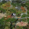
For my part, I really don't like the new dark terrain, at least not as it appears in the screenshots. It makes me want to pump my graphics card's gamma correction up several notches because I can't make out any details. However, to do a fair test, I'll have to go home and try installing the new graphics (at work on break at the moment). But my gut reaction is that it's too dark to properly see what's going on.

(I should mention that I always set my PC's monitor to maximum brightness and contrast.)

ETA: I didn't see the original screenies at first; unlike what most people here seem to be saying, I like those better than the dark version, although I agree it does seem a bit on the cheery side for FfH and the hills look a little odd.
 
Okay, now that I've played a while with the new graphics, I've got a better feel for how they look, and my opinion remains unchanged: they're far, far too dark. (I know, FfH is dark fantasy, but that doesn't mean you have to make everything so dark you can't see anything.)

I have trouble seeing the roads on grasslands, special resources like wine and reagents don't stand out enough when on grasslands, and forested tundra hills are hard to tell apart from unforested. The Ljosalfar units blend into the forests so much that it's hard to tell exactly where they are, and the Orcs and Goblins also don't show up real well when in forest or jungle. And, aesthetically, it just plain looks dull, dingy, and ugly.

In the spirit of full disclosure, though, I should acknowledge that I prefer the stock Civ IV terrain to the Blue Marble terrains.

My dislike of the dark terrain isn't great enough to make me stop playing, but if it were to become part of the mod, I would very much prefer to have the option to use brighter graphics that are easier to see.
 
I completely disagree with you. If anything, they could be a little darker (although it really isn't necessary). And the default Civ IV terrain is horrendous.

You should probably just turn up the brightness on your screen. (I don't really mind the graphics even when my laptop screen is on the dimmest setting, assuming there isn't a lot of glare, and thing that if I turn it up all the way then it is too bright.)
 
I completely disagree with you. If anything, they could be a little darker. And the default Civ IV terrain is horrendous.

If they were any darker, I wouldn't be able to see a darn thing. Some of us don't exactly have perfect vision, you know.

My big complaint with Blue Marble is that I sometimes have problems distinguishing plains and grassland, which is not an issue with the default terrain. However, in the default terrain, the color difference between coast and ocean is subtle enough that I sometimes have trouble seeing it.

Drifting back on topic, the idea somebody proposed of having the terrain graphics darken as the armegeddon counter rises would be cool, if it's feasible. If the terrain is this dark from the beginning, though, you've got to punch up the brightness of, or tweak the colors of, the units and some of the resources so they actually show up against the background.

I'll try to see if I can get a few screenshots...

ETA: Ok, screenie attached. I guess if I could pick any one thing to change, it'd be to make the deserts look less washed-out colorwise. Second choice would be to tweak the ancient forests to fill in the big gap in the lower left and upper right corners.

And just so you don't think I hate everything about this, I think the new selection circle looks really, really cool.
 

Attachments

  • FfHScreenie.jpg
    FfHScreenie.jpg
    429.5 KB · Views: 90
Maybe make the nifty little red circle it places on the feet of an enemy in your borders bigger would help you with seeing units?

Granted, only within your own borders, but generally anywhere else they are right beside you, so finding them shouldn't be much of an issue?

Or turn on the little pop-up bubbles for units and resources. Even in Vanilla I have always used the pop-bubbles for resources because I normally don't notice them (granted, this means I wind up still not seeing them since a huge bubble is in my way, so I have never yet gotten used to them)

I sometimes use the resource bubbles, when I'm trying to figure out, is there any copper on my continent in a hurry, otherwise, I find them distracting. I might use them more often, though.

If the red bubbles/circles warning of an enemy near/in the borders lasted longer, they'd be more useful.
 
I wasn't talking about the bubble that pops up (picture of their face and showing direction to the unit), but rather the one that shows up on their feet (like our selection circle for active units). It is small, and barely noticeable, but permanently shows on them IIRC.

And just as you can have the bubbles for resources, you can activate them for Units. But I think you have to go to World View (F11) to customize which units it will put the bubbles on.

Also, the way I normally track units myself is through the (F5) screen. Select all leader heads, then click to select all units. Any red flashing dots on the screen are enemy units
 
deserts seem to be more dominant, with reference to the in-between tile land, than they should be; like when a desert is surrounded by non-desert in vanilla civ, its recessive, with the other terrains dominating the in-between lands.
this causes the noticeable forest-on-desert phenomenon since the trees are likely expecting the in-between ground they occupy to be plains or grassland.
 
I didnt change the desert blending mask, so in general it should be less dominant, because the saturation is toned down :/

AndrewDJ, i understand your point, I think Kael might implement a game option to switch terrainart back for those who have trouble seeing things (while i still think, that you just have to get used to it, then you can enjoy the art and still recognize other game items).

A very important thing for us to do (which has no progress until now) is the ancient forest graphic. We will have a look at it after the first release of shadow.until then unit graphics of the focus civs (malakim, balseraph, sidar, svartalfar) will be more important.

Hope I did not destroy all your joy of FfH by creating new terrain :/
 
i like the terrain myself :p 
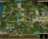
looks more rugged and dark

just noticed the desert thingy and hoped there might be a simple solution

if you play around in worldbuilder you notice things like two grassland tiles diagonal to each other, surrounded by plains, and the grasslands will have green grasslands connecting the two grassland diagonal tiles. but if you do 2 plains tiles diagonal to each other surrounded by grasslands, the two plains tiles will not be joined with plains between them, but instead appear as two independent islands of plains in a sea of grassland.
deserts are usually the islands of this system, but they appear to have switched to be more dominant than plains, tho i cant imagine why heh
 
looks brilliant =)

only thing I thought could be improved was the tundra- it looks a bit too rocky and not quite cold enough at the moment.
 
if you've really got a problem seeing all the resources/tiles, i'd recommend switching some of the ingame options on (resource-flagging and show yield). Personally, i have these 2 on all the time, just to get a clearer view in terms of city placement and what improvements to build.
 
By old, I meant the original. (I decided to try out a couple new mods recently, and was horrified to see the original graphics. I had forgotten how bad they were, since I had been using blue marble for so long before these new ones came out.) I think I may have already forgotten how the blue marble graphics look, but I know it wasn't nearly as good as FfH's new lichen filled tundra.
 
i finally played FFH again, after a short break playing pharaoh (yeah, that really old game) anyway, i played with the dark terrain, and it looks much better. as everyone's said, though, deserts need work.
 
By old, I meant the original. (I decided to try out a couple new mods recently, and was horrified to see the original graphics. I had forgotten how bad they were, since I had been using blue marble for so long before these new ones came out.) I think I may have already forgotten how the blue marble graphics look, but I know it wasn't nearly as good as FfH's new lichen filled tundra.

I still much prefer this tundra to the old one- was just trying to give constructive criticsm :)
 
I didnt change the desert blending mask, so in general it should be less dominant, because the saturation is toned down :/

AndrewDJ, i understand your point, I think Kael might implement a game option to switch terrainart back for those who have trouble seeing things (while i still think, that you just have to get used to it, then you can enjoy the art and still recognize other game items).

A very important thing for us to do (which has no progress until now) is the ancient forest graphic. We will have a look at it after the first release of shadow.until then unit graphics of the focus civs (malakim, balseraph, sidar, svartalfar) will be more important.

Hope I did not destroy all your joy of FfH by creating new terrain :/

Well, it's grown on me a bit. The biggest issue for me, really, is that it's a lot harder to see the terrain under the fog of war, so the darker graphics are most annoying to me in the early game.

On a more technical note, there are some odd glitches, like the trees on desert, but also some weird divots that show up. I've attached a screenshot.

The little cow skeleton that sometimes appears in the desert tiles is pretty cool.
 

Attachments

  • FfHScreenie 2.jpg
    FfHScreenie 2.jpg
    173.3 KB · Views: 167
Those dark divots are to make plains look more realistic and less dull uniform.

The new plains actually look more northern and border-tundra while the original were more savannah-like.

Deserts could be a bit more rocky or then a separate rocky desert (0,1,0) terrain could be added.

Can there someday be a patch to make AoI use these terrains?
The original vanilla-like ones are horrible as tundra looks like aluminium plates.
 
Back
Top Bottom