You are using an out of date browser. It may not display this or other websites correctly.
You should upgrade or use an alternative browser.
You should upgrade or use an alternative browser.
Why does each iteration of Civ get more & more cartoony?
- Thread starter Strong Reaction
- Start date
Varelse
Rabble Rouser
- Joined
- Jul 25, 2002
- Messages
- 377
I have no problem with the art style in Civ6 however I would love to see a version of the game at some point that had a kind of google earthish quality to it, even if it were not terribly realistic. I also miss the global view we got in Civ4. I like being able to have that level of zooming on a map. I am happy to see that map labels are back with Civ6 though.
In the words of C.S. Lewis, "To be concerned about being grown up, to admire the grown up because it is grown up, to blush at the suspicion of being childish; these things are the marks of childhood and adolescence."
Honestly, I've loved the art style of Civ6 since I first saw it, and have only loved it more the more I've seen of it. Aside from the gorgeous leader scenes, Civ5 was an eyesore. Sure, I wouldn't mind the colors in Civ6 being slightly more muted, but if the bright colors are an affront to your masculinity the problem is with your own insecurity, not the colors. I applaud the Civ6 art team for embracing such a unique style rather than caving in to the ever-popular, frequently-dull ultrarealism. The measure of art is style, not verisimilitude, and Civ6 has style.
Honestly, I've loved the art style of Civ6 since I first saw it, and have only loved it more the more I've seen of it. Aside from the gorgeous leader scenes, Civ5 was an eyesore. Sure, I wouldn't mind the colors in Civ6 being slightly more muted, but if the bright colors are an affront to your masculinity the problem is with your own insecurity, not the colors. I applaud the Civ6 art team for embracing such a unique style rather than caving in to the ever-popular, frequently-dull ultrarealism. The measure of art is style, not verisimilitude, and Civ6 has style.
alaric1112
Chieftain
I have to say I like the new graphic style so far but it will take 1 or 2 play throughs to be sure.
Even though I like Civ5 art style when the map became busy it would really hurt my eyes.
Hopefully this new style will be easier on the eyes.
Even though I like Civ5 art style when the map became busy it would really hurt my eyes.
Hopefully this new style will be easier on the eyes.
God of Kings
Ruler of all heads of state
Civ VI's art style is gorgeous.
By the way, there was a video about the art style debate of Civ VI:
I am in my late 20s and I enjoy video games with bright, colourful, and "cartoony" graphics.
By the way, there was a video about the art style debate of Civ VI:
I am in my late 20s and I enjoy video games with bright, colourful, and "cartoony" graphics.
I dont like it either. It has grown on me too though.
Still i would prefer more beautiful varied landscapes. I think the lack of difference in trees is one of the most nagging things to me. I want trees in the tundra to look different from those right next to a desert.
Civ 5 had different continents. Beautiful and varied. That's what i would like to see in 6. We have day / night cycle but i dont care about that really. Also i want different art style for civs. Asian civs should look different from European ones and they should look different from American and African ones. But that seems to have been sacrificed to make the game look more uniform. At least you ll be able to recognize everything quicker but its not like people cant tell some different art styles apart! Hope its added later...
i DO really like the look of the GUI and thats also really important for me in a game.
Kirejara
King
Another reason for a cartoonish style could be to avoid the uncanny valley. The lifeless mannequin leaders of Civ5 were allready in there (or at least too close for comfort).
http://tvtropes.org/pmwiki/pmwiki.php/Main/UncannyValley
http://tvtropes.org/pmwiki/pmwiki.php/Main/UncannyValley
Septentrion
Warlord
- Joined
- Aug 14, 2015
- Messages
- 152
Ultra-realistic would be a insult to the imagination. There should always be a bit of an element of the imagination with civilization. Civ 1-4 had you ruling over graphical squares. It literally impossible to realistically represent cities from orbital heights and have them be meaningful. A cartoonish style helps with the leap from game to world.
I like the style for really. It looks more and more like my favorite game ever:
Nuclear War from 1989.
With the difference that Civ6 has no SDI!!!
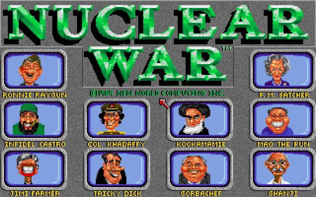
I played it for so many hours.....it was a masterpiece I agree !!!!
rschissler
King
The only thing I don't like are the trees.
Because cartoon graphics run better on mobile devices, of course.
Same reason they picked Cleopatra for Egypt, easier for mobile phones to handle.
When will the iOS version of Civ6 be released then?
")
dunkleosteus
Roman Pleb
A lot of talk about the lifespan of graphic styles, realistic graphics don't age as well as stylized. 6 years after Civ V was released does anyone think it looks bad? I don't.
Most of my issues with the graphics aren't the models or textures themselves but how they are used. For example, forests in Civ VI are very sparse. Earlier Civ games rendered forests as thick groves or thickets whereas Civ 6 renders them as grassy fields with a scattering of trees through them. Watching some of the Lets Plays that have been released, I actually find this sparseness difficult to see. There was at least one time where it took me a second to realize why a unit wasn't allowed to move into a tile because it only had 1 move left. Then I noticed the small trees in the hex and I realized it was a forest tile.
The tree models look alright but the way they are used leaves something to be desired.
Shortly after America was announced, I tried to edit the American unique unit to give it a clear canopy instead of a pale blue opaque one. Here is the result:

The image on the right looks like a cheap plastic toy and the image on the left looks more like a real plane. All I did was change the canopy. Small things like this pile up and overall give me a negative opinion of the graphics as a whole.
Most of my issues with the graphics aren't the models or textures themselves but how they are used. For example, forests in Civ VI are very sparse. Earlier Civ games rendered forests as thick groves or thickets whereas Civ 6 renders them as grassy fields with a scattering of trees through them. Watching some of the Lets Plays that have been released, I actually find this sparseness difficult to see. There was at least one time where it took me a second to realize why a unit wasn't allowed to move into a tile because it only had 1 move left. Then I noticed the small trees in the hex and I realized it was a forest tile.
The tree models look alright but the way they are used leaves something to be desired.
Shortly after America was announced, I tried to edit the American unique unit to give it a clear canopy instead of a pale blue opaque one. Here is the result:
The image on the right looks like a cheap plastic toy and the image on the left looks more like a real plane. All I did was change the canopy. Small things like this pile up and overall give me a negative opinion of the graphics as a whole.
Abraxis
☮
In the words of C.S. Lewis, "To be concerned about being grown up, to admire the grown up because it is grown up, to blush at the suspicion of being childish; these things are the marks of childhood and adolescence."
Honestly, I've loved the art style of Civ6 since I first saw it, and have only loved it more the more I've seen of it. Aside from the gorgeous leader scenes, Civ5 was an eyesore. Sure, I wouldn't mind the colors in Civ6 being slightly more muted, but if the bright colors are an affront to your masculinity the problem is with your own insecurity, not the colors. I applaud the Civ6 art team for embracing such a unique style rather than caving in to the ever-popular, frequently-dull ultrarealism. The measure of art is style, not verisimilitude, and Civ6 has style.
It's worth mentioning that plenty of displays and graphics utilities offer options to reduce colour saturation to anyone who'd prefer it.
Yes, I think Civ5 looks hideous. I don't think it looked great on release, and six years haven't done it any favors. Don't get me wrong, Civ5's leader seens are glorious and to some degree I'll miss them, but Civ5's muddy map textures, tiny units, 2D terrain features, and boxy cities are an eyesore that I won't miss. The problem with Civ5 is it looks generic. It lacks style or direction, which is a frequent problem with games that try too hard to be "realistic."A lot of talk about the lifespan of graphic styles, realistic graphics don't age as well as stylized. 6 years after Civ V was released does anyone think it looks bad? I don't.
I do agree, however, that Civ6's forests are disappointing, both that they're too sparse and that they only occur as conifer forests.
ehecatzin
Emperor
- Joined
- Jun 29, 2007
- Messages
- 1,917
I do agree, however, that Civ6's forests are disappointing, both that they're too sparse and that they only occur as conifer forests.
That is the one problem I have with the new graphics, the one graphical feature from civ5 that I wish gets back is the terrain variation for diferent continents. Tho that's the kind of stuff that could easily be bundled in a DLC along with a scenario and civ (or modded).
jekke
Warlord
Apart from CiV VI forests, I suppose it is mostly the leaders who might look cartoonish, not the landscape, so the comparison of the views from the top was missing the point a bit.
Now, the leaders in CIV VI look more cartoonish than in Civ V, don't they? However, I must admit, leaders in Civ IV looked even more cartoonish, some of them were picking their nose or biting their nails and stuff.
Now, the leaders in CIV VI look more cartoonish than in Civ V, don't they? However, I must admit, leaders in Civ IV looked even more cartoonish, some of them were picking their nose or biting their nails and stuff.
Furycrab
King
- Joined
- May 26, 2011
- Messages
- 914
It's basically just aiming for the left peak of the uncanny valley... If you don't know what that is, I suggest googling a youtube video on it, Extra Credits does a really good one on it.
Basically they have the choice to go for these vibrant expressive, albeit stylized, characters, and we can appreciate the human traits they gave them... or invest so much more to try and go for some photo-realism and most likely fail on some level at which point all we could look at are the flaws.
I love the more board game aesthetic. Incidentally it keeps the turn times and computer requirements lower.
Last edited:
SammyKhalifa
Deity
- Joined
- Sep 18, 2003
- Messages
- 6,811
It's basically just aiming for the left peak of the uncanny valley... If you don't know what that is, I suggest googling a youtube video on it, Extra Credits does a really one on it.
Basically they have the choice to go for these Vibrant expressive, albeit stylized characters, and we can appreciate the human traits they gave them... or invest so much more to try and go for some photorealism and most likely fail on some level at which point all we could look at are the flaws.
I love the more board game aesthetic. Incidentally it keeps the turn times and computer requirements lower.
Hear, hear. If you try too hard to make them look real they'll just seem creepy instead.
Similar threads
- Replies
- 0
- Views
- 563
- Replies
- 7
- Views
- 1K
- Replies
- 5
- Views
- 537
- Replies
- 2
- Views
- 730