Civ 6's Art Style - Do You Like It?

Do you like Civ 6's art style?

  • Yes - I like Civ 6's art style can be improved

  • No - I think Civ 6's art style can be improved


Results are only viewable after voting.
Speaking of which I sometimes wonder why China-Qin is a dark green - IRL Qin ordered his empire's "national color" to be black for auspicious indications (black is the color of water in early Chinese epistemology, and Qin was said to have the virtue of water).

Because when speaking of "Chinese Empire" people will immediately thought of "jade"? :lol: I do agree that having a major civ colored in black is very odd.
Originally they were a jade green color which I liked. Then the jersey system came along and they changed it to the dark green because that was one of shades of green they used and I guess the medium green and light green didn't work at all. :dunno:

Some original color schemes of civs were much better like the rose colored Poland. The only one I am glad they changed was Australia, who finally got their correct color scheme.
And the Dutch who are now a correct colored orange, not the brownish orange that they started with.
 
Despise it. Mostly.

It does the job and it makes distinguishing things easy. The leaders are unique, sure, and the map very readable. But the cartoonishness of everything just badly hurts the experience. Civ 5 felt grand - important! I was playing chess with the adults. Civ 6 feels silly, like I'm playing candyland at the kids' table.

as I was saying elsewhere, doesn't help when the game makes the government policy system into literally a card game. and like with all the add ons from NFP, they are decent mechanics that they could have presented any number of ways - instead, we get vampires.
 
One thing to bear in mind is that Firaxis took a risk with the Civ 6 leaders in making them 3D caricatures. These days, there is a tendency for certain people to pounce on any caricature of non-white people by white artists with claims of racism. By and large, I think Firaxis have carefully avoided anything that could be taken as offensive even by people looking for something to offend them. Ironically, the one that makes me uneasy is Menelik - with those claw like hands the style is uncomfortably like some antisemitic images of the past.
 
I don't like the leader models at all. Not that that the animations are bad at all, they are certainly not, but the way they are used and presented kills it all for me. I guess I'm more used to it now but I remember really feeling like it was more of an animation "showcase" than anything else. Especially with the weird like fade in and outs. The denouncements are a perfect example of this. No matter how well done the actual animation is is, there is just something about a screen popping up where a character screams at me in anger, and then fades back to "normal" that feels very... bad to me.
At its worst it reinforces the idea that I'm playing with petulant children, especially combined with the agendas.

Some leaders look better than others. Poundmaker is one of the better ones for me. While still "cartoonish", he feels a bit more subtle, laid back and real. Other leaders, like Cleopatra or Qin Shi Huang look downright revolting to me. Not appealing or "fun" in a cartoon sense, just appalling.

I'm not a huge fan of the map look either. I did appreciate the attempt at having a game sort of inspired by the age of exploration in terms of how it looked but it doesn't come together well in my opinion. Menus and stuff doesn't look good either.
I do really like the look of the fog of war and the way it looks like a map. It's a pretty cool effect.

But overall I'm not a fan of how the game looks at all unfortunately. I was very pleased to see the Civ V map mod or whatever it's called, it's much more to my personal taste.
 
Why ain't Anime-style arts appeals to Firaxis yet? What I see in Civ6 is like ither Tangled or Frozen XD
I'd rather anime style stay within anime. :p
I personally do not think every leader looks like it could come from Disney as their are quite a few realistic ones, in my opinion.
 
I'd rather anime style stay within anime. :p
I personally do not think every leader looks like it could come from Disney as their are quite a few realistic ones, in my opinion.
Poundmaker and Cyrus come to mind for me.
 
I think the sweetspot for VII could be a mix of the best aspects of V (painterly) and VI (vibrant and stylized).
In my opinion, Humankind manages the perfect compromise between realism/detail and vibrancy/readability.
 
Why ain't Anime-style arts appeals to Firaxis yet?
Anime style is extremely polarizing. I don't mean this as a value judgment against anime, but I find the style extremely offputting in an almost physical sense.

Since Disney comparisons are being thrown around, I'd love to see traditionally animated leaders in Civ7, but that would be a lot of work for the devs. :p

I think the sweetspot for VII could be a mix of the best aspects of V (painterly) and VI (vibrant and stylized).
I 100% agree with this. Take the dynamic Civ6 leaders and put them in an interesting, detailed setting and I think you'd have perfection. Ditch Civ5's aims of photorealism, though. It doesn't age well, if done poorly it just looks bad, and if done too well it crosses into uncanny valley territory.
 
I 100% agree with this. Take the dynamic Civ6 leaders and put them in an interesting, detailed setting and I think you'd have perfection. Ditch Civ5's aims of photorealism, though. It doesn't age well, if done poorly it just looks bad, and if done too well it crosses into uncanny valley territory.
Yep. Civ 5 Bismarck to me is the WORST of the uncanny valley group. :p


Why ain't Anime-style arts appeals to Firaxis yet? What I see in Civ6 is like ither Tangled or Frozen XD
BLECH!! :p Anime as Civilization animation should not be a thing. This is not against anime, this is against anime Civ Leaders.
 
My main complaint about the artsyle would be that they made the game feel too much like a boardgame. With civilization I want to feel immersed, as if I'm actually controlling and developing a civilization, not just playing a game.
I'd much prefer if buildings were smaller and more numerous as they were in earlier games. Sure it's easier to idenfity buildings/districts at a glance with this artstyle, but they could just add a lens for identifying districts/buildings/wonders more easily.
Wonders are a bit ridiculous scale-wise, as many of them are specific buildings, but take up the same space that an entire city center takes up. Civ 6 really should have made tiles smaller, not bigger, when making the decision to unpack cities.
 
One thing to bear in mind is that Firaxis took a risk with the Civ 6 leaders in making them 3D caricatures. These days, there is a tendency for certain people to pounce on any caricature of non-white people by white artists with claims of racism. By and large, I think Firaxis have carefully avoided anything that could be taken as offensive even by people looking for something to offend them. Ironically, the one that makes me uneasy is Menelik - with those claw like hands the style is uncomfortably like some antisemitic images of the past.

I have no idea what you are talking about... and he's a Christian... so what the heck dude
 
I have no idea what you are talking about... and he's a Christian... so what the heck dude
I think it refers to how the Ethiopian royal family claimed its line had the blood of Solomon. But yeah, I somewhat don't understand what he means either... I get the gist, but it's a bit complicated.

Menelik constantly refers to the "Lion of Judah", as perhaps a reference to the fact that Ethiopian rulers traced their lineage to Israel.
 
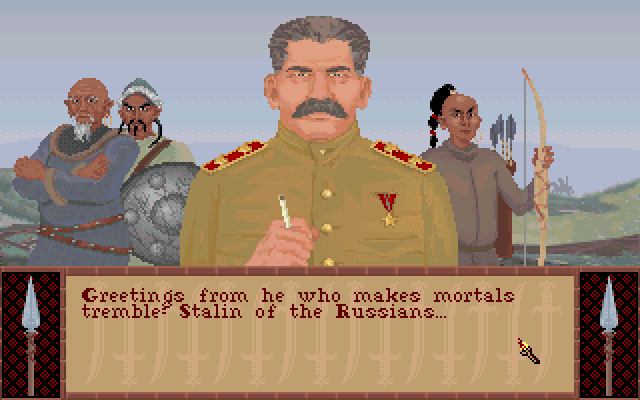
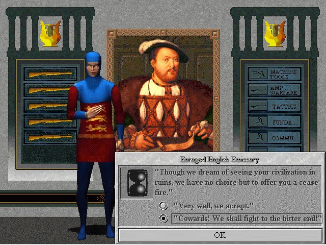
Just for reference


I kind of like this - it's very clean and minimal, and it kind of feels like a dialogue when you engage with it.


2, despite probably being my favorite of all time, had probably the worst - just sparse. And there was a bug I had at least where it wouldn't show the little ambassador guy in front which made it look like you were talking to an empty room with a portrait.


3 has that weird tan color that the designers liked so much.
 
I know perfectly well that Menelik was not Jewish. That's why I said "ironically". I'm referring to the art style of some antisemitic images that those sinister hands call to mind. If you have never seen such, count yourself lucky, and I'm certainly not going to post examples.
 
The pose in question comes from Cyrus, where it looks perfectly natural, but Menelik's proportions don't fit Cyrus's animations well. His head is too big, which makes his shoulders look too narrow, and his fingers are strangely long and thin. I suspect the devs hoped it would come across as contemplative, but since the original pose was intended to be crafty and devious...

The pose in question: Cyrus and Menelik.
 
I know perfectly well that Menelik was not Jewish. That's why I said "ironically". I'm referring to the art style of some antisemitic images that those sinister hands call to mind. If you have never seen such, count yourself lucky, and I'm certainly not going to post examples.

Actually this leads me to wonder - has there ever been a Jewish leader in Civ? Not to my knowledge...
 
Top Bottom