Boris Gudenuf
Deity
I posted several years ago, use the Romantic landscape painters of the 18th - 19th centuries for inspiration: dramatic lighting, details on rthe landscape, if necessary exaggerated height effects to make hills, mountains, etc distinctive:
.jpg")
Any doubt that those are Mountains in the distance?
And even open fields have stray animals, rocks, individual trees and brush - detail keeps the map from being Bland.

Dramatic lighting of the terrain/map can emphasize differences in terrain as well as the details of the terrain itself: no question that those are mountains again, and a river/stream in the foreground that is not just a dull blue line.

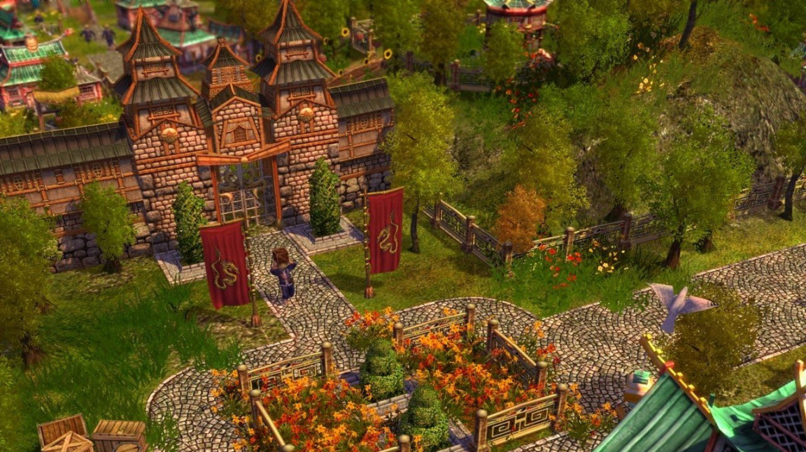
And this is from a game Older Than Civ V by years. It is on a much lower ground scale (City Builder) but shows how brighter colors can be combined with detailed terrain to our advantage.
Any doubt that those are Mountains in the distance?
And even open fields have stray animals, rocks, individual trees and brush - detail keeps the map from being Bland.
Dramatic lighting of the terrain/map can emphasize differences in terrain as well as the details of the terrain itself: no question that those are mountains again, and a river/stream in the foreground that is not just a dull blue line.
And this is from a game Older Than Civ V by years. It is on a much lower ground scale (City Builder) but shows how brighter colors can be combined with detailed terrain to our advantage.