Colours of explored and unexplored area are too similar

No issue for me either on the lps i saw. And i even wtached some on my phone...

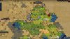
Unexplored is a drawn map without real details. Fog of war areas has all the usual map details
 
I've made a thread about this a couple of months ago. I'd like to see a bit better color differentiation, but at the current state the map is ok to me.
 
Really though, if they made it too different wouldn't it lose that "old-timey map" aesthetic? Personally I'm used to having to look a little harder at the maps anyway so I don't think it will affect me much and I really like the creative approach to FoW. Still, I can definitely see the OP's point.

They could add in some handdrawn features, colored or black outlined or otherwise, and still preserve the "old-timey-ness", like some handdrawn rivers and mountains and grasslands and desserts. Or add in another lens where the inactive area is properly colored.
 
Really though, if they made it too different wouldn't it lose that "old-timey map" aesthetic?
In that case their choice wouldn't really match the whole "We want everything to be easy to read"-mentality of the rest of the game - which would be pretty ironic. ^^

But I think that shouldn't be much of an issue in general. Just google "Old Paper Texture" and you'll see tons and tons of paper-like textures that come in many different tones and are very easy to distinguish from one-another.

But maybe the issue doesn't even exist and it's just the fact that "watching" something is a very different experience than actually playing something, and youtube's encoding may also wash out some of the color differences.
 
Does anybody have a link or a screenshot to the most recent video so one can see how things are currently on this question?
 
I rewatching it now, and I would definitely prefer a slightly different color for the places you have already explored.
 
OK, yeah, looked a little closer and I definitely can see the difference relatively easy. The unexplored portions have blank squares or mythical creatures drawn on it while the explored parts do not have the Latitude/Longitude grid and have fairly decent detail. I think it might take a couple glances to tell the difference between plains and grass but if my colorblind eyes can see it fairly well I think the general population should be able to handle it fine.

I think Ryika's point about there being a difference between playing and watching LPs is probably the biggest factor here.
 
I think the contrast between the two is distinct enough. I even double checked the recent stream and had no issue personally. A poll could be a nice addition to this thread.
 
The distinction between unexplored and explored is just one issue - the one that concerns me the most is when planning new city locations. It is hard if not impossible to differentiate the details of the terrain with the map texture as compared with the old tint style.

Rather than wreck the aesthetic that Firaxis has established, the best solution would be for a layer/filter to display tile types. There is already such a layer for optimal city locations.
 
I think it's clear enough. You can tell which tiles are grasslands (they have a darker, greenish shade of brown, and grass drawn on them) and which are desert, or marshes, or ocean or whatever.

I don't understand the issue with the unexplored areas. They are empty, unexplored, just an old map texture. The color doesn't matter, I don't understand how it can be confusing.

It's a bit more problematic on the mini-map, but I don't think we need that kind of detail there anyway.
 
The distinction between unexplored and explored is just one issue - the one that concerns me the most is when planning new city locations. It is hard if not impossible to differentiate the details of the terrain with the map texture as compared with the old tint style.

Rather than wreck the aesthetic that Firaxis has established, the best solution would be for a layer/filter to display tile types. There is already such a layer for optimal city locations.

This too. After watching Civ6 gameplay for the first time, this concerned me moreso than the unexplored/explored issue. It's very difficult to accurately understand the layout of explored terrain at a glance. I needed to pause the video and stare at it for a while, which is no good for gaming.
 
My issue is not the unexplored/explored areas of the map, but I think the devs should make the distinction of explored/unexplored in the minimap.
 
I'll also agree with the notion that the spot where this really a potential problem is the minimal. This is reminding me of how unhelpful the minimal was in BERT vs V
 
The distinction between unexplored and explored is just one issue - the one that concerns me the most is when planning new city locations. It is hard if not impossible to differentiate the details of the terrain with the map texture as compared with the old tint style.

Rather than wreck the aesthetic that Firaxis has established, the best solution would be for a layer/filter to display tile types. There is already such a layer for optimal city locations.

There is the strategic view that could be used for that. And you could add pins to make a Civ 4 dot map. :)

Spoiler :
attachment.php


We haven't seen the strategic view in the newest builds so don't know if any it has received any tweaks. (This version doesn't have any of the images like the Kraken in the unexplored areas that are in the recent livestream builds)

Source: https://www.youtube.com/watch?v=u3djGPOn4GY&t=790
 

Attachments

  • strategic_view.jpg
    strategic_view.jpg
    181.3 KB · Views: 321
I can see what you're saying about the colors but I like where they're going with it. The idea that areas you do not have active line of sight on appearing as more of a hand drawn map is a good one. Maybe just a little bit of tweaking is in order. I wonder if this graphic updates in later eras? In the modern era for example people don't use hand drawn maps anymore.
 
Back
Top Bottom