- Home
- Forums
- OUR ARCHIVES
- List of Archived Forums
- Civilization III Archives
- Civ3 - Game of Democracy V
- Civ3 - Demo Game V: Citizens
You are using an out of date browser. It may not display this or other websites correctly.
You should upgrade or use an alternative browser.
You should upgrade or use an alternative browser.
DG Website
- Thread starter GeZe
- Start date
Cyc
Looking for the door...
FionnMcCumhall said:ok here we go a new look to the dg website. middle info not added because we need to decide what goes there.
I believe that screen shots with narrative should take up the bulk of it, but we should also have a list/narrative block for "WHAT'S HOT!". This block could hold links and/or info on such things as current Constitutional/CoL polls.
FionnMcCumhall
Emperor
keep in mind cyc a map center should be up or at least an importnat link to it directed to the forums
GeZe
elmo knows where you live
Hows this?
Red is the main colour as it is Japan's colour. The other colour makes colour harmony with the red.
EDIT: How the nav would work: when you hover over the nav text, the navagation would slide out horizontaly.
Red is the main colour as it is Japan's colour. The other colour makes colour harmony with the red.
EDIT: How the nav would work: when you hover over the nav text, the navagation would slide out horizontaly.

GeZe
elmo knows where you live
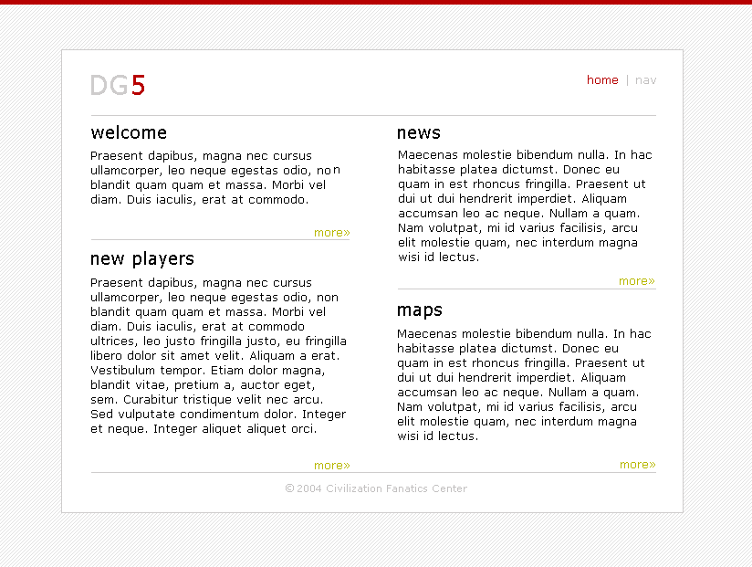
Oh, thats dummy text. It means nothing yet, to the eye, looks like English. http://www.lipsum.com/
EDIT: Oh, do you like the design?
EDIT: Oh, do you like the design?
FionnMcCumhall
Emperor
where in the blue heack did you learn to designa website, that is so darn plain and has nothing to do with japan. at least mine is themed on it. Thats me being nice. while its very clean and medical like. its graphically challenged.
@msz4 - That's one of the preview settings that I think Dreamweaver uses. The "latin" is a placeholder.
@Fionn - Tone it down a bit. Not everyone is a great (or professional) web designer. It would be better to say, "It looks nice, but maybe you can try this..." without resorting to flaming.
@Fionn - Tone it down a bit. Not everyone is a great (or professional) web designer. It would be better to say, "It looks nice, but maybe you can try this..." without resorting to flaming.
truckingpete
On a Stark Trek
All I know is basic HTML, I taught it myself.....its been awhile since I made a website....
- TP
- TP
GeZe
elmo knows where you live
Sorry, I didn't mean to step on your territory. I just had an idea and drew it up in Paint. I am going to post a redone version Monday addressing the "sterile" and "theme" issues. I advocate "clean" design, written mainly with CSS, as it has faster loading times, better user usibility and I like how it looks better then graphic heavy designs.FionnMcCumhall said:where in the blue heack did you learn to designa website, that is so darn plain and has nothing to do with japan. at least mine is themed on it. Thats me being nice. while its very clean and medical like. its graphically challenged.
It is interesting that this was your response after what you said earlier in the thread:
If you still have a grudge against me becuase of my earlier comments, I am sorry, I did not know that designer was part of the community. If I knew you where part of the community I would not have told you that I found your designs were ugly. Please forgive me.FionnMcCumhall said:the person who said it was ugly should be careful what they say when the developer is part of the game.
Happy designing!
FionnMcCumhall
Emperor
i apologize, you caught me on a bad day. A little constructive criticism. you can have a graphical diplay with CSS as much as having a sterile design much like you had for more info go to cssZenGarden.com. you middle idea is very good tho, and seeing as how with my being in school it would make sense for you to be on the design team to help me update the site. perhaps you can focus on developing the supporting pages. My main index page is still in development as i still need to some minor tweeking to the menu's and such
Similar threads
- Replies
- 6
- Views
- 512
- Replies
- 0
- Views
- 360
- Replies
- 16
- Views
- 2K