DLL Features

Rifleman 4 of London (Rifleman)

You'll still see it when you upgrade, of course.

Rifleman 4 of London (Infantry)

What if you've already built four other Intantry units in London when you get around to upgrading that Rifleman 4?

This is something I've wrestled with, using my manual naming convention (which I only seem to bother doing consistently for naval vessels or specialist-promoted land units like Amphibious Artillery). I consider all of the ships that carry ordinary land units to be members of the same unit superclass, because they all eventually upgrade to Transports. So I want the first Galley I build to be "T-1", and the second "T-2". I don't want my first Transport to be T-1, because when I upgrade that Galley, I'd have two T-1 ships.

Is there something in the automatic naming system that groups units by upgrade path, so that they share a common pool for numbering?
 
AFAIK, the closest you can come to that is using the UnitCombat type.

If we were to add a UnitUpgradeGroup class, how would you name them? Keep in mind that Warrior and Archer will end up in the same group since both can be upgraded to Infantry.
 
If we were to add a UnitUpgradeGroup class, how would you name them? Keep in mind that Warrior and Archer will end up in the same group since both can be upgraded to Infantry.

That would probably be dependent on a lot of factors, but calling them "Infantry" certainly makes a lot of sense. In ordinary military terminology, they are all infantry units, whereas Chariots, Horse Archers, etc. all the way up through Gunship are Cavalry (the US Army calls the latter "Air Cavalry" to distinguish from Armor). .

So the main categories are:
LAND: Infantry, Cavalry, Recon, Artillery/Siege, Armor
SEA: Transport (Galley, Galleon), Courier (Caravel, Sub), Light Supremacy (Trireme, Frigate, Privateer, SotL, Destroyer), Heavy Supremacy (Battleship, Missile Cruiser), Carrier ]
AIR: Fighter (I guess this includes Airship), Bomber, Missile


But each of these categories have different naming needs, at least to me. It isn't nearly as important that I distinguish between the 21st and 22nd Panzers as that I can tell which transport they're getting into. It's also far more likely that I'll want a historically-relevant name for a ship than for a land unit. Germany building a Battleship and having it be named the "Bismarck", or the US having a Frigate named "Bonhomme Richard" creates a far higher awesomeness factor than "123rd Infantry (Atlanta)".

The Civ3 idea that you name your elite units fits here. I'd probably want to have a separate RE-naming system that kicks in when a unit hits a certain promotion level, so that the best US fighter unit might earn the name "Tuskeegee Airmen" appended to, or instead of, "45th Fighter Squadron".

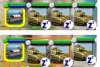
But back to ships... That reminds me of an interface improvement I'd like to see. In the standard interface, as you can see on the top of this picture, it is not possible to determine whether the Panzers are in the Transport or merely sleeping in the city. I can't tell you how often I've sent a transport out to sea only to notice someone got left in port. I'd like to see units carried inside another unit to have their icons pushed down a few pixels, and possibly have some kind of box around them as in this picture. In the lower sample, you can see that the first two Panzers are loaded in the Transport, but the third is not. I haven't begun to poke around in the code to see if that's doable in Python or requires .DLL changes. I miss the Civ3 interface's explicit identifications like "Panzer in T-2 Karl der Große"; if the hover text said something like that it would be really cool.

attachment.php
 

Attachments

  • CarriedUnits.jpg
    CarriedUnits.jpg
    6.7 KB · Views: 321
my initial reaction to the 'down a few pixels' is that it is do-able in python. The only snag is that we would need to know that it is on a boat. The other option is to change the 'mission' icon.
 
I just noticed this DLL thread. I really, really hope that you can add the option of telling the governor what Specialists it's not allowed to build. Like adding a checkbox for any that we don't want to see in a particular city. I see so many complaints about the AI selecting Spies when people are trying to run a Science city etc. Having the option to choose would really cut down on the micromanagement.
 
Python significantly reduces the speed of the game. Since you are going to introduce a .dll BUG version, any chance you will be moving aplicable BUG features from Python to gamecore? Would be a nice additional bonus for those peeps that use the .dll version as stand alone and for those who incorporate the new BUG .dll in mergings.:deal:
 
my initial reaction to the 'down a few pixels' is that it is do-able in python. The only snag is that we would need to know that it is on a boat. The other option is to change the 'mission' icon.

This was my idea as well. I would much prefer to change the mission tag. Moving the icons down a few pixels a) would require increasing the space between all the rows (doable but a PITA) and b) would still be hard to see for those of us with poor vision. A new mission decal, however, could be made to stand out really well.

We already have an anchor on a yellow background for sea patrol. Any suggestions for something to signify loaded on a boat? It should probably have a white background to go along with sleep/fortify/wait since that's what it's doing. I could use an anchor on a white background in a pinch.

I really, really hope that you can add the option of telling the governor what Specialists it's not allowed to build.

This has been discussed and is an often requested feature. There are many ways to do it that I've thought of, but I haven't found the best way yet. The main issue is that to do it right I think will require a new mode. That area of the screen is pretty cramped on 1024x768.

The simplest solution would require no extra screen real estate: ALT + click a specialist puts a red X over it and removes it as a possible specialist for the city. That right there would probably satisfy 95% of the cases people want: no more damn spies. :)

An addition would have ALT + SHIFT + click to mark that specialist as the only type the city should ever use.

Python significantly reduces the speed of the game.

That depends. Adding functionality that is called in tight loops while the AI makes its moves--Autolog is the only BUG feature that fits this--could slow down the game. However, it's more that Autolog hits the disk each time it's called, not that it's Python vs. C++. But all the interfaces being in Python makes no difference. You won't notice the slowdown when it comes to UI.

Do you have other examples where the game is slowed down by Python?

Since you are going to introduce a .dll BUG version, any chance you will be moving aplicable BUG features from Python to gamecore?

I doubt it. I have a limited amount of time to work on BUG. I can either add new features or replicate existing features in the DLL. I'd rather have new features, and I think most users feel the same, so I don't anticipate porting features from Python to C++ without a very good reason.

Same as above: do you have an example that would benefit from this?

Keep in mind that where the feature is built (Python vs. C++) is determined more by the game's architecture than the language. All the hover text is built in C++ because that's how Firaxis built the graphics engine. It simply wasn't possible to add new real hovers in Python. Similarly, I have no idea if it's possible to create UI screens in C++ because I don't think the UI framework (GFC) is exposed to the DLL.
 
This was my idea as well. I would much prefer to change the mission tag. Moving the icons down a few pixels a) would require increasing the space between all the rows (doable but a PITA) and b) would still be hard to see for those of us with poor vision. A new mission decal, however, could be made to stand out really well.

We already have an anchor on a yellow background for sea patrol. Any suggestions for something to signify loaded on a boat? It should probably have a white background to go along with sleep/fortify/wait since that's what it's doing. I could use an anchor on a white background in a pinch.
What about inverting the unit icon as if they were packed in the boat upside down :D
 
The simplest solution would require no extra screen real estate: ALT + click a specialist puts a red X over it and removes it as a possible specialist for the city.

That's pretty much what I had in mind and would suit me just fine. It would make a wonderful addition to the city screen.

BTW, awhile back your guys were discussing putting the number of cites each civ has on the scoreboard. Is that going to be an addition in the next version? I hope so, it's a pain having to go into the trade screen and count them all.
 
This was my idea as well. I would much prefer to change the mission tag.

Excellent idea.

This icon conveys the notion of "loaded" via a shape suggesting the cross-section of a ship in the water, with the letter "L" (for "Loaded", but most languages seem to use words starting with L for the same idea, and L is the hotkey to load a unit) inside, making it visually distinct from the Sleep "Z'". In the second variation, the 2nd unit has been ordered to sleep until healed. Since a loaded unit can be in these two distinct states (permanent sleep vs. temporary) it may be helpful to have the second form as well.
attachment.php
 

Attachments

  • LoadedUnits.jpg
    LoadedUnits.jpg
    3.5 KB · Views: 313
what about a fighter on a carrier in a city - the fighter mission will look the same - should we have different ones for when it is on a carrier?
 
I'm wondering if instead we should add another overlay like the mission tag on the left side when it's loaded on a ship. The same will apply to missiles loaded in a sub. That way we can have a single overlay to handle all types of units.

I like the look of the sea/horizon with the ship outline. I'll have NikNaks make us something similar.

Note that this will cover up the upgrade arrow. Can you upgrade units on a ship, or do you have to unload them first?
 
I'm wondering if instead we should add another overlay like the mission tag on the left side when it's loaded on a ship. The same will apply to missiles loaded in a sub. That way we can have a single overlay to handle all types of units.
I like it. What about about a small blue triangle top right (see below) that we just overlay the unit icon.

_
\|
 
The simplest solution would require no extra screen real estate: ALT + click a specialist puts a red X over it and removes it as a possible specialist for the city. That right there would probably satisfy 95% of the cases people want: no more damn spies. :)

I need this *right* now :love:
 
I'm wondering if instead we should add another overlay like the mission tag on the left side when it's loaded on a ship. The same will apply to missiles loaded in a sub. That way we can have a single overlay to handle all types of units.

I like the look of the sea/horizon with the ship outline. I'll have NikNaks make us something similar.

Note that this will cover up the upgrade arrow. Can you upgrade units on a ship, or do you have to unload them first?

Yes, you can upgrade a unit in a ship, provided it's inside your cultural boundaries. So we don't want to interfere with that. Maybe if, instead of an overlay, it's an underlay... Here's a variation of the first suggestion:
attachment.php

Instead of offsetting the icons, we're leaving them where they are, but producing a visible grouping of the ship and its cargo. It's now obvious that the first and second Panzers are in the Transport, but the third hasn't been loaded yet. This way, a fighter that's technically "loaded" in a Carrier that happens to be in port, but has a mission to intercept inbound air units, can still have an Intercept mission badge, and if it's eligible for an upgrade, can have that tag too. Another fighter that's assigned to the city, flying the same Intercept mission, would not be enclosed in the grouping box, so you'd know that it'll stay put if the Carrier puts out to sea.
 

Attachments

  • CarriedUnits2.jpg
    CarriedUnits2.jpg
    3.5 KB · Views: 293
nice - will that interfere with the promo frame?
 
nice - will that interfere with the promo frame?
It would have to go "under" (z-axis) the promo frame and be sized slightly larger so that both would be visible when a promotion is available. It wouldn't have to be a complete "frame" either -- a horizontal "bracket" under the ship and its cargo would provide the same information. Here's an attempt at that, which as a bonus shows how many cargo slots the carrying unit has, and how many are filled:
attachment.php

The black slots under the Transport instantly tell me there's room for that third Panzer and one more unit.
 

Attachments

  • CarriedUnits3.jpg
    CarriedUnits3.jpg
    3.4 KB · Views: 303
The problem with the underlay that connects unit icons is that the icon spacing can be adjusted. Increasing it would break the connections and make it look funny.

Working still from a second tag icon placed above the mission tag, for the boat it could change it's display to show how many slots it has and how many are full. Think of a pie graph, starting at the top at noon, and going clockwise. It would have divisions to show how many slots, and color the filled slots with a different color.

For all the cargo units, a single loaded icon would be used.
 
Here's a grid of what icons for EF's proposal might look like, with an added "Loaded" icon, which is more-or-less the same as above. I might work on another idea for that.

BugCargo.png


Empty -> Full

The two styles, as you can see, either show all the partitions all of the time, or just the one between red and green. I've done that for cargoes of 3 and 4.

EDIT: Space-wise, could we put the extra "Loaded" icon in the left corner of the icon, or to the left of the normal one at any rate? Or would that get in the way?
 
The problem with the underlay that connects unit icons is that the icon spacing can be adjusted. Increasing it would break the connections and make it look funny.

Well, if icon spacing is adjustable, maybe my original idea was right, just in the wrong direction. How hard is it to reduce (halve?) the horizontal inter-icon spacing between the carrying unit and its cargo, and possibly increase (add that half back here) the space between the last cargo unit and the next unit, so that it produces a grouping effect without needing any new badges?


The visual clumping together would, IMO, be self-explanatory, whereas badges might produce a bit of a learning curve for some. Furthermore, as has been pointed out, pLoopUnit.isCargo is orthogonal to missions like Intercept, Fortify/Sleep Until Heal, etc.; using a Mission badge for that isn't as clean as doing something to visually group a carrying unit and its cargo

But I don't even know where icon spacing is done. I've poked around in CvMainInterface.py and figured out where the badges are applied, but I can't see where the (x,y) coordinates of the button are passed to the function that actually draws it.
 
Top Bottom