Improve the UI, please!

Nitrium

Chieftain
Joined
Apr 5, 2002
Messages
18
Location
Toronto, Canada
As I feared, the user experience designers at Firaxis need to have another training session in usability and general accessibility. I understand that some people are praising the UI, but to me while the design is outstanding (seriously, their artists did a great job), the user interface/user experience designers did a piss-poor job with the interface. Not only the typeface choice is pretty ordinary compared to Civ V (seriously, Minion Pro for a game?), but there are some serious contrast issues. Look below.

I like the game quite a lot, but c'mon Firaxis, this is a letdown - I can't see stuff I'm clicking. These screens are at 1440p, and I can't enable UI resizing (I guess that option is meant for 2k/4k displays?).
 

Attachments

  • Contrast_Panels.png
    Contrast_Panels.png
    1.9 MB · Views: 259
  • Typeface_Sizes.png
    Typeface_Sizes.png
    6.6 MB · Views: 236
Last edited:
Depressing isn't it? I ended up paying a total of 85 dollars US for the game but in a way I really didn't pay anything since it was through a gift card that I got for free. If I had to shell out my own cash I would of skipped this game altogether but since I have it, I am going to try to play with it and live with it for awhile but it is the first Civ game out of 6 that I have that I actually might shelf in the first month of playing.
 
I agree with you for the first pic (contrast panels). The stuff in the other pic doesn't bother me too much.
 
DewFuel posted this in another gaming forum that I participate in, and I thought it was a pretty good writeup... I 100% agree with him:

-

Here's my thoughts on it having played 2000+ hours on civ5 (G&K/BNW):

TLDR: game is very fresh and a lot of new features make it so that each play-through feels very different. Nothing is transparent in the game which makes planning very nebulous. If you're on the fence, skip until its patched/updated/expansion.
-----

The game is okay.

The good stuff:

I feel like everything is there, just that the implementation is really fudging poor. They need to streamline the interface and make things more transparent. I like how the districts work, and there's a lot of tension of what you can and can't get in each city. It makes choices more meaningful rather than the obligatory monument, water mill, granary build order that plagued civ5. Each city you kind of have to tailor to its local environment, and I like that. I also like how the game incentivizes the player to make certain things that they normally wouldn't make (caravans, military units) by boosting civics/tech.

The civics tree is nice. I like navigating through it. Eureka moments are very interesting early game, and gives some semblance of a build order. (i.e. Getting an early builder to make a farm/pasture/mine is very important). Theres a lot of cool stuff in the civics trees that work well, decoupled from the tech. I think they did a great job of pacing on the civics tree (aside from the first few civics you get.. They're kinda no-brainers). I LOVE how you can swap out policies as your cities change in focus. It gives a horsehocky ton of flexibility that was missing in civ5.

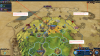
I love the new movement rules, and how terrain actually plays a role in where you position your units & cities. Upgrading costs are lowered (nice) and the combat is way more transparent than civ5. Combat feels good, and the unit upgrade system is very well done. Glad they made that more friendly. The natural wonders are VERY cool. I like how they're very different than civ5 and it makes the early game scouting/exploring fun. For example, some natural wonders will boost surrounding tiles with resources (science, culture, faith, double tile yields) and are not workable themselves. Some natural wonders are workable with unique yields (culture, faith). Overall, most of them seem useful and exciting to find. Sometimes exploration is a slog if the terrain isn't favorable, but moving in open fields for days is great with scouts. If you keep them alive, its easy to scout the entire map by the industrial era.

The bad stuff:

Eureka moments, while interesting and fun, feel forced most the times rather than an incentive. If you're not constantly boosting techs that you're researching, you're falling behind (human opponents), so it kind of dictates what your build order is. It makes for some interesting timings (start a tech/civic, finish it halfway, and pop the eureka moment to instantly get the tech. Its engaging and keeps the min/max players interested).

However, towards the middle game, they have horrible conditionals and are completely unattainable because there's better things to build than some horsehockey walls or a barracks that early.

I hate how it's so difficult to keep track of things in game, since everything is hidden into menus and sub-menus. Once you get to 6+ cities, it becomes unplayable. I think one of the problems is you can't set builders to automate. So as you get more cities, it takes up more time.

Quality of life implements, like no alert on fortification (so when a barb comes nearby you aren't alerted), are severely lacking that it is unbelievable. No way to check when border growth happens (or where it happens). I don't think there is an indication of when a city grows in population. How much marble do you have? 1? 2? 5? How are the amenities being distributed in my empire? If I settle a new city, how many excess amenities will it have? No fudging idea. Lets just make a city and see what happens.

Where's the strategic resource list on the main UI? Do I have iron/horses?
How many turns until my next great scientist? fudge if I know.
Why do I have to edit a config file to prevent auto-unit cycling?
Why do I have to go into the civlilopedia to find out how adjaceny bonuses work for districts?

Etc.

It's so difficult to keep track of demographics, and I don't understand why. Figuring out how many cities another civ has is nearly impossible. Trying to figure out who has what wonders or which policies enacted is impossible. The list goes on, but I won't fill in the spaces. Then there's small things that take away from the enjoyment.

The AI is unbelievably dumb which makes diplomacy a nightmare. I know civ5 didn't have great AI out the gate, but firaxis has 6+ years of experience in this, now. Once you get the hang of all the new features, they get so far behind in tech/civics (even on emperor) that it's not really a challenge. They're constantly building units in the beginning and raping city-states. I played 3 games so far, and in all the games, by the time turn 100 hit, at least 2 AI's were eliminated because of super-aggresive civs. I get you're a war civ, but goddamn.

I want to finally mention a minor gripe in that it doesn't feel like you're progressing through eras in the game. I'm not sure what it is, but I'm not getting the impression that I moved from era to era. In civ5, I can take a look at a map and have a reasonable estimate of what era its in and even what techs are researched. If you gave me a game speed, I could probably ballpark what turn it's at. Granted, I've played only 3 games, but each game I had moments of "oh wow, I can build the eiffel tower... Didn't realize I was in modern era".

I think firaxis did a great job of reinventing the game, making things interesting, and adding a lot of new flavor. It's terribly implemented, with a lot of key features missing, that hopefully get modded in by the community or added via patch/expansion.

I'm still gonna play it because civ is addictive, but I can't wait until things are much more transparent and streamlined.
-

Source: http://www.shacknews.com/chatty?id=35566377#item_35566377
 
I agree with you for the first pic (contrast panels). The stuff in the other pic doesn't bother me too much.

I don't know, dude. Another person pointed me out to the list of luxury resources, and it's just as bad as I thought. Look at this:

Firaxis drives me nuts sometimes.
 

Attachments

  • Luxury_Resources.png
    Luxury_Resources.png
    328.8 KB · Views: 166
I wish there was a way to see whether a resource is worked/improved. Right now it's almost impossible to see/guess. Except maybe by looking at tile yields.
 
Dont personally have a problem with the font or UI size, but then again i play from 30" dell ultrasharp at 2560x1600 or from 56" LCD TV at 1920x1200 (really like that 16:10), maybe on smaller monitors and/or bigger resolutions it becomes an issue.

I wish there was a way to see whether a resource is worked/improved. Right now it's almost impossible to see/guess. Except maybe by looking at tile yields.

I second this. In previous civs that was easy to see without clicking on the city. Different animation on the tile etc.
 
Hello fellow leaders! Below is my list of complaints, as I feel pretty disappointed by the state of UI/UX design in the new Civ. Especially so, as many of the problems are pretty obvious and seem like they wouldn't require much time to implement.

Either way, sorry if I am repeating known facts or sounding like a whiner. It is just that I love Civ franchise, the sixth installment seems promising, but there are so many irritating issues, that I just needed to voice my frustration somewhere. I just hope that they will patch the game shortly, and if not, that the great moders of the Civ community (may they be praised!) will do the job for them.

I won't go into the game mechanics themselves – although there are some pretty troubling issues as well – and will try to concentrate on the UI/UX side of things. I might have missed quite a few things, and I might have missed the target on some issues, as I am writing it from work (slow day!) from memory, away from the game.

-

In general, information is often unavailable or buried too deep. Some interface solutions are far off from optimal and it seems as if, in many instances, they have been designed with noobs in mind. In no particular order:
  1. No demographics tab.
    There is some partial info about it here and there, but that does not seem enough for a game like Civ.

  2. Unhelpful Civilopedia.
    Once again unnecessarily criptic and brief. Descriptions for many items seem more like placeholders than helpful information. And there is no "back" button. C'mon!

  3. City(?) report tab.
    ...is an example of a really bad design. More annoying than useful.

  4. Ammenities mystery.
    Some form of summing up and following what's going on with ammenities in your empire is a must. But it evidently did not seem that way to developers. There is a similar problem with housing, although not as glaring.

  5. Gossip dumb.
    Valuable information from gossips gets flooded by meaningless crap like someone having build granary. I can't even tell if there really is anything interesting there, because this constant avalanche of bullfeathers just forced me to ignore it altogether.

  6. Unit cycling.
    Player should be able to turn it off. It causes unwanted unit movements again and again and pisses me off like hell.

  7. Removing city screen was not a good idea.
    I can imagine that developers wanted to make the game more immersive (?) or approachable for noobs (?), but the cure turned out to be much worse than the disease. It forces you to literally click thousands of additional times through per playthrough to get to options (production, buying tiles, etc.) and info about the city (buildings, what the hell is going on with ammenities, etc.).
    Moreover, you can't queue production and even cycle through cities with keyboard arrows (why not?).

  8. No game log.
    Quite a lot happens during the game and often you just notice that something happened, but not quite exactly what it was (notifications disapear pretty quick). Well, you have no option to get back to it.

  9. Border expansion.
    No information about it. You can't tell when it will happen, which tile will be claimed next, and the game does not notify you when it happens.

  10. Unit list.
    Hidden. I haven't even noticed it at all during my first playthrough. And I won't justify it with a lack of perceptivity on my part. I have played Civ games for 15 years and if I haven't detected it by myself, then it is just plain bad UX design.

  11. Experience points.
    ...for units should be more readily visible. Why I do have to hover at the edge of screen over a barely visible bar to get a small tooltip about it?

  12. Tooltips.
    A game like Civ should be flooded with tooltips. Everywhere. And if someone doesn't like it, just let them switch it off. Currently, in many situations, there is no helpful information readily available. Why do I have to go to Civilopedia to see district bonuses? The same goes for the already built district. Why map with turned on yiealds does not show me their production?

  13. Diplomacy overview.
    Wouldn't you think that a need for one is quite obvious? Maybe I am dumb, but it seems that now you have to just manually click through all the civilizations to get some basic data about it.

  14. Renaming cities and religions.
    Why they decided to remove this is a mystery to me. You seem to be able to rename your religion, but my copy of the game did not quite allow for it to happen.

  15. Cryptic tech boosts.
    It won't be rare that you get some technology or civic boost and will not know what caused it. Why the notification doesn't tell you that in a clear way?

  16. Exiting pop-ups and tabs.
    Often it is waaay to hard. Why do you have to aim for the little X at the top right to make it go away. For the wonder mini-movies clicking on the screen should be enough. For discoveries, clicking outside their pop-up should do the trick.

  17. Animated leaders and diplomacy screen.
    When leaders contact you or react to something, you have to wait too long to take action. It would be all nice and fun if it happend only a few times per game, but for a playthrough that takes dozens of hours it gets old very quickly.

  18. Layers.
    This is not a bad idea in itself, but its execution leaves a lot to be desired. First of all, it is way too heavy handed – turning any layer on makes terrain features barely visible. It is even worse for settlers, because their layer (I can't now remember what it is called) turnes on automatically and makes it needlessly hard to move them around. And it pisses me off.

  19. Religion enhancement screen.
    It might not be the only one that does it, but this was the one that came to my mind first. What is the problem? Well, its priority seems to be beauty, not usefulness. When you are choosing a pantheon, it takes over your screen, so you have to constantly switch it on and off to check subsequent bonuses with the land you own (and might own in the future).
    Making it a sidebar would be a better solution. Moreover, choice list is unnecessarily crammed in a tight space, so you have to scroll it up and down to go through your options, while a huge section of the religion screen above is designated for your religion's symbol.

  20. Not remembering game settings.
    Currently you have to set your game from scratch each time. Jesus Christ, this just seems like game devs wanted to piss us off here, intentionally.

  21. No restart location option.
    It is a minot issue for me and I would easily let it slide, but there are so many issues like this with this game...

  22. Tile allocation.
    Is it just me, or did allocating citiens to tiles become a pain in the ass?

  23. Lack of keyboard shortcuts.
    Many of the problems with UX (city screen!) might have been mitigated by shortcuts. But these are only available for the major overview tabs.

  24. Notifications.
    Again, this might just be me, but I could use more notifications about deals ending, barbarian camp spawns, cities growing in the early eras, and so on.

  25. Map issues.
    Hills are sometimes hard to distinguish from flat land. Similar problem for improved/unimproved tiles. Tribal villages might be a little hard to notice, but I am OK with that.
To end on a positive and not to leave it with a wrong expression:
I like quite a lot about the game, but the many problems with user interface just grind my gears. Make it right!
 
There's also no replay option in the end, just to show score graphs. Damn Firaxis, play Civ I and IV! The quick replay on the map of what happened was more gorgeous than the victory movies we have.
There is no easy way tosee what each city produces. There's a window hidden somewhere that shows the yields, but to find out your best prod or best science city shouldn't take more than 1 click on a hot key. Right now it's hot key + menu + button + scrolling because the details are too big and even worse, there is no sorting.
 
Hello fellow leaders! Below is my list of complaints, as I feel pretty disappointed by the state of UI/UX design in the new Civ. Especially so, as many of the problems are pretty obvious and seem like they wouldn't require much time to implement.

Either way, sorry if I am repeating known facts or sounding like a whiner. It is just that I love Civ franchise, the sixth installment seems promising, but there are so many irritating issues, that I just needed to voice my frustration somewhere. I just hope that they will patch the game shortly, and if not, that the great moders of the Civ community (may they be praised!) will do the job for them.

I won't go into the game mechanics themselves – although there are some pretty troubling issues as well – and will try to concentrate on the UI/UX side of things. I might have missed quite a few things, and I might have missed the target on some issues, as I am writing it from work (slow day!) from memory, away from the game.

-

In general, information is often unavailable or buried too deep. Some interface solutions are far off from optimal and it seems as if, in many instances, they have been designed with noobs in mind. In no particular order:
  1. No demographics tab.
    There is some partial info about it here and there, but that does not seem enough for a game like Civ.
(...)

Great points, I agree with pretty much all of them.
 
OMG...so true. There are so many of these seemingly 'little' fixes that I'm almost ready to put the game down and go back a notch for awhile. How did they get to release the game with some of these basics not in place? No Restart...? No way to save game creation preferences? Ruszel's posting had A LOT of great information on it. I just know there are 10's of thousands of us out there that agree with almost every point. Please fix these Thanks!
 
It would be really nice if the "news", the ones that pops up in the middle of your screen and dissappear faster than you can read them, would show up on the left side of the screen (where no other info comes up anyway). And make them stay there until you close them manually.

I was lucky to catch that another civ started a wonder that I am working on, so now I know to try and speed it up more.
 
  • Tile allocation.
    Is it just me, or did allocating citizens to tiles become a pain in the ass?
Preach it, brother.


  1. Unhelpful Civilopedia.
    Once again unnecessarily criptic and brief. Descriptions for many items seem more like placeholders than helpful information. And there is no "back" button. C'mon!


  2. Ammenities mystery.
    Some form of summing up and following what's going on with ammenities in your empire is a must. But it evidently did not seem that way to developers. There is a similar problem with housing, although not as glaring.


  3. Unit cycling.
    Player should be able to turn it off. It causes unwanted unit movements again and again and pisses me off like hell.

  4. Removing city screen was not a good idea.
    I can imagine that developers wanted to make the game more immersive (?) or approachable for noobs (?), but the cure turned out to be much worse than the disease. It forces you to literally click thousands of additional times through per playthrough to get to options (production, buying tiles, etc.) and info about the city (buildings, what the hell is going on with ammenities, etc.).
    Moreover, you can't queue production and even cycle through cities with keyboard arrows (why not?).

  5. No game log.
    Quite a lot happens during the game and often you just notice that something happened, but not quite exactly what it was (notifications disapear pretty quick). Well, you have no option to get back to it.

  6. Border expansion.
    No information about it. You can't tell when it will happen, which tile will be claimed next, and the game does not notify you when it happens.


  7. Experience points.
    ...for units should be more readily visible. Why I do have to hover at the edge of screen over a barely visible bar to get a small tooltip about it?

  8. Tooltips.
    A game like Civ should be flooded with tooltips. Everywhere. And if someone doesn't like it, just let them switch it off. Currently, in many situations, there is no helpful information readily available. Why do I have to go to Civilopedia to see district bonuses? The same goes for the already built district. Why map with turned on yiealds does not show me their production?


  9. Cryptic tech boosts.
    It won't be rare that you get some technology or civic boost and will not know what caused it. Why the notification doesn't tell you that in a clear way?


  10. Tile allocation.
    Is it just me, or did allocating citiens to tiles become a pain in the ass?

  11. Lack of keyboard shortcuts.
    Many of the problems with UX (city screen!) might have been mitigated by shortcuts. But these are only available for the major overview tabs.


I agree with most of your points, but I've left the most crucial IMO above!

In addition:
  • I cannot find keyboard shortcuts for some common actions: C to center screen on active unit, W to skip active unit to be moved later. Whatsmore, if i select a unit with a current order (go to, build, etc) or already moved, I am stuck with that unit selected, cannot do anything, and cannot just "move away" to the next available unit.
  • How can I briefly see the food balance of a city? I want to see if the total is a positive (growth) or negative (stagnation) number, while adjusting citizens on tiles. Cannot find it anywhere. The same with the total of hammers.

I've been saying for AGES that a good User Interface is the key for a good game.
C'm on Firaxis, it seems to take very little to end up with a good game. However, as it is now, it's barely playable and enjoyable.
 
So many are complaining about the contrast of text in this game. I haven't really had that problem myself, I'm playing on a 1080p monitor with quite high contrast. Maybe you could try to up the contrast on your monitor when you play the game? As a temporary solution of course.
 
As a ux designer myself, I am really constantly irritated by the new UI. Actually, it already started in the previews. It looked so bloated, so much "chrome". That's how designers call it when you have all those cozy frames and gradients and all that bullsh*t that cries for attention when it really shouldn't. Especially when it is in such a complicated environment like the civ game. And to make things even worse, the affordances (this is how designers call the thing that destinguish for example a clickable from a non-clickable area) are complete random. Sometimes, the clickable area is the chromy, cozy, overbloated button, sometimes it's literally JUST THE ICON (i.e. the civilopedia entries to the right in a pedia page). not even the cursor is switching to a hand (even thou only 10% of users are actually aware of that switch). but still, not even that. you have literally to click you through EVERYTHING in the hope, that it will do something. you have to find out on your own what is clickable and what not and then to memorize it. And then, in some cases rightclick brings you to pedia entry and in some others (even if its EXACT THE SAME item you want to look-up) IT DOESN'T!!!!

The constant map overlay on settlers and religious units its just a PITA. a total PITA!!!! You can't actually even see the religious fight because those lightnings are almost the same color as the background. Guys wtf, did anyone actually even played it for ONCE outside of 3dsmax or whatever software you used to create the animations? How can you pass this if you literally CANT SEE it!

Then you have giant non-interacting parts of a screen (like the already mentioned religion select) and then when you want to see the quests or influences of a city state, you have these TINY, really TINY buttons you have to click on. On a 1920 resolution! Where you could make clickable areas just as huge as paintings!!!!! (speaking of paintings: the great works screen... with the paintings just expanding out of boundaries of the chrome... really? i mean, really?)

At some point I just don't understand why they didn't took the quote on wheel tech so nicely performed by Sean Bean for real at least in one screen: "YOU DON'T HAVE TO REINVENT THE WHEEL. JUST REALIGHT IT." -- YES, dear firaxis staff. This would've caused you A SH*TLOAD of less headace during the screen design as well as in the release aftermath with your fanbase. Hell, you just had to take your ux interns and tell them: "Here is a ciV screen of XY, here is the style guide for ciVI .. now go and just paint the new style over the old screen." -- THATS IT! Now need to reinvent the wheel here. Really no need at all!!!

Beyond Earth's UI was straightforward. It wasn't very "wowy" and didn't help a visual designer to jerk off on it, but it WORKED. Yes, some things still had to be done, but at least it didn't scream for my attention. It just gave me the figures I wanted to know and that's it. You already put so much efford into the new map look (and obviously there is some room for improvement as well), but now you put the same amount of cozy shinyness into the UI screens around the map aswell. WTF? WHY? WHY IN HELL?

To me, it looks like there had been several designers, more or less independently working on PARTS of the UI, without someone really overlooking it and keeping it together. And I actually believe that it is due to today's development methods of agile development. While they definetly have their advantages, you can't just use it as an excuse for a clumsy interface. And if the designers were actually aware of it and it still got released that way, then dear project leaders, you should really be grateful like a man dying of thirst finding victoria lake for this civ fanbase.

Well, that's about the interface. I could also talk about AI and some weird things about it, but for now just this little story of my last game: Brazil tells me to move away my troops from their border (while I was only guarding my own with no intention at all to engage. Hell, it was ONLY an archer, a spearman and a swordsman. that's it! That was the whole "army" the AI was so afraid of!! Well, I still do as asked. The next turn, they declare war on me (surprise!), so I move my units back to my border and kill their awfully outdated troops while not even setting a foot on their land. just defending my territory. Then I get a msg a few turns later that I DIDN'T KEEP MY PROMISE TO MOVE AWAY MY TROOPS -- are you kidding me????????
 
Last edited:
Top Bottom