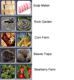
22. While yours hs more contrast than mine I do not think yours is the correct species of Agave. It needs to be Blue Agave, aka Tequila agave.
23. Mine has much more contrast. Mine also looks better in my opinion.
24. This is a toss up. Its hard to tell what either one is. We may need a 3rd image.
25. Your is a photographic while mines is a painting. I would have rater it be a painting, but if it has to be more contrast then I guess yours wins.
26. I think mine looks a bit better. Especially when it comes to the stuff below. Its hard to tell yours has money because of the white band on it looking like its two separate items.
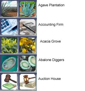
27. This is hard I like the honey combs on yours but I like my bee better.
28.
Approved.
29.
Approved.
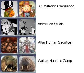
30. I had to look at your for a long time to see the face. I think both suck and we need a better rd image.
31. Yours is way too modern. We need one that looks ancient.
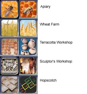
32. Yours might be over contrasted. Like over exposed. Otherwise I think they are equal.
33. Rather not have a white background on that.
34.
Approved.
35. Too modern looking. This need to look prehistoric. I think the name is making it sound too modern.
36. I think both are too cluttered and we need to find a 3rd image.
37. I think we need a 3rd image. Such as
this. Crop out the person.
38. I like the idea of Porky Pig since animation tech has Mickey Mouse. It should be some black and white Warner Bros character like Porky Pig or Bugs Bunny.
39. Really I think the one I have is awesome looking. Please don't chnage this one. I really love this one.
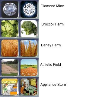
40. I think the walrus ones are about equal.

 Ours is Green ($100), Gold ($50), Red ($20), Blue ($10) an Light Purple ($5). They are also different sizes so that people can tell the difference by feel.
 )opinions are closer on many of these than I'd figured the would be. Not on ALL of them of course but your outlook is making a lot more sense to me now.