New Buttons

This batch is a very good sample of those that are VERY blurry in the game. Is there any way that we could get the original pics from you and maybe rework them so they aren't so blurry? Looking at them here the originals do look nice but they are fuzzed out to unrecognizability ingame.

12. Here. Here is a better one if we want to use it.

13. Here

14. Can't Find.

15. Can't Find. (Which is sad since this is the 2nd replacement for it).

16. Here

Note many of the4se I did years ago. Some like the Animal Actors I think I did before C2C was a mod.
 
Buttonscropped5_zpsbab71239.jpg


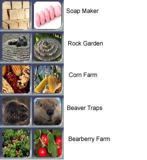
22. While yours hs more contrast than mine I do not think yours is the correct species of Agave. It needs to be Blue Agave, aka Tequila agave.

23. Mine has much more contrast. Mine also looks better in my opinion.

24. This is a toss up. Its hard to tell what either one is. We may need a 3rd image.

25. Your is a photographic while mines is a painting. I would have rater it be a painting, but if it has to be more contrast then I guess yours wins.

26. I think mine looks a bit better. Especially when it comes to the stuff below. Its hard to tell yours has money because of the white band on it looking like its two separate items.

Buttonscropped6_zpsdb3a7760.jpg


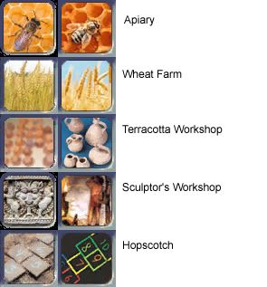
27. This is hard I like the honey combs on yours but I like my bee better.

28. Approved.

29. Approved.

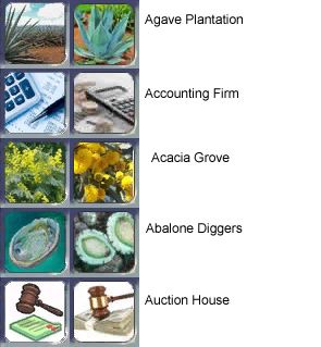
30. I had to look at your for a long time to see the face. I think both suck and we need a better rd image.

31. Yours is way too modern. We need one that looks ancient.

Buttonscropped7_zps96770ef4.jpg


32. Yours might be over contrasted. Like over exposed. Otherwise I think they are equal.

33. Rather not have a white background on that.

34. Approved.

35. Too modern looking. This need to look prehistoric. I think the name is making it sound too modern.

36. I think both are too cluttered and we need to find a 3rd image.

Buttonscropped8_zpsadcccc5a.jpg


37. I think we need a 3rd image. Such as this. Crop out the person.

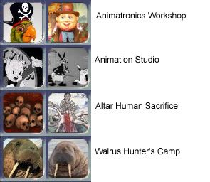
38. I like the idea of Porky Pig since animation tech has Mickey Mouse. It should be some black and white Warner Bros character like Porky Pig or Bugs Bunny.

39. Really I think the one I have is awesome looking. Please don't chnage this one. I really love this one.

40. I think the walrus ones are about equal.
 
26. I think might looks a bit better. Especially when it comes to the stuff below. Its hard to tell yours has money because of the white band on it looking like its two separate items.

That's money there! Why is is such a bland colour?:mischief: Ours is Green ($100), Gold ($50), Red ($20), Blue ($10) an Light Purple ($5). They are also different sizes so that people can tell the difference by feel.
 
So, I presume that the way we should run this is that if you're approving it, it may replace the core. If you're on the fence we can put it as part of alternative modmod file set. If 'against' it then we can work out an alternative (if open to it) or leave it. If we should leave it, please try to supply the original artwork so that we can see if we can get it any clearer. I think those originals are probably going to help a lot. And I can honestly say our (you and I anyhow ;) )opinions are closer on many of these than I'd figured the would be. Not on ALL of them of course but your outlook is making a lot more sense to me now.

Thanks for your patience and workability H!

I was saying that the approved ones should be added to replace the current ones. Anything not approved should either be made to be approved such as a 3rd image or included in a modmod if you still want it in your own personal game.
 
Buttonscropped9_zps575ea7bd.jpg


41. Mine has the old type of soap while yours is too modern. Plus the Soap Factory already has an icon that looks similar to that.

42. Yours is blurrier plus yours doesn't look much like a rock garden at all. What is the original image from? I would much rather use mine.

43. I would like it to have "Indian Corn" type corn so if we don't want the my image then lets have another image that uses that type of corn.

44. I think we need a 3rd image for this one. So we can tell its a beaver and not some otter or muskrat.

45. Approved, but only if the image is not squished. From the leaves and fruit it looks like it was squished when resized.

And I think that covers all of them.
 
Sorry but the new Rock Garden is so obviously better.

Are you sure you're being impartial Hydro?;)
 
Sorry but the new Rock Garden is so obviously better.

Are you sure you're being impartial Hydro?;)

I have to agree. I see a stone pot in the old one. While the new one is much more like what I have seen as rock gardens. The old may be one of those Zen sand and rock gardens but the way it is framed the lines make it look like a barrel/pot.
 
In the other rock garden it has like yellow flowers or something. Here is a picture of mine. I don't think its the same picture but its of the same garden. Do you have large image of the new rock garden image? Because I would like it to be more of a Japanese rock garden style rather than the one you have which seems to have rocks and yellow flowers. On reason I like the Japanese rock garden is that it has patterns in the gravel rather than just placed rocks.

EDIT: Here is a new image if you want to use this in the Japanese style. Perhaps this will be easier to see when small.
 
The shaded grass is green, and the unshaded grass looks yellow in comparison. I could be wrong but I don't think there are any flowers there.

I haven't researched it, but surely the Zen variety is a very extremist end of the spectrum of rock gardens, and I'd suspect such extremes are later developments "to boot".
 
Sorry but the new Rock Garden is so obviously better.

Are you sure you're being impartial Hydro?;)

Sorry but I disagree, the new image looks like a dryed out fountain. I am not to keen on the original either.

Rock gardens are mounds of earth with scattered rocks and plants and bushes. IMO you need another image.
 
Any news on the Tales of sea creature buttons? I would really like to get them into the next release if possible as they are a bug fix. Not a code bug fix but a confusion for new players bug fix.
 
@DH Sorry it has taken so long, our internet has been running like c**p all week, TB perseveres with it, I don't.

Anyway, I have a few samples for you to take a look at, let me know what you think. The great white/manta pictures are examples only.
 

Attachments

  • V1button.jpg
    V1button.jpg
    19.5 KB · Views: 75
  • V1ingame.JPG
    V1ingame.JPG
    11.9 KB · Views: 36
  • V1pedia.JPG
    V1pedia.JPG
    12.1 KB · Views: 29
  • V3button.jpg
    V3button.jpg
    18.5 KB · Views: 67
  • V3ingame.JPG
    V3ingame.JPG
    11.2 KB · Views: 76
  • V3pedia.JPG
    V3pedia.JPG
    11.7 KB · Views: 33
  • V4pedia.JPG
    V4pedia.JPG
    12.6 KB · Views: 72
  • V4ingame.JPG
    V4ingame.JPG
    11.1 KB · Views: 26
  • V4button.jpg
    V4button.jpg
    19.1 KB · Views: 71
A couple more versions.

Let me know if I am completely off track.
 

Attachments

  • V4pediafull.JPG
    V4pediafull.JPG
    11.9 KB · Views: 32
  • V4ingamefull.JPG
    V4ingamefull.JPG
    12.2 KB · Views: 35
  • V4fullbutton.jpg
    V4fullbutton.jpg
    19.4 KB · Views: 76
  • V5button.jpg
    V5button.jpg
    20.4 KB · Views: 77
  • V5ingame.JPG
    V5ingame.JPG
    11 KB · Views: 25
  • V5pedia.JPG
    V5pedia.JPG
    11.8 KB · Views: 71
They are excellent. Much better than what we have. Either of the last two are just what I was after. Naturally I like the one that takes longer more ie the right hand one with the extra scroll showing, less blue.
 
The Rock Garden. I did have a pic with rocks and plants but TB told me a rock garden is a garden of rocks. The reason I didn't like the original was I kept overlooking it thinking it was the town well.

The Abalone Diggers original pic to me looks like the islands/atolls you fly over in the pacific ocean, that is what I saw every time I looked at the pic.

The Altar for Human Sacrifice. It took me ages to work out what the original pic actually was. I wish it was this clear in game.

Animation Studio. Again I couldn't see that it was porky pig. Also porky pig/mickey mouse are very proprietary.

Apiary. Again the original pic looks good here but in game is fuzzy.


The reason I wanted to change my buttons. A while ago I spent many hours making build lists of varying categories...production, health, war weariness etc. with all the new buildings added these lists are no longer viable. Now if buttons are not recognizable I have to find the sweet spot on the button to bring up the building name, and I have found this a drag.

This project was in no way to criticize any ones work done previously. I wanted to offer up my services for making buttons for anyone wanting help.
 
They are excellent. Much better than what we have. Either of the last two are just what I was after. Naturally I like the one that takes longer more ie the right hand one with the extra scroll showing, less blue.

Do you mean the one with the circle cut out of the scroll? If you wanted to go with that one I do have to clean up the cut out, it is a bit haphazard at the moment.

TB has concerns with that one, I will let him fully explain, something to do with framing and size of pic.
 
Do you mean the one with the circle cut out of the scroll? If you wanted to go with that one I do have to clean up the cut out, it is a bit haphazard at the moment.

TB has concerns with that one, I will let him fully explain, something to do with framing and size of pic.

I actually liked the haphazard look. The one with just the animal and no blue around is also good if it is easier. Buttons have to be 64x64 but I like that these look like a scroll rather than a normal button.
 
I actually liked the haphazard look. The one with just the animal and no blue around is also good if it is easier. Buttons have to be 64x64 but I like that these look like a scroll rather than a normal button.

I liked it too on that scroll. My only concern with it is that it really shrinks the amount of room we have to display the animal depicted - and possibly by so much that other animals may not be so clearly identifiable. The animal cutout placed on top of the scroll (I suggest the 4th version given) gives a lot more room for the animal image itself allowing the animal to be much larger and in other situations perhaps a lot more identifiable.
 
@DH do you have original artwork for the animals that you want to use? If you do, I could do some buttons with your artwork so you can see the final version of the different scrolls so you can make a decision.
 
Back
Top Bottom