Tanelorn
Deity
Part1: Lets draw an Orc.
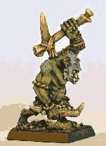
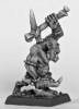
1) Go to a nice miniature modeling site like: http://www.coolminiornot.com/ and choose a picture of an Orc, like this one:
 Nice sharp features, not much clutter, etc.
2) Now lets save it and open it in Paint Shop Pro.

3) Now you can go the Catfish way and follow http://users.tpg.com.au/jpwbeest/jp_makingunits01.htm
But I have a confession to make. I am lazy and this is too much work.
So lets think about colors. Colors are light, and there are grades of shade in our image. Lets take the colors out of the picture, for refference:

4) Instead of resizing the actual photo as is I see I have only four colors: green, blue, ivory and brown. So I dont need all those colors in the palette.I reduce the colors to 16 (2 is too few):
I decide now which area of the photo belongs to each color.
5) Let's increase the color depth back to 16bit and delete the backround to the customary magenta with the magic wand tool. Lets set tolerance to, say, 32. It depends on the bacground tone.

It is much easier to do now, with all the complex color blending gone. The picture has sharp edges. The internal shades are discreet.
6) Lets resize the picture to 17% to fit the civ unit frame. I don't want to loose all that crisp outline to the background and I want my shades to remain separate. So instead of "Smart Size" I use "Pixel Resize" and get this:
 ,which is a reminder of the "Hi-Res" days of yesteryear (...). All the steps up to 6 takes me about 2 or 3 minutes.
7) I make a copy of this last image and then I cut out the part I decided back in step 4 is going to be green:

I do this with the simple paintbrush, painting over the blue, bone/tooth and brown skin parts. Another couple of minutes, more or less.
8) Then I go to adjust\hue and saturation\colorize and paint it green.

9) The entire process up to now took about 5 minutes. Now the real painting part starts. How long it takes depends on the photo quality, skill and inspiration. Lets follow these guidelines:
a) What is away from you and below your line of sight is darker. So the feet, the underside of legs and arms and the back especially is darker.
b) What is closer to you or is hit by light coming from the viewer's side (or frontally) is brighter. Flat surfaces follow this rule, depending on their angle.
c) Cylindrical objects are darker at the sides and brighter in the middle. Spherical objects (convex) are darker along the circumference and brighter at the point closer to the source of light. Concave parts to the contrary are lighter along the circumference and darker inside. Bodies are cylindrical and spherical.
d) Bumps (ribs, corded muscle) are light. Recesses (armpits, neck, earholes) are dark. Also note that arms and any objects carried or worn cast additional shadow.
First I draw the darker parts of the outline, using the burn/ lighten-darken brushes and using the push brush to grade the paint from the darker spot to the lighter one. Where I find a resizing distortion I pick the closest desirable color with the dropper tool, paint it over and use the push brush on it.
Starting from the darker parts I work my way inwards. Unless something really sticks out, it is better to grade colors from darker to lighter using the push brush -as if you were not pressing your pen so much in paper-
Finally, I ink-wash the protruding/ lighter parts, right-clicking the burn and lighten brushes.
It is generally better to use low opacity values, to be able to get the result you want. Once you get the hang of it, you will be playing with the opacity value constantly. For example, my "painting" push brush has opacity at 75 and my ink-washing push brush has it at about 20.
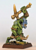
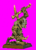
The result is this:

It is useful to have the source photo open somewhere, and zoom at the part painted at that moment. I focus at a single body part each time, as if I was painting a miniature.
10) I repeat steps 7 to 9 for blue (see picture 1 bellow)
11) I match them together. I set magenta as background in transparent selection (pic2).
12) I match them to the rest of the body, because the bone and skin parts are under body part shadow and I want to decide what gets affected (pic3).
13) I detail all bone, teeth and skin following the guidelines in step 9 (pic4).
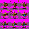
14) I raise the saturation of rope in adjust\hue and saturation\hue saturation lightness, position the unit in the grid, add a body shadow -thicker where it is under more mass-, slap my sig to the side (pic5) and go for lunch.

An hour to an hour and a half probably. Often less
Good luck.
1) Go to a nice miniature modeling site like: http://www.coolminiornot.com/ and choose a picture of an Orc, like this one:
2) Now lets save it and open it in Paint Shop Pro.
3) Now you can go the Catfish way and follow http://users.tpg.com.au/jpwbeest/jp_makingunits01.htm
But I have a confession to make. I am lazy and this is too much work.
So lets think about colors. Colors are light, and there are grades of shade in our image. Lets take the colors out of the picture, for refference:
4) Instead of resizing the actual photo as is I see I have only four colors: green, blue, ivory and brown. So I dont need all those colors in the palette.I reduce the colors to 16 (2 is too few):
I decide now which area of the photo belongs to each color.
5) Let's increase the color depth back to 16bit and delete the backround to the customary magenta with the magic wand tool. Lets set tolerance to, say, 32. It depends on the bacground tone.
It is much easier to do now, with all the complex color blending gone. The picture has sharp edges. The internal shades are discreet.
6) Lets resize the picture to 17% to fit the civ unit frame. I don't want to loose all that crisp outline to the background and I want my shades to remain separate. So instead of "Smart Size" I use "Pixel Resize" and get this:
7) I make a copy of this last image and then I cut out the part I decided back in step 4 is going to be green:
I do this with the simple paintbrush, painting over the blue, bone/tooth and brown skin parts. Another couple of minutes, more or less.
8) Then I go to adjust\hue and saturation\colorize and paint it green.
9) The entire process up to now took about 5 minutes. Now the real painting part starts. How long it takes depends on the photo quality, skill and inspiration. Lets follow these guidelines:
a) What is away from you and below your line of sight is darker. So the feet, the underside of legs and arms and the back especially is darker.
b) What is closer to you or is hit by light coming from the viewer's side (or frontally) is brighter. Flat surfaces follow this rule, depending on their angle.
c) Cylindrical objects are darker at the sides and brighter in the middle. Spherical objects (convex) are darker along the circumference and brighter at the point closer to the source of light. Concave parts to the contrary are lighter along the circumference and darker inside. Bodies are cylindrical and spherical.
d) Bumps (ribs, corded muscle) are light. Recesses (armpits, neck, earholes) are dark. Also note that arms and any objects carried or worn cast additional shadow.
First I draw the darker parts of the outline, using the burn/ lighten-darken brushes and using the push brush to grade the paint from the darker spot to the lighter one. Where I find a resizing distortion I pick the closest desirable color with the dropper tool, paint it over and use the push brush on it.
Starting from the darker parts I work my way inwards. Unless something really sticks out, it is better to grade colors from darker to lighter using the push brush -as if you were not pressing your pen so much in paper-
Finally, I ink-wash the protruding/ lighter parts, right-clicking the burn and lighten brushes.
It is generally better to use low opacity values, to be able to get the result you want. Once you get the hang of it, you will be playing with the opacity value constantly. For example, my "painting" push brush has opacity at 75 and my ink-washing push brush has it at about 20.
The result is this:
It is useful to have the source photo open somewhere, and zoom at the part painted at that moment. I focus at a single body part each time, as if I was painting a miniature.
10) I repeat steps 7 to 9 for blue (see picture 1 bellow)
11) I match them together. I set magenta as background in transparent selection (pic2).
12) I match them to the rest of the body, because the bone and skin parts are under body part shadow and I want to decide what gets affected (pic3).
13) I detail all bone, teeth and skin following the guidelines in step 9 (pic4).
14) I raise the saturation of rope in adjust\hue and saturation\hue saturation lightness, position the unit in the grid, add a body shadow -thicker where it is under more mass-, slap my sig to the side (pic5) and go for lunch.
An hour to an hour and a half probably. Often less
Good luck.
Attachments
-
 Orc Snapshot.png189.7 KB · Views: 817
 -
 PSP Open.png42.8 KB · Views: 731
 -
 PSP Black and White.png25.6 KB · Views: 752
 -
 PSP 16.png15.9 KB · Views: 740
 -
 PSP Bacground.png12.6 KB · Views: 727
 -
 PSP Pixels.png3.5 KB · Views: 778
 -
 PSP to be green.png2.2 KB · Views: 773
 -
 PSP green.png2.1 KB · Views: 739
 -
 PSP green painted.png2.2 KB · Views: 775
 -
 PSP steps.png7.5 KB · Views: 753