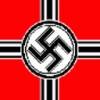
Some nice icons! I esp like the contrast in the battleship pic. the Nazi flag looks a bit strange with the black background (compared to the squared free french symbol). Perhaps you could use something like the first file attached (just as concept.. I am not too happy with it either)
If should decide to keep the flag as it is, there is a one dot line wide color issue between the red of the flag and the black background.
Also the blitzkrieg files don't fit any format... guess you accidentally uploaded the unedited version of them.
One last point:
Even if it's for free selling your product is important
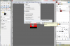
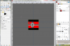
Or better: the preview will be what most people see of your work so getting all icons in a regular order would be cool. If you use gimp the ledger lines with percentage option (is that the correct english name? If not see attachment 2 and 3) are always very useful. Other programs should have similar options... Perhaps you could also change from five pics in the first line and two in the second to four in the first and three in the second line.
Many other authors also include a preview of the small icons as they are the important ones for the tech-tree (sad but true )
Also one positive remark at the end: many people mess around with the palette at the beginning but yours are all well done!
wow thats good to know. ive been using gimp for a while now, never used that... Thanks!
Also with my blitzkrieg tech i dont know whats up with that. i usually have my brother try my stuff out on his computer to see if it works and when i first sent it to him it had this enlargement thing happen. i dont know why. it seemed to happen when i compressed it into the zip file.
i like the re-done nazi flag you did. i may use something to that effect. Thanks for the input.
This site uses cookies to help personalise content, tailor your experience and to keep you logged in if you register.
By continuing to use this site, you are consenting to our use of cookies.
 hope ya like...
 ")
 )
)