A problem with 2d leader backgrounds

Status
Not open for further replies.
I think this is the painting her model is based on.
Spoiler :
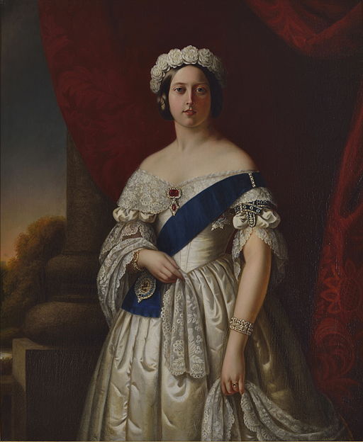
512px-Melville_-_Queen_Victoria.jpg

Yeah, but her head is more oval shaped. They should polish her a bit.
 
Exactly. They're too gloomy, it's almost a mood breaker. And because the map screen is so vivid and bright, the contrast is even more striking. Here you are, playing on lavish green plains, sailing on deep blue waters, when suddenly... you meet this fellow in a dark and lugubrious scenery. You'd say his kingdom is decadent, no?

I'm no digital artist, so excuse my lack of skills, but I did a quick alternative version of Victoria's screen (imagine it made by Firaxis's superb artists). Which version would you say is more vibrant and more adequately conveys the vigour of Victoria?

Spoiler :
8WdScgIl.jpg


WbNnh8Kl.jpg

I didn't care about this at all until you made this post. You're right; the second one looks better. The backgrounds should be more vibrant.
 
I didn't care about this at all until you made this post. You're right; the second one looks better. The backgrounds should be more vibrant.

I know right?

Heck, even something like this would look better IMO:

yhfm8lql.png


BUMaSF9l.jpg
 
They cheaped out terribly on the 2D backgrounds in Civ6. One of the best backgrounds in Civ 5 is with that (Dutch?) guy who`s reading a book by the window or the Brazilian guy sat behind his desk or even Bluetooth up on his boat. Even the Japanese guy on a green field adds some kind of `place` to where he is.

All very immersive.

Now they just stand before a washed out background. Kills immersion.

What immersion? 3D backgrounds make your immersion in a strategy game? In a game as abstract as CIVILIZATION? You get immersed by Pedro behind his desk in stone age?

It's amazing how much of a personal preference immersion is after all. I for one would be much more immersed with 2D backgrounds that change with era along with the clothing on the 3D leader. Hell I would be more immersed with 2D leaders to begin with, that change clothing with the era. NOTHING kills my immersion more than seeing Pedro behind his awesome 3D desk in stone age. :p

And before you throw "there be dragons" argument about immortal leaders... well there it is, they are immortal for example, alternative reality, suspension of disbelief and all that crap. But I can't rationalize them being in 19th century clothes in 19th century office in stone age, while the rest of whole globe haven't even invented the wheel. :mischief:

It all depends on how you look at it :dunno:
 
Maybe, just maybe, the backgrounds lighten up as you get to know more about the Civ.

That being said, I don't mind the dark backgrounds. :)
 
Exactly. They're too gloomy, it's almost a mood breaker. And because the map screen is so vivid and bright, the contrast is even more striking. Here you are, playing on lavish green plains, sailing on deep blue waters, when suddenly... you meet this fellow in a dark and lugubrious scenery. You'd say his kingdom is decadent, no?
I wonder if what we're seeing is a shift in art direction earlier in the development resulting in inconsistencies. The dark backgrounds and dramatic lighting are very reminiscent of tenebrism. I wonder if, since they wanted to go for a more painted look (that would also explain the fairly sober look of the hand drawn fog-of-war style) and then slowly switched to more and more vibrant colours and models.
 
This draws the eye away from the character to the background. Which is exactly what they don't want.
I completely disagree. I don't think a simple image like that draws away any attention from the character.

But even if that were the case, even a simply brighter sky would be better.
 
I completely disagree. I don't think a simple image like that draws away any attention from the character.

My attention is actually drawn to the bright part of the background. So, the fact that you don't think it does doesn't really matter. I'm guessing you just photoshopped that image really quick, so there may be a way of making the image somewhat brighter and not distracting, but you didn't really demonstrate that with the image - you just showed what sort of image looks good to you, and it serves that purpose well.

(And based on past discussions on here, I feel compelled to say that just because I disagree with this one point I quoted, it does not mean that I think your images are bad or that I think the desire to have brighter images is bad or that I necessarily even like the game's 2D backgrounds.)
 
Overall I have no preference as I am in the camp that spends minimal time admiring leader screens, but I enjoy this conversation.

If I had to guess, the dark backgrounds are solely used to make the characters pop out, as if on a stage and interacting with you. Perhaps the strong contrast between background and character is important if they want to port over to virtual reality. This is speculation but it's worth a thought. Again, not saying you wrong to desire cool art, but I think Firaxis priorities lie in a different place.
 
My attention is actually drawn to the bright part of the background.
This is Art Composition 101; difference in value (light and dark) is a basic tool used to direct the viewer's eye around the scene.

I think the altered image is beautiful as a piece of artwork, but as a game screen it draws the user's attention to the wrong element of the screen. Also, the bright part of the background is exactly where the UI overlay is going to be, which would also be a problem. The background is dark for a reason.
 
This draws the eye away from the character to the background. Which is exactly what they don't want.

It's pretty, but it doesn't serve the game purpose for which it was designed.

When the character is moving, eyes will again mostly be focused there. That art composition page doesn't seem to take that into account. It is much nicer to see an actual image that makes a person actually think the lighting reflecting off the characters is coming from.

EDIT: That art composition thread you posted also focuses on the use of shadows and lighting, which seem to be all over the place in the leaders we've seen.
 
When the character is moving, eyes will again mostly be focused there. It is much nicer to see an actual image that makes a person actually think the lighting reflecting off the characters is coming from.

Exactly. You have to imagine that the character is moving -- and, of course, its lighting would have to be a bit brighter.
 
We might not like it, we might nto enjoy but people need to start remembering the purpose.

It's Art Language.

Yes, a 3D leader screen was beautiful, but I've always felt my eyes would wander to the background in Dido's leaderscreen as opposed to herself.

As a game, Leaders, you're meant to discuss and interact with the, and I've always been drawn to them first than anything else.

While it may not be pretty, it's got it's purpose and they're doing it darn well

And this applies to all graphical aspects.
 
While it may not be pretty, it's got it's purpose and they're doing it darn well

And this applies to all graphical aspects.

My point is, it could have been 2D and fulfill the same purpose and still be pretty.

By the way, just to make it clear, I love the map art-style and I find the leader art and animations superb. And I think these would greatly benefit from slightly improved background art (while still within the same style).
 
This is Art Composition 101; difference in value (light and dark) is a basic tool used to direct the viewer's eye around the scene.

I think the altered image is beautiful as a piece of artwork, but as a game screen it draws the user's attention to the wrong element of the screen. Also, the bright part of the background is exactly where the UI overlay is going to be, which would also be a problem. The background is dark for a reason.
Quoting this post because more people need to read it and Arioch's other posts on the subject. Was coming here to say this myself :p

I mean, did nobody notice the actual art quoted at the top of this page matches the same artistic principle pretty much 100%? Most portraits from that era do, too.
 
Exactly. They're too gloomy, it's almost a mood breaker. And because the map screen is so vivid and bright, the contrast is even more striking. Here you are, playing on lavish green plains, sailing on deep blue waters, when suddenly... you meet this fellow in a dark and lugubrious scenery. You'd say his kingdom is decadent, no?

I'm no digital artist, so excuse my lack of skills, but I did a quick alternative version of Victoria's screen (imagine it made by Firaxis's superb artists). Which version would you say is more vibrant and more adequately conveys the vigour of Victoria?

8WdScgIl.jpg


WbNnh8Kl.jpg

Now THAT`S the kind of thing i`m talking about. I am also an artist and know the power of imagery even to something as apparently unnoticable as a background. Such a small change to the background can have a huge effect on how a Leader comes across. Firaxis needs to change their cheap backgrounds.

p.s. Also the fact that some say the background might take away the view from the main Leader is silly. This would be true if the Leader was also a static painting, not moving, but the fact it will move and TALK, means the background will never override the viewer`s attention on the leader. The background will be passively noticed.

Sheesh. Some of you really don`t seem to know how imagery works.
 
I think that in a game like Civilization, leaders are not just characters that stand on their own. They are representatives of their country, their culture too. The design of the leader, their demeanor, as well as the location they were in told you a lot of things about who they are and where they are from. It's a shame that part of it has been torn off in favour of more 'expressive' animation. As the famous gif says: why can't we have both?

I see some people here saying that they'd often look at the background instead of the leaders themselves. Isn't that good? There's more to see in that one screen than just a character standing there. There's traditional Hawaiian canoes floating in the water. There's the white beach sands. There's the beautiful blue sky. And the next time you go to the diplomacy screen, you might pay more attention to the leader themselves. That was the fun of it. I can't image why someone would say: all those pretty things, take them away, I don't like them. Give me a black screen with a caricature instead. Yes, surely that would never get boring!
 
What immersion? 3D backgrounds make your immersion in a strategy game? In a game as abstract as CIVILIZATION? You get immersed by Pedro behind his desk in stone age?

It's amazing how much of a personal preference immersion is after all. I for one would be much more immersed with 2D backgrounds that change with era along with the clothing on the 3D leader. Hell I would be more immersed with 2D leaders to begin with, that change clothing with the era. NOTHING kills my immersion more than seeing Pedro behind his awesome 3D desk in stone age. :p

And before you throw "there be dragons" argument about immortal leaders... well there it is, they are immortal for example, alternative reality, suspension of disbelief and all that crap. But I can't rationalize them being in 19th century clothes in 19th century office in stone age, while the rest of whole globe haven't even invented the wheel. :mischief:

It all depends on how you look at it :dunno:

:goodjob:

BTW, I loved that in Civ 3.
 
I think that in a game like Civilization, leaders are not just characters that stand on their own. They are representatives of their country, their culture too. The design of the leader, their demeanor, as well as the location they were in told you a lot of things about who they are and where they are from. It's a shame that part of it has been torn off in favour of more 'expressive' animation. As the famous gif says: why can't we have both?

I see some people here saying that they'd often look at the background instead of the leaders themselves. Isn't that good? There's more to see in that one screen than just a character standing there. There's traditional Hawaiian canoes floating in the water. There's the white beach sands. There's the beautiful blue sky. And the next time you go to the diplomacy screen, you might pay more attention to the leader themselves. That was the fun of it. I can't image why someone would say: all those pretty things, take them away, I don't like them. Give me a black screen with a caricature instead. Yes, surely that would never get boring!

Agreed.
I simply can`t understand why some complain as if somehow they simply would not be able to maintain concentration because of a pretty background??

That makes no sense. How did they even play Civ 5 before then? Did they fail every game because they couldn`t concentrate on the Leader? If that was the case, why did they never complain about it before?

Because it wasn`t a problem.
 
Status
Not open for further replies.
Back
Top Bottom