Alternative Map for DOC

Xenforo doesn't have a search function. Remember the page?

It's popped up several times, but the basic idea is to have Sardinia be two vertical tiles, and then Corsica diagonally connected NW. This 3 tile land mass will likely not be attached to the Italian mainland. Don't think you'll find a picture that shows this: the iterations with screenshots are either Corsica on the Italian mainland, or Corsica and Sardinia as separate islands.
 
Xenforo doesn't have a search function. Remember the page?
Of course it does, the magnifying glass at the top right of the page. By default it searches your current position, so you can search a thread if you have it currently open.
 
:wow: How'd I miss that? It's been like a year since the switch.
 
I implemented some improvements into the map:

First of all, i enlarged Sri Lanka. There really is no reason not to do it.
Spoiler :
Civ4ScreenShot0050.JPG


Secondly, i implemented some redesigns of the Italian peninsula based on Leoreth's post some time ago. I left out the additional tile near Venice as I find the shape to look more natural this way.
Spoiler :

upload_2018-2-6_19-31-25.png


Furthermore, I implemented the proposal concerning Indonesia, though I took some liberties with the resources. (Tripple Bananas in the Philippines seemed overkill.) There also seems to be a Problem when placing swamps near the coast, hence we'll probably have to refrain from doing so. I also forgot to place rain-forests on Java.
Spoiler :
Civ4ScreenShot0051.JPG


Here is a redesigned Californian coast. Note that I also moved the Rockey Mountains one tile west, as this is actually more accurate.
Spoiler :
Civ4ScreenShot0055.JPG


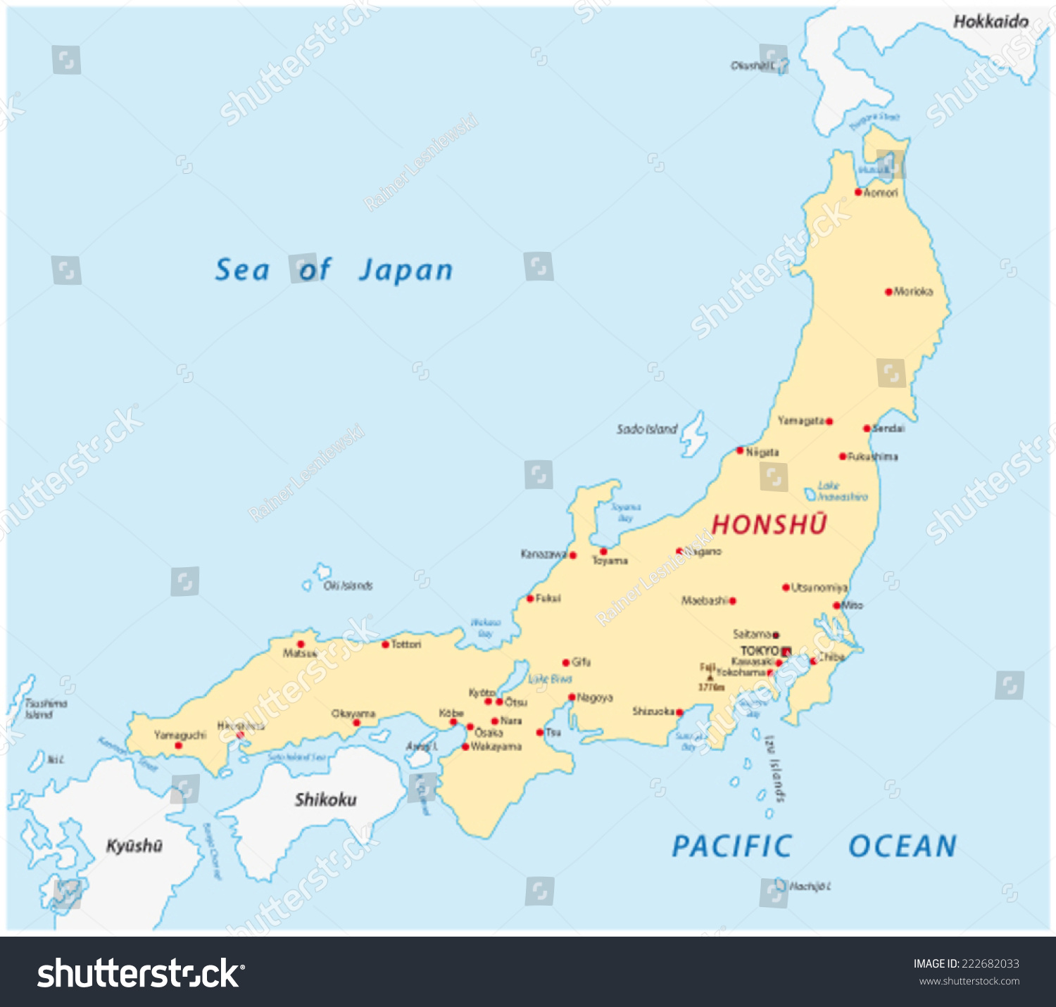
Finally and most importantly, I moved Japan one tile east, as this allows for both a larger Korea and Taiwan. I hope you like the changes. Sadly, this separates Hokkaido from to far form the Russian mainland, hence I had to redesign the island. It does not look perfect, but a larger Korea is certainly more important. I also slightly redesigned the east coast of Japan, as it looks more accurate this way.
Spoiler :
Civ4ScreenShot0052.JPG
Civ4ScreenShot0053.JPG
Civ4ScreenShot0054.JPG
 

Attachments

  • Civ4ScreenShot0057.JPG
    Civ4ScreenShot0057.JPG
    475.9 KB · Views: 67
I love everything about this. I also had planned to move Japan around and reshape it a bit, to try if a slightly larger Korea fits in. Not sure if there is still a better solution but this Korea is already very good. Same for the new Sri Lanka and Taiwan. I also like the new California, the only thing missing is that if San Francisco is 1S1E of the fish, the river should be 1N so the city is below the Golden Gate.
 
I know the Corse topic has been thoroughly discussed, but moving the top-most tile of that 3-tiled Sardinia-Corse hybrid 1 tile west would allow to make Italy slightly larger in Tuscany (add a tile west of the pigs) - which would look better (for Italy) and would put Corse within reach from Marseille.

I like fat java :)... not so sure about super sized Taiwan and Sri Lanka, but as you say "why not".

Edit: with Hokkaido being separate from the Russian mainland - do you mean Sakhilin? If so, that looks really good.
 
Could Touhoku be a bit thicker and hillier? Just one or two more tiles, maybe one of them a plains hill so more than one city can have production
 
@Bautos42, which other map suggestions in this thread have you already included in your map and which ones do you plan to include in the future?
 
I know the Corse topic has been thoroughly discussed, but moving the top-most tile of that 3-tiled Sardinia-Corse hybrid 1 tile west would allow to make Italy slightly larger in Tuscany (add a tile west of the pigs) - which would look better (for Italy) and would put Corse within reach from Marseille.

I looked at the proposed change and personally, I prefer the current version. In my opinion, it just seems more natural. But I'll let everyone decide for themselves:
Spoiler :
Civ4ScreenShot0060.JPG
Civ4ScreenShot0058.JPG


Could Touhoku be a bit thicker and hillier? Just one or two more tiles, maybe one of them a plains hill so more than one city can have production
I see no way of adding another tile without distorting the shape of the Honshu. If you have a concrete proposal, I'm all ears. Concerning the production issue, how about turning one or two of the current grassland hills into plains?

@Bautos42, which other map suggestions in this thread have you already included in your map and which ones do you plan to include in the future?
I've (mostly) implemented the changes of Leoreth to Italy, AessahSH to Indonesia and those of DC123456789 to Canada. By "mostly" I'm referring to the fact, that I adjusted the proposals slightly when I saw fit. I also implemented some of the changes of soul-breathing to China, but as the proposal was poorly documented, I probably missed half of them. Finally, I added the tile to western Ireland Bobby marten insisted on, but I did not implement any other proposals concerning western Europe as I mostly did not like them.

I love this latest version! When will it become playable? Looking forward to it!
We are a long way from having a playable version in the sense that the AI can cope with the new map, mostly because there is a lack of fitting stability maps, not even mentioning the huge balancing problems a bigger map induces. But I have a version of the mod where the map is already playable in the sense that the game does not crash and most scripted events are implemented, although it has not been updated to the current map changes.

I attached the my current version of the map to this post. Apart from adding lots and lots of islands, there is one mayor change since my last post: I tried to redesign Scandinavia in order to connect Sweden to Denmark: Do you like these changes or do you prefer the old ones?

Old Version:
Spoiler :
Civ4ScreenShot0061.JPG


New Version:
Spoiler :
Civ4ScreenShot0062.JPG
 

Attachments

  • RFC 3000 BC.CivBeyondSwordWBSave
    1 MB · Views: 45
I liked the proposal with Zealand as the connecting tile more.
 
It was related to more extensive changes around the Baltic area, that let you connect the island diagonally to Jutland and Scania, see here.
 
Plains hill, 1E the silver. I think it fits Honshu which doesn't really shrink at the top. I'd then move Hokkaido one east and maybe make it bigger; it is a very wide island. That and move the Iron 1E so Tokyo can use it in addition to Kyoto
 
I attached the my current version of the map to this post. Apart from adding lots and lots of islands, there is one mayor change since my last post: I tried to redesign Scandinavia in order to connect Sweden to Denmark: Do you like these changes or do you prefer the old ones?

I like Jules Auburn's proposal (https://forums.civfanatics.com/threads/alternative-map-for-doc.619845/page-18#post-14909171) that adds a column to Europe and Anatolia and reworks the Baltic Sea
 
I prefer not connected Denmark and Sweden cause realism, but maybe a river in between to separate the two might work?
 
I prefer Corsica and Sardinia all in the same column.

For Scandinavia, I'm starting to think that a land connection is better than none (ideally with an implementation of my straits idea), but I think the other map approximates the shape of Sweden a little better. Also, I think Åland does not deserve a full land tile. Gotland maybe.

I'm thinking that the river next to Oslo should be shifted one tile west, so that Oslo is east of it and so that it is better aligned with Denmark.
 
I like Jules Auburn's proposal (https://forums.civfanatics.com/threads/alternative-map-for-doc.619845/page-18#post-14909171) that adds a column to Europe and Anatolia and reworks the Baltic Sea
Yeah, that's the one I linked to. I never reviewed the changes in their entirety but the new Baltic region looked good.

I prefer not connected Denmark and Sweden cause realism, but maybe a river in between to separate the two might work?
There's no river there, how is that more realistic? I never understood this approach.

I prefer Corsica and Sardinia all in the same column.
I have to admit, the diagonal connection looks worse than expected (it's always unpredictable how the game renders this). But still preferable to the blocky three tiles imo.

For Scandinavia, I'm starting to think that a land connection is better than none (ideally with an implementation of my straits idea), but I think the other map approximates the shape of Sweden a little better.
Aesthetically, diagonal connections already come very close to narrow straits, even though they are not passable to ships. I looked into the code but the pathing rules are baked pretty deep into it, and stuff like pathfinding comes from the engine so I don't want to mess with them.

What I plan to do though is to make cities that border to different bodies of water passable even without open borders. So as long as Copenhagen exists those two seas would remain connected.
 
Last edited:
I looked at the proposed change and personally, I prefer the current version. In my opinion, it just seems more natural. But I'll let everyone decide for themselves:


I attached the my current version of the map to this post. Apart from adding lots and lots of islands, there is one mayor change since my last post: I tried to redesign Scandinavia in order to connect Sweden to Denmark: Do you like these changes or do you prefer the old ones?

Old Version:


New Version:

I get a crash to desktop error when trying to load it. Maybe cause I am using a modmod?
 
Top Bottom