Ares de Borg's Terrain Pack II: Preview Thread

Ares de Borg

Norman Knight
Joined
Sep 19, 2004
Messages
5,156
Location
Heart Of Europe
Alright guys, before the other thread gets too messy, here's a brand-new one about my upcoming Terrain Pack II. :)

Maybe some of you noticed the pack I released some time ago (here's the Link). That was mostly a compilation of artwork from other authors.

This one is on a totally new level.
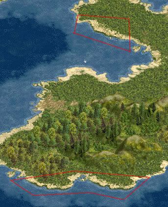
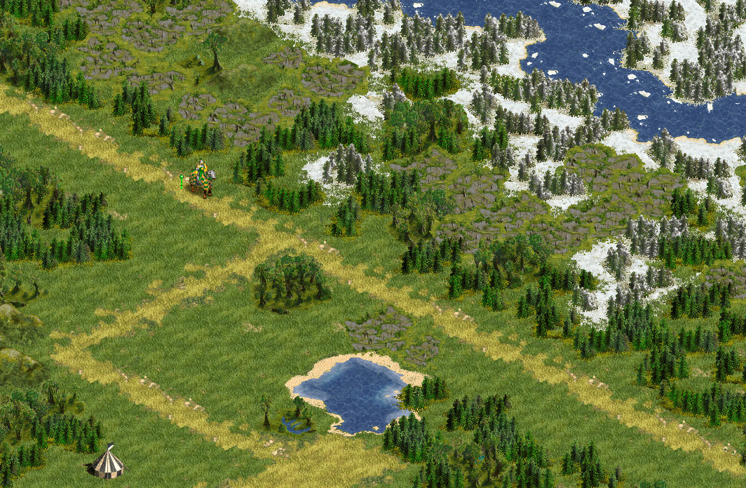
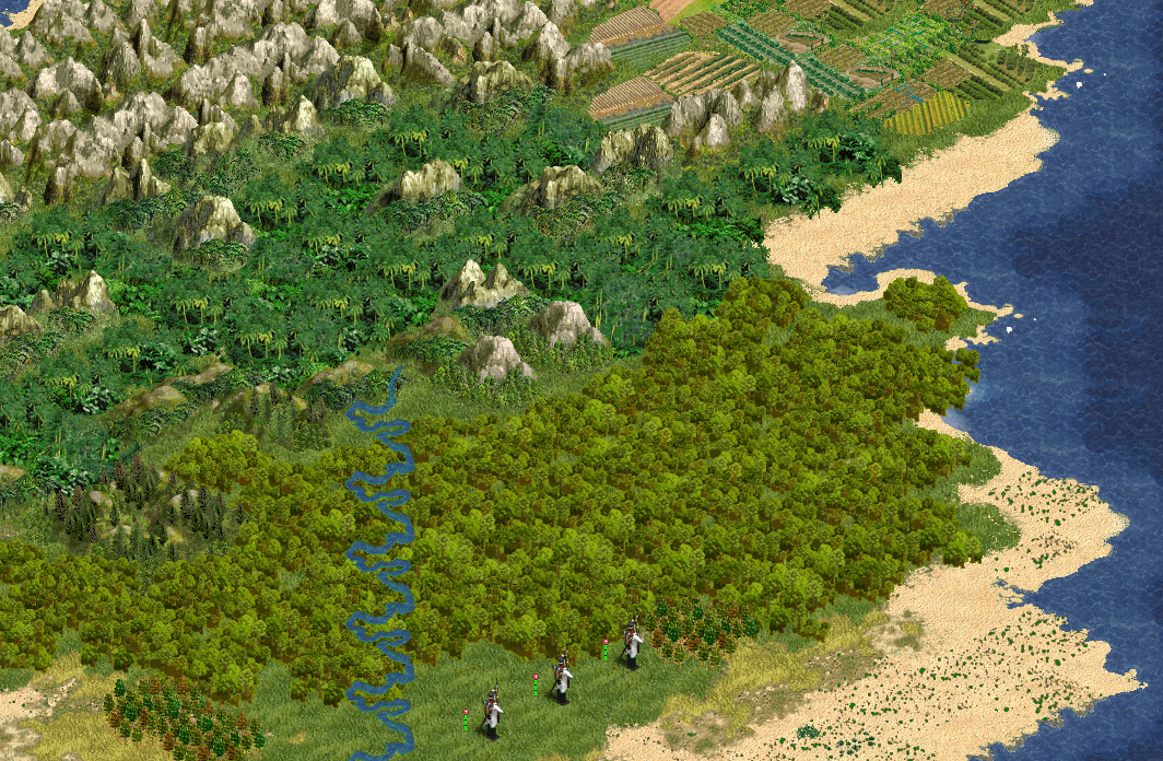
I've remade nearly every single pcx, added brand-new textures, blended trees and mountains into the grassland, reworked the coastline ...etc, etc.

I wanted to do something that is more than a compilation, rather a true new pack with some old goodies.

I think it looks alright already, there's still work to do, though. I hope to finish it soon.

Here are some WIP screenshots (click thumbs for hi-res pictures). Some of you might know them already. ;)

OLD SCREENSHOTS (2006):


Channel crossing


Little friends


Desert & dust


Down in the jungle


OLDER SCREENSHOTS (2010):


NEWER SCREENSHOTS (2013)


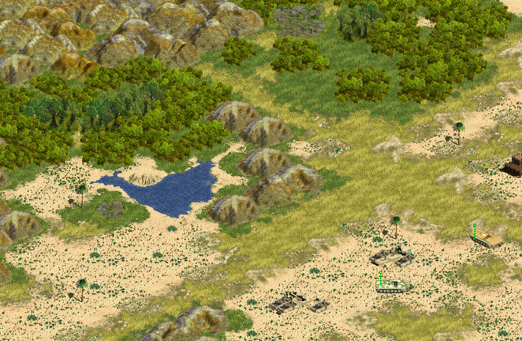
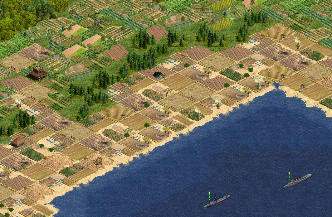
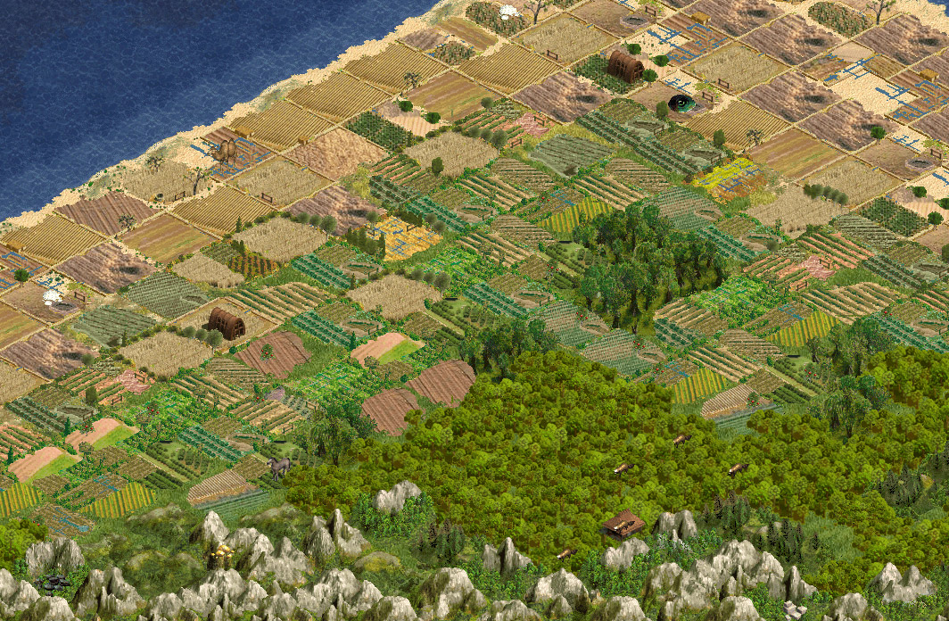
It took hours of work already, and I hope you like it.

Your comments are, as always, appreciated. :)
 
I loved your jungle terrain in pack 1 so much I added the whole terrain file to my Battle Island Scenario (fictitious WW2 Pacific scenario,should be done soon).

Looks great so far..(I noticed you added the newly discovered Zero to your game....;) ) If I could make one request could you change the water? I'm not sure if its the color or the texture but it makes the submarine and Yamato look very pixilated around the waterline. How about using the water with the coastal ridge line in it not sure who made that though....Either way keep up the great work. :goodjob:
 
Thanks for the comments. About the water: I made the texture myself and it may not be perfect. Anyway, this is still work-in-progress, some things will change until release... :)
 
These, just like the first lot, :rockon:

EDIT: FWIW, I think you've improved massively on the jungles and taken a step back on the grassland areas, which are a bit too blended with the trees for my liking.
 
Whats that thing coming out of some of the irrigation? A Statue? That's silly...
Oh, wait, is that the victory point marker? Then it is not silly.

I have to say, I do not like the water. Also, the River delta looks a bit too.. Big? Spread out? Something. Whatever.
 
Rambuchan said:
FWIW, I think you've improved massively on the jungles and taken a step back on the grassland areas, which are a bit too blended with the trees for my liking.

Well, that's a matter of taste, I think. I wanted the trees to fit nicely into the surrounding. I guess I could just make them a *bit* lighter, I'll see.

Goldflash said:
Whats that thing coming out of some of the irrigation? A Statue? That's silly...
Oh, wait, is that the victory point marker? Then it is not silly.

Yep, it's the VP. ;)

Goldflash said:
I have to say, I do not like the water. Also, the River delta looks a bit too.. Big? Spread out? Something. Whatever.

Nobody likes my water... :cry:
I'll redo that slightly. And the deltas aren't wider than before. ;)
 
FWIW, I like the the way the grass looks ares, and the delta's duplicate the sediment runoff effect that rivers create when the enter the ocean quit nicely IMHO....;)
 
The overall look is very nice. :thumbsup:
I'm extremely fond of the idea of the coniferous hills, but I'm not so sure about the practice; there's a bit too much pines, and too little hill, so when you see them at a glance you think "pines" instead of "wooded hills". I think you should remove a couple of trees here and there. :)

The hill-mountain border is too abrupt in some tiles, your mountains are too grey compared to the hills, a bit of green gradation at the bottom would be good. I'm specifically thinking of the "4-way" mountain, but check the others too.

The desert has a checker pattern, every other tiles is slightly more yellow than the other, these should be smoothed IMO.

The grassland looks cool, but is a tad too "knobbly" I think.

I think that you use too few colours in sea and ocean, some smoothing would be good here too.

The green coastlines look a bit odd to me, why have that green line inbetween the sandy beach and the blue sea?

I hope these comments help you more than they irritate you, keep up the good work. :thumbsup:

And, btw, I suspect that my pollution would fit in good here. ;)
 
Thanks for your comments, mrtn! Yes, the desert needs work, this is the last remaining texture I didn't make myself from scratch. Yet. ;)

Btw, there is no "green" coastline... on my screen, it's blue. :rolleyes:

I don't think that I will change the grassland texture anymore. It was helluva work already... :)
I may change the trees a little bit, though.

Okay, as I see it, the water tiles need the most attention, right?
 
Ares de Borg said:
Well, that's a matter of taste, I think. I wanted the trees to fit nicely into the surrounding. I guess I could just make them a *bit* lighter, I'll see.
It is entirely a matter of taste. Don't go changing things because of my likings. I just put them up there as good ol' honest feedback.
 
Rambuchan said:
I just put them up there as good ol' honest feedback.

And you know what, buddy?

I appreciate that! :D ;)
 
Ares de Borg said:
...Btw, there is no "green" coastline... on my screen, it's blue. :rolleyes:
...

Here you have grassland, beach, green line and blue water, if you're entering the sea from the grassland (for a spring dip, I assume ;)).

Edit: I hope that you're not colour blind, so you can see that red. On the other hand, then maybe you shouldn't make gfx, if you are...;)
 
The grass land really does look too knobby. It loogs like someone planted thier yard over great big marbles. Maybe you could take what you already have and reduce the size and then tile a square with 'em. That way you'd keen your colors and the general look but it would look a bit smoother.

Another thing, is that brown stuff supposed to be plains? Look rather like vegetationless dirt to me.
 
Top Bottom