Deon
Lt. of Mordor
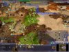
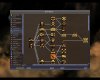
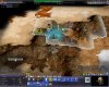
Hovertank sketch:


Is this design ok?
Spoiler :
Is this design ok?
Thanks, re-uploaded zip with file added.Only thing is the empty NIF is missing from the empty folder...
<ShadowDef>
	<ShadowNIF>Art/Units/empty/empty.nif</ShadowNIF>
	<ShadowAttachNode>MD NonAccum</ShadowAttachNode>
	<fShadowScale>1.0</fShadowScale>
</ShadowDef>Edit Edit: I think it may be because it's using fewer movement points or something. In vanilla units moving on railroad will blur like this. Perhaps it can't be changed.
Some other weird issues with sandrider; somehow (because I had one selected at the end of the turn, or in between turns somehhow?) the build icons for my sandrider units in the construction menu in cities changed into the sandrider icon, and my on land sandriders changed into worm graphic form.

 My 1st serious buisness modding
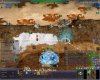
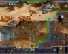
Some other weird issues with sandrider; somehow (because I had one selected at the end of the turn, or in between turns somehhow?) the build icons for my sandrider units in the construction menu in cities changed into the sandrider icon, and my on land sandriders changed into worm graphic form.
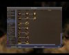
Next step - UI
")
Cool. We can work together in that. I would like to replace the current blue surfaces with some custom graphics. Maybe you can do some brain storming inside corel and I can rebuild it in civ4.
Ok folks, its Complete!
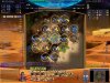
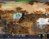
Looks awesome. I have put it into the game and taken another screenshot. I think you may have missed sandrider and atreides loyalty. "Led by Warlord" looks odd in the orange color. Mercenary appears to be "inverse" in color, it has a large yellow background and the highlights in brown. Tleilaxu plague is the only one in grey color, which also looks a little odd.
I am not sure the mentat ones need to be in their own color, they are just promotions. But since the mentat powers are not yet implemented and they may completely change, let's not worry about them for now. The ones you made are definitely better than the ones I made.
In your zip file, you kept two directories, one for the files from the pak, and one for the other files. You don't need to worry about that. If there is a file in the pak, and a file with the same path/name that is outside the pak, the game automatically ignores the one in the pak. So just one directory is fine.
Let us see what other people have to say about the visibility when the icons are in the smallest size.
1. Turn red/green button - Should be replaced with sandworm, made by me in vector graphics, but look a-la vitrage (glass thingies you know). When turn in "green" it opens its mouth and there is a orange light.
When turn finished , it closes its mouth (with/without animation) - no strict need in clothing mouth animation)
 Not sure about the animation. But opened/closed mouth and that orange light should be fine...
2.For ui there are 2 ideas:
a. Sandy, dune like ,something like city screen ytyou make already - 2 dunes.
b. Monolitish, resemble human life on Arrakis - warm grey (quite dark) with some places with semi visible ancient freeman scriblings/engravings (somethink like arabic writing combined with primite drawings from prohestoric caves ), perhaps in orange color. All semi-transparent, combined with some quite futiristic shapes. Some art fiction i imagined. Mix of landsraad and freeman atmosphere.
in the center - semi visible orange outline drawing (ancient) of the Great Maker.
I can show interface depending on the house/civilization you are playing...Hmm, I don't have corel. But maybe you can convert it to some file format readable by gimp or photoshop...It will be awesome if you will just accept my corel graphics.
We can try that.
Make both.
Hmm, I don't have corel. But maybe you can convert it to some file format readable by gimp or photoshop...

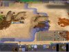
City plots are coastal land plots (allowing domain sea units to enter the city)...
do you see that suddenly, on some turn, *all* your melee build buttons and units turn to worms?
i wanted to destinct Civ-specific promos.