Dune Wars Art Thread

Wonders are for all civilizations and early ones may need some modders' love most :). Because you're going to see them in every game.

UU is another approach and I think that they should be designed later, with as much seriousness and dedication as possible to make civilizations distinct not flavor-wise only, but gameplay-wise too.

Edit: I was ninjad with a different opinion. Well, I think because they are "more important", it means that there should be more time dedicated to their design rather than a strict implementation. Start a few brainstorming threads.
 
Back in 1.4, I think, I went through the wonders and normalized them against vanilla. So there are about the same number as vanilla, and there are about the same number which get a build speedup from marble, and from stone.

Yes, but in vanilla, marble is just a bonus resource that happens to be on terrain. There isn't an opportunity cost where you have to give up say +2 happiness resource or a strategic resource.
Why would you ever pick marble over soostone or opafire or ginaz training etc.?

Wonders are probably more important to redesign, the problem is they are much harder to do. Designing UUs is pretty easy. Thinking of good wonders is much harder.
 
I have a question - i ddint found any promotions icons in art dir.... are they packed? i am not programming modding monster so i need bit help just to know where i should take, change, and put new promotion icons.

@Deliverator - will it be ok if i just make all icons and you add them, updating files and converting them to DDS? That will be alot easier for me this way i can advance alot with Graphics. Can you please give me TGA format, Normal, alpha channel of some of 1 promo icon, and i will just use it as base for size and alphachannel in my TGAs.
If not please just tell me how i can exctract FPK and DDS into shiny TGAs with mask (alpha)?
 
The art is in dune-wars-15.fpk and you shouldn't be a "programming modding monster" to use the forum search function.
Use the "Packbuild" utility to unpack it.

By the way, Landsraad Emissary has a transparent icon on his case thus it makes the case transparent (I guess it's a wrong alpha, I didn't check it yet).

Yes i did that myself already while you were posting :P 
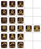
but still it have only few promotion icons in promotions dir.
Thats ok i think i will find, though it will take bit of time till i locate current espionage icons i looking for
 
When doing wonders we have to make movies, or at least some wonder 'pictures'. I always feel cheated when getting this small main log message only.
 
Here's a fixed Protoss Nexus building.
It's supposed to have glowing lights on the ends of each node and on the top, but the alpha transparency was set up wrong and also it was rotated 180* thus you couldn't see the glow texture.
Fixed (attachment).
 

Attachments

Ok, done fixing gamefonts file

Minnor issue : seems i made gray and red drops biiiit smaller than blue one....

1. Removed white pixels around Landsraad icon
2. Added canon Imperial icons
3. Added more blue to Spice Melange icon
4. Added Water Consumption and Water Starvation icons
 

Attachments

  • Fonts.zip
    Fonts.zip
    606.5 KB · Views: 72
  • Civ4ScreenShot0072.JPG
    Civ4ScreenShot0072.JPG
    291.9 KB · Views: 79
  • Civ4ScreenShot0074.JPG
    Civ4ScreenShot0074.JPG
    243.7 KB · Views: 69
@Deliverator - will it be ok if i just make all icons and you add them, updating files and converting them to DDS?

It does not seem like any extra work for you to create the final icons. For me, all I do is choose "File -> Save As -> DDS" and it all works. I use Photoshop elements, but the DDS writer is a plugin. Transferring raw files from one continent to another just to do one more "save as" seems inefficient. No new xml is needed, if you use the same filenames as existing.

Once you have used pakbuild, you will see all the icons. Even in the patch release, if you look into assets/art/interface/buttons, and then in any of the subdirectories, you will see some buttons there. They are all in the right DDS format with the right transparencies.
 
OK, after I've fixed the "Protoss Nexus" I decided to try to learn some basics animations.

Here's a changed Spaceport. Put it in the /assets/art/structures/buildings/emp_spaceport/

There's a small animation with a very small spaceship added. It's for flavor, namely for civilopedia screen, because in most cases you won't notice it during the game. But in civilopedia it looks nicely. It flies up and after some time lands back.
fqa10.jpg

Spoiler :
29zzp06.jpg


Now when I know how to animate, do you mind if I try to animate current terrain improvements? To see that someone works on them.
 

Attachments

Ok, it happened as with Gamefonts - i found my way and that seems pretty easy, just some micro job.
At start things seem to be confusing, but once you crack into them its going pretty smooth :P

So here results:

I redone, and packed into a game new set of choco Spy promo icons .

Atm its only spy promos, will continue later.

Attached screenshots (any icon recognizable on max resolution)
New icon map
DDS related file from dune fpk
 

Attachments

  • spy2.jpg
    spy2.jpg
    121.3 KB · Views: 122
  • Civ4ScreenShot0075.JPG
    Civ4ScreenShot0075.JPG
    285.7 KB · Views: 73
  • dunepromoatlas1.zip
    dunepromoatlas1.zip
    94.8 KB · Views: 43
  • Civ4ScreenShot0077.JPG
    Civ4ScreenShot0077.JPG
    265 KB · Views: 71
OK, after I've fixed the "Protoss Nexus" I decided to try to learn some basics animations ...Now when I know how to animate, do you mind if I try to animate current terrain improvements?

What building would you suggest we use the Nexus for? I think animating the existing improvements is fine, but replacing a number of the improvements and buildings would be even better. Here is a list of my thoughts.

1. We have a vanilla wind turbine, but the Turbine II and Turbine III units are just copies. Something to make the II and III improvements different would be nice.

2. I think we would rather replace the three mines (surface, deep, core) with some better buildings that look like mines. So I wouldn't suggest to animate the existing ones, but rather to replace them.

3. Among the city buildings, I think the religion design is fairly stable now. But we have just used random vanilla religion buildings, which is not very Dune-like. Creating a brand new set of religion buildings would be very useful.

4. Among the non-religion city buildings, some of them are not appropriate. Deliverator went through and picked better ones for most of them. But there is a big opportunity to create some custom buildings. If you take a quick look through the civilopedia, you will find a number of opportunities.

We'd love to have any contributions!
 
I already looked through the Dune'O'pedia and I am not satisfied with the look of the buildings :). While they are quite good choices for a pick from existing list, it would be nice to have them in the nice style (and I am a bit tired of babylon gardens in every mod :D).

I can make them, but I am lacking the knowledge of the canon. Can you help me with some sources? Existing interenet dune wiki projects are quite deserted and empty.
 
I can make them, but I am lacking the knowledge of the canon. Can you help me with some sources? Existing interenet dune wiki projects are quite deserted and empty.

I get quite a lot of stuff by googling "arrakis". There is bunch of stuff on wikipedia; there is a bunch of stuff you can find at images.google.com; deliverator has posted a link in the history thread about the online Dune encyclopedia. There is at least one other good wiki I know deliverator has joined into, but I cannot find the url offhand.
 
MMmmmm now when i redesigning all icons/ promos, i think it will be necessary to redesign UI. Now it is transparrent Blue (like vanilla?), seems unfit with Arrakis, Sand and Dunes......

I think i can catch that, but before it may be anyone have any suggestions how it should look? I dont think that opaque cityscreen sand-stone style will be good, b/c it still should be transparrent.

May be just changing tint (hue) of UI to be yellow/spice orange/ brown?
Or using cityscreen one with some transparency? Any thoughts?
 
I redone, and packed into a game new set of choco Spy promo icons .

I like the color scheme. I guess what your screen shots show is the second hardest test for icon visibility; the hardest is when you have several units in the stack, and you hover the mouse. Then the icons are even smaller.

Is it possible to make the chevrons, the bars at the bottom which show the level, a little more distinct? Either make them a little taller, or make the vertical gradient a little sharper? It is difficult to tell the difference between level 2 and level 3.

Please check it in game - i running max resolution - so those mini icons are shown at minimal size, but another thing -CFF previev screen is smaller than full screen, so you getting smaller images than its ever possible in game. Please run in inside game, and its really easilly destinguishable. (or just click few times on it to see it in full screen version)
Also in game it kinda appear more contrasting, and there is notable difference bettween 1-2-3 rank stripe width. Level 4 though is yet to be confused with lvl 3 , so here i need to find solution for sure.

Please check it in game and tell what you thinking and i will do what you deicide then, cause its quite important for you to see things in right proportions while CFF previev shrinking the image.

Another question if those will be only ones, that will use new brand chevrons, bc we need to distinguish them, from combat ones, and their leverage, OR I might change color from this brown to some other, bit different tint, leaving some of military stuff using those chevrons too (Anyways, Military not using Infiltrators promos, and vice versa). Please tell me what you thinking about this.
 
After giving more though to the topic, after your feedback, please check this overall plan.

1. Because , for spy promos, its quite to important to see logo (to see in what he proficient) , i think i may enlarge actually logo itself or make no change, because , even if it small for window mode, its multiplied, so by seeing 3 increasing logistics promos you can understand that unit have 3 logistics promos. New Chevrons will be used ONLY for few certain spy promos.

2. Only change will be done for Improvisation - this sign will be used in similar to vanilla "combat" line compositions (replacing combat stars with this crossing arrows symbol), because having lvl 5 is more tricky than lvl 3. Escape Artist and Loyality will have also new, but different from chevron composition.

3. All military promos will remain almost with no change (with some fixes perhaps) in composition, only thing that they will have changed is more clean vectorish graphics as those samples, replacing old, handrawn.

Is that Sounds good for you?

As attachment - presketch for Improvisation line
 

Attachments

  • spy3.jpg
    spy3.jpg
    18.4 KB · Views: 50
Back
Top Bottom