• We are currently performing site maintenance, parts of civfanatics are currently offline, but will come back online in the coming days (this includes any time you see the message "account suspended"). For more updates please see here.

Dune Wars Art Thread

I like your take 2 as well more that anything I've managed to come up with. Can you upload the file? I also want to tweak the detail layer to it less contrasty/severe. I can make the grid version too.
 
Here's a shot of the Tleilaxu with the French DARK_BLUE player colour (I've always though this was more indigo than dark blue).

Whilst I think it is just about distinctive enough, I think I prefer the current magenta. It has connotations of Tleilaxu flesh vats and vibrant colours like this look better against the monochromatic landscape in my opinion.
 
I have a small request.
Can someone please help me cutting out the Fremen in the lower right corner (I marked red). It's for the Fremen homeworld screen and will prevent having "fat" Fremen in wide screen mode. :)

duneii.jpg


Thank you!

Also , koma, i progressed with our stuff today, posted some early raw materieal :P

Ah, I see. :) I am looking forward to and hope you make good progress. Btw, you can ignore anything in Resource/Themes/Civ4/*.thm, I will bypass it anyway.
 

Attachments

  • Dune_II_by_usernameunknown.jpg
    Dune_II_by_usernameunknown.jpg
    213.6 KB · Views: 105
When you say "cut out" do you mean leave everything apart from the Fremen transparent, or paint over them?

I don't have time myself for about 24 hours.

Also, the stars look dodgy. Are you going to do something animated or could we just replace with some real star images.
 
I quite like the current dropship style Medium one - apart from the clinical white skin which I don't think fits Dune. The issue is it needs significant work to make it viewable in the viewport/pedia/Koma's funky new homeworld screen. The current Light one is a bit basic and not especially nice in my opinion. I think we should use these for carryalls for now as it will fix the varying height and invisible in the pedia issues. We can revisit later - I'll take you comments into account. The Suspensors need an overhaul, they're on my hitlist.


Darker is just not going to work. I've tried that route before. It needs to be lighter/greyer. I'm working on it.

I may remake carryalls if you want. We can have a carryall like in Dune 2000 for light/medium and one like in a movie for a heavy carryall.
 
When you say "cut out" do you mean leave everything apart from the Fremen transparent, or paint over them?
I just need the Fremen part...
Painting over them? Hmm, that could be handy too. Then I can try fading it into the main screen view.

Also, the stars look dodgy. Are you going to do something animated or could we just replace with some real star images.
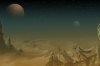
I don't plan to use the upper half of the image.

I don't have time myself for about 24 hours.
No problem...
 
I may remake carryalls if you want. We can have a carryall like in Dune 2000 for light/medium and one like in a movie for a heavy carryall.

I think there is a lot of new artwork we can do. I say "we" as if I was doing any of it :-). I think the buildings/improvements are in much more need of attention.
 
Last quick thing for now. I've made proper buttons for the Sisterhood Covenant and Fremen Water Debt bonuses.
 
Well i did some extensive work on gamefonts, all Dune bonuses have original (or modified alot) version of gamefont symbol. Please test it.
Edit - all seem working, few bonuses have completely new original font symbols now (like crystal and sardukar)

EDIT 2: I only misplaced Stavridium and Soostone, i dont know if you took files already, can you please chnge their entries? Just swap. Number for Soostone meant for Stavridium and Stavridium is for Soostone. They just look bit similar.
Stavridium s/b 47
Soostone 40

EDIT 3: NVM I FIXED, CHECK NEW FILE
 

Attachments

Here is take 2 on rugged dds
 

Attachments

Ah btw our Dune'O'pedia still called SEVOPEDIA. :(
Also mod have not icon, can you please put icon of spice (blue eye used for spice res) as icon for 1.6? Or something else? i forgot hot to make windows icon i am noob. Remind me how and i will make it :P
 
Well i did some extensive work on gamefonts, all Dune bonuses have original (or modified alot) version of gamefont symbol. Please test it.
deliverator said:
Last quick thing for now. I've made proper buttons for the Sisterhood Covenant and Fremen Water Debt bonuses.

Ah, like ships passing in the night. I think that means two new font characters are needed.

EDIT:
i forgot hot to make windows icon i am noob. Remind me how and i will make it :P

Good idea, we need this. But I do not know how either.
 
Ah, like ships passing in the night. I think that means two new font characters are needed.
Atm they use same character. Their character is very simple. Please check current freeman char, he, i think, least interesting among all of them. Can you add entry in XML, because i not feeling sure to do that, and tell me number of font placing i will update Gamefonts files.
 
Atm they use same character. Their character is very simple. Please check current freeman char, he, i think, least interesting among all of them. Can you add entry in XML, because i not feeling sure to do that, and tell me number of font placing i will update Gamefonts files.

The other way around is easier. Please put the new character anywhere available in the gamefonts file, and tell me the ID. I will update the xml.
 
The other way around is easier. Please put the new character anywhere available in the gamefonts file, and tell me the ID. I will update the xml.

Ok added originals for them both (handdrawn) , Debt uses old number (6) and sisters are 32.
 

Attachments

I think one of the highest priorities should be a new shield fighter unit. Currently this is a guy with a rifle, instead of a (ideally shielded) warrior with a sword.
 
@koma i'll see what i have today at evening, generally i wanted to progress with ordos, and dint got to that due yesterday pre-patch fixing of fonts file, also if there iwll be 1.6 already we may postpone this and rest one day and just play new patch :P If not and all fits i will do that. The best way to do is vector cutting or smooth mask cleaning in hight zoom with enlarged picture (resized), so we'll see how things rolling, i'll do that later. (Cant do that on job as well)
 
I think there is a lot of new artwork we can do. I say "we" as if I was doing any of it :-). I think the buildings/improvements are in much more need of attention.

Still I think carryall should be more transport-like.

I was thinking about something like this for a light one:
33u7vdj.png
 
Here's a screenshot of the tech dialog box in WB. It shows a small view of every technology icon. This is a big improvement over the mixture of vanilla and other weird icons we had until 1.5.2. Still, not all of them are distinct/memorable. A number of them are orange, with some blob in the middle.

:old:

Would anybody be interested in picking 5-6 of the most orangey ones, and make new ones which would be more distinguishable?
 

Attachments

  • tech-icons.jpg
    tech-icons.jpg
    101.5 KB · Views: 66
I was looking into the heightmap issues and I've found a couple of small errors in the peak and hills heightmaps.

@David: For 1.6 can you please clear out the existing hills and peaks folders we have and replace them with the attached?
 
Back
Top Bottom