- Joined
- Jan 12, 2004
- Messages
- 1,427
try the attached beta (code should create buttons for mods too, untested) - I don't like it, too crowdedDon't give up though -- there *IS* an extremely cool response to that tricky problem. I'll create an example structural design in a picture later to reveal how it would show on screen. Let me give you some hints;
- Each individual (49x50) flips area can overlap the next to its left.
- A shadow layer (light or dark, that depends) obscures the entire row of F1 items (from right to left) when nothing is selected or mouse hovered on.
- Scan the row (mousing) and the F2(s) deploy above everything (again with some tricky shadowing process L&R) allowing us to select it to access the corresponding popup.
- The advantage to this system is that you can have a very tight row where we only "see" the IconFrame edges (4,6,10,16.. or even 22 wide) for anything that isn't selected.. yet.
- Another is that we keep the individual 45x45 files.
- Coding this stuff is just a matter of proper XML functions and values (Anchor, offset, size - etc).
Once the general (coding) principle is made clear by both of us, the easy part will be to create the necessary graphic assets.
Be patient, i'll have an example -- soon

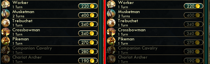
city queue is still not done yet, this is only a 3rd intermediate stateWhat about the above? Any luck lurking our ways for this small detail... which makes detection vastly more easy?*PS2; Speaking of colors while i can have your busy attention on this specific subject.
The City-View and its leftside list_column of produceable items. When we select anything and it gets transfered in the Production box at the bottom... the code automatically inserts a "Queued" txt_comment underneath the items on that list. It would be easier to detect those if the "Queued" would be RED or somethin'.
Cheers
")


")


 Nobody here is claiming that such a new design for a condensed prototype DC row is EASY to realize. Or even that (any) code_work might require some minimal skills or ingenuity. EUI should deserve whatever needs to be done, AFAIC.