Flags!

Bumping, because this is thread is useful and a good thing. On that note, my request to any image manipulation-gifted persons to toy around with this:

Spoiler :
scaled.php


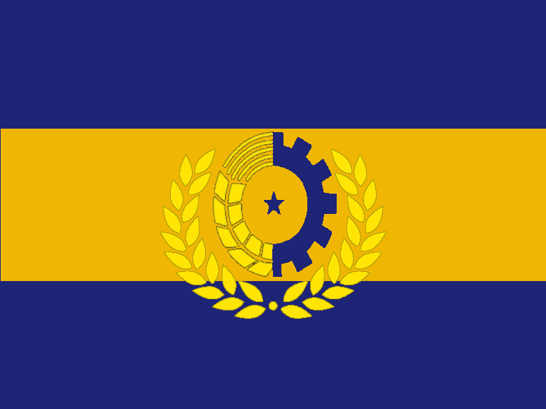
... for the purpose of Capto Iugulum. It is the "Fatherland Tricolor" of the Workers' Commonwealth of Scandinavia. I'd greatly appreciate if anyone could potentially increase the quality of the image/perhaps add a wreath beneath the "cog and wheat stalk" symbol like this.
 
Here's the Imperial Flag of Japan in Capto Iugulum. It's based upon OTL's Imperial Seal and the flag of the Imperial Japanese navy. I thought it was a good play on the Empire of the Rising Sun.

Spoiler :
QFB4p.png


@LoE: If I get the time, I'll make a new one for you. I dunno about increasing the quality of the image, but it'd be easy enough to appropriate the flag Circuit design for the Mississippi Proletarist Republic and remake your flag. It'd be a 10-15 minute job.

Spoiler :
MPRFlag_zpsfdfab9fe.png
 
@LoE: Here we go. Bigger and with the wreath. I figured it wasn't worth expanding the gold stripe to encompass the wreath.

Spoiler :
ProletaristFlag_zps2a07fb19.png
 
It's perfect, Quisani. Thanks! :goodjob:
 
Another Capto Iugulum flag for ya. The flag of the newly liberated United Principalities of India that I just made in a couple of minutes. The lotus is a little pixel-y, so if someone could help with that, I'd be much obliged.
Spoiler :
fnsF1.png
 
@Bair the Normal, I seem to understand that the sewing wheel (if that's what that is) was a nationalist symbol associated with Gandhi more than anything else, which might not be entirely appropriate for Capto Iugulum India. Other than that I like your design.
 
The flag Circuit made is really nice, looks like the best project to me. :)

Bair: I like your avie (the previous one was a nice anime one too, but this one is even better!) and the flower on the flag.
 
@Bair the Normal, I seem to understand that the sewing wheel (if that's what that is) was a nationalist symbol associated with Gandhi more than anything else, which might not be entirely appropriate for Capto Iugulum India. Other than that I like your design.

That particular wheel actually originates in Buddhist symbology, which is on the Indian flag because it was used by the emperor Asoka on some his edicts way back in the day. The spinning wheel was used on some flags by the Indian National Congress under the Raj, but that's not the same one as the wheel on today's flag.

All these flags look great. Circuit's Mississippi PR flag looks especially amazing.

Yeah, what I did was pull a lotus, the Ashoka Chakra, and the colors off of: the saffron orange off the Maratha flag, and the green off the OTL Indian flag to make my own flag. I might even dare to say it looks alright.

EDIT: Two alternate flags here, that I prefer more than the first one due to the uniformity, but with the same overall design.

Spoiler :
c6ERb.png


Spoiler :
E1SLs.png


I like the second one because I think that the orange is too bright to play too great of a role, but I'd like to see which one y'all think looks better.
 
I think the first one works a bit better.
 
I like the second a little bit more. The orange stands out well against the green.

Its a bit late, but I really wanted to show this flag off, even if Phoenixist Spain won't make an appearance in Capto Iugulum;

The flag of the Spanish Phoenix Party.
 

Attachments

  • Spanish Phoenix flag.png
    Spanish Phoenix flag.png
    61 KB · Views: 371
For the record Grandkhan, not at all a fan of that Google Images-standard phoenix emblem.
 
Spoiler :
phoenix.png

Phoenix_Lineart.jpg

phoenix_line_art_by_kestrel8807-d2xi4i0.jpg

Phoenix_Lineart.jpg


For your benefit I looked for some more Pheonixes. I mostly kept an eye out for symmetrical, or spirited designs.
 
None of those feel particularly Spanish. A heraldic eagle, imho, should be less stylized, more like the eagles you see on European flags.
 
Spoiler :
A Heraldic Pheonix. (Bleh)
erik.gif


Stylized Pheonii I liked.
Phoenix-Tattoo-Design.jpg

Phoenix_designs_by_KiyaraSabel.jpg

images

Phoenix-lotus.jpg


Personally, I liked the stylized Pheonix with the shield emblem. It just looks ready for action, proactive and self-righteous. But that's just me really. I'm just going through a few google searches picking through the weeks-for a quick possibly throw-away flag, I don't see a problem with the Clipart Pheonix and I do feel it has its own certain charm to it.

EDIT: The last Pheonix also has promise, if the tail and the lotus are erased.
 
I actually prefer a stylised phoenix. If you look at a lot of fascist symbols, they're all very futurist, with very sharply defined lines and that kind of thing. Look at the swastika, the fasces, the logo of the BUF, the flag of the dutch fascists, the flag of the Falange... I can go on.

Its because they are organisations from a time when futurism was taking off, and they were all pretty young people who were kind of in with the artistic scene - look at fascist Italian architecture for an example. So I wanted a stylised, linear phoenix for a logo.

I dunno, I quite like the look of the flag I posted, because it looks like the phoenix is actually rising, but some of the ones in Terrance's first post are pretty cool too.
 
Some parts of the artistic scene. It's not exactly as if the artists all gravitated to a single ideology.
 
Back
Top Bottom