offworld trade and resources

I think david's right, we need a custom version of the screen for the Fremen. A nice desert still image on the left, and no heighliner on the right would probably be most appropriate.

I was going to a mockup of some ideas I have for the screen - but I'm going to david's terraforming things first.

Here's my ideas:

1) I'd really like the heighliner to start next to the planet on the left, then when you click the button a little image/short video of a Navigator folding space appears in the centre at the top and then the heighliner fades in above Arrakis. I want the folding space aspect to be represented.

2) Beneath the planet, I'd like to have the faction logo, the name of the planet and a little bit of descriptive text like 'Caladan - Third planet of Delta Pavonis; traditional homeworld of House Atreides...', 'Ecaz - 'The Greenhouse Planet...', etc.

3) I'd like the Guild logo from the movie to appear somewhere. Perhaps a more visible 'LAUNCH' button with that logo as a backdrop? Also, LAUNCH seems like the wrong word somehow...

4) I'd like a bit of text explaning the purpose of the screen and adding theme somewhere across the top. 'A Guild heighliner awaits to transport much needed re-inforcements to Arrakis - if you can only pay the fee...'
 
One small weirdness as a result of using unique units for homeworlds. If you look in the unit list in the pedia, you see an entry for homeworld planet, a unit with the sardaukar button, strength 0, and movement 0. No big deal, just weird.

I saw some discussion of animation and rotation. Did I miss something in merging? The planets look awesome in the homeworld screen, but they do not animate.

@ koma, I know I asked to move the launch button to the bottom. But, it is even more important to keep both buttons (launch and exit) together. Please, either move the launch button back to the top next to exit, or move exit to the bottom.
 
1) I'd really like the heighliner to start next to the planet on the left, then when you click the button a little image/short video of a Navigator folding space appears in the centre at the top and then the heighliner fades in above Arrakis. I want the folding space aspect to be represented.

This sounds cool.

3) I'd like the Guild logo from the movie to appear somewhere. Perhaps a more visible 'LAUNCH' button with that logo as a backdrop? Also, LAUNCH seems like the wrong word somehow...

Maybe "purchase". Or "transport".
 
The planets should revolve! That's the coolest part... perhaps install both of the patches in case I missed something.

Having the homeworld unit is a small price to pay for the neat implementation we have going.

I think 'Transport Units' is good instead of 'Launch'.
 
The planets should revolve! That's the coolest part... perhaps install both of the patches in case I missed something.

Nuts. I have a lot of local changes and merging yours/koma's is a little time consuming. I merged 2.02 but I did not test it, then I merged 2.03.

Is anybody besides deliverator/koma13 installing these? Do you see rotation?
 
I am seeing rotation - very cool.

I have: 1.5 + 1.5.3 patch + HW2.03 patch from post 156.

However, despite the fact that I am Ix (and the screen says "reinforcements from Ix") the rotating planet looks like Caladan.
 

Attachments

  • Caladan.jpg
    Caladan.jpg
    127.3 KB · Views: 66
Great new planet nifs. But can it be they have some impact on performance? Planets swirling is very stuttering, I can nearly count the frames. This problem seems to be limited to the nif itself, performance of other parts of screen (selection, camera movement) are fine.

I'd like to be able to change the direction of the light source so that more of the planet is in shadow - that would be cool - I'm guessing it's not possible though since we are using the unit graphics engine?

No, not really. We could try placing the home planets as a unit on map and then change facing direction. I don't think it's worth the trouble. Another way would be making it a movie, but then we can't loop it...
Of course you can always move the planet nif with your mouse/keyboard, giving you a temporary illusion of having a cool placement. :)

Is it possible to remove the swirling stars from the left-hand side and fix the little gap at the top where the NIF is cut off. If the NIF starfield has to be stretched then I can fix that.

See attachement and copy it to python/screens.

Can't remember if the Fremen have the screen...

For Fremen I can remove the (left) planet view and the space ship. Maybe placing an animated moon at the upper screen? This graphic can be cool too:

Spoiler :

duneiibyusernameunknown.jpg


One small weirdness as a result of using unique units for homeworlds. If you look in the unit list in the pedia, you see an entry for homeworld planet, a unit with the sardaukar button, strength 0, and movement 0. No big deal, just weird.
I can remove it in next update.

I saw some discussion of animation and rotation. Did I miss something in merging? The planets look awesome in the homeworld screen, but they do not animate.
You need to set graphic options to high.

Here's my ideas:

1) I'd really like the heighliner to start next to the planet on the left, then when you click the button a little image/short video of a Navigator folding space appears in the centre at the top and then the heighliner fades in above Arrakis. I want the folding space aspect to be represented.
This would be awesome. Maybe we can make it a little movie...

I will think about 2,3 & 4, I can imitate the guild report style from the lynch movie intro. If someone want to write these descriptive texts, I can add them...

However, despite the fact that I am Ix (and the screen says "reinforcements from Ix") the rotating planet looks like Caladan.
I think there is still no planet for Ix, Caladan is only a place holder.
 

Attachments

Great new planet nifs. But can it be they have some impact on performance? Planets swirling is very stuttering, I can nearly count the frames.

I have no stuttering issues, it is very smooth for me, but my computer is fairly high end.

I think there is still no planet for Ix, Caladan is only a place holder.

Then no problem.
 
koma13 said:
davidlallen said:
The planets look awesome in the homeworld screen, but they do not animate.
You need to set graphic options to high.

OK, now it works. Cool(er)!! This is definitely worth mentioning in the release note.

I have no stuttering issues, it is very smooth for me, but my computer is fairly high end.

My machine is 1-2 years old, so "medium end", and I do not have any stuttering issues. I guess this is also worth mentioning in the release note.

koma13 said:
Of course you can always move the planet nif with your mouse/keyboard, giving you a temporary illusion of having a cool placement.

I wouldn't have thought of doing that unless you mentioned it. Using the arrow keys causes the flat halo and animated backdrop to spin, which looks very weird. Is it possible to bind these keys so they always move the map on the right, instead of changing the camera view on the left?
 
Of course you can always move the planet nif with your mouse/keyboard, giving you a temporary illusion of having a cool placement.
I wouldn't have thought of doing that unless you mentioned it. Using the arrow keys causes the flat halo and animated backdrop to spin, which looks very weird. Is it possible to bind these keys so they always move the map on the right, instead of changing the camera view on the left?

Yeah, I didn't try that either until now, but its very weird. Its not a big problem, but there isn't any particular gain from allowing it.
 
Yeah, I didn't try that either until now, but its very weird. Its not a big problem, but there isn't any particular gain from allowing it.

I know. It's enabled by default (you can try it in civilopedia). I can turn that off by placing a invisble layer on top of the planet. Not sure about the arror keys.

I have no stuttering issues, it is very smooth for me, but my computer is fairly high end.
Hmm. I have a low end computer, bought in 2004... :dunno: Let's see if other people complaining about performance.
 
My computer is 2003 vintage, but I do have quite a decent graphics card. I did notice some stuttering, but I thought that might be from having your star backdrop playing as well as the NIF. Does removing that help?

There's a bit of optimizing I can do on the textures - I can put up another version with Koma's original backdrop removed from the left-hand side and optimized textures. We'll see if that helps things.

That Fremen image is quite decent - the stars look a bit dodgy... we can do the usual routine and I can tweak it once you release.

Noticed the drag thing on the left hand side - we should disable that.

I can write some little planet descriptions at some point soon.
 
My computer is 2003 vintage, but I do have quite a decent graphics card.
Me too, I have an ATI X800 Pro!:worship: Usually my cpu is the bottleneck...

That Fremen image is quite decent - the stars look a bit dodgy... we can do the usual routine and I can tweak it once you release.
I know, always feeling like a vampire. :) What is about making a new main interface? ...
 
My textures were shockingly over-sized in some cases - I've been able to halve the file size in many cases with no loss of quality. Run smooth on my machine now.

Edit: Koma, your background DDS files are also waaaaaay big. For one, background.dds is just a black square. With DDS files that are just a solid block of colour an 8x8 px file will serve exactly the same purpose as 1024x1024 px file. I changed the file and the size taken up is now 1KB instead of 1MB! Also I was able to compress heighliner3.dds using DXT5 - from 2MB to ~500KB. So, to summarise, the attached patch will take up much less of people's graphics memory... all for no loss in visible quality. :)

I also brightened and sharpened the heighliner a little bit.

new main interface

Definitely worth doing. No particular ideas right now. I liked what FFH2 did a lot - the way they made more space for things was good.
 
The last post contains a new patch for the homeworld screen - I strongly suggest using this version for patch 1.5.4.
 
The new planet graphics are much better, no stuttering. Background.dds isn't needed anymore and can be removed. ;)

What is about making a new main interface? ... I really would like to avoid having different screens for main interface, city screen and homeworld screen.

Ok, the last sentence doesn't make much sense. What I wanted to say is that I would like to have some consistent style for main interface, city screen and homeworld screen, if possible. This is also the main reason why I still don't have any real interface graphics for the bottom half of the homeworld screen (monitors, guild logo, ...).
 
Deliverator, I need you help and talent. :p 
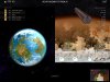
The current homeworld screen design is a little schizophrenic with these both completely different sides. I thought how we could make a somewhat believable seperation without sacreficing too much screen space. And I had an idea, but unfortunately my graphics skills are too limited to make more than a simple concept art:

Spoiler :

tankyv.jpg


I hope you know what it is. :)

To make it perfect we would need:
- a metallic surface look
- some more details
- animated bubbles would be great too
- a Darth Vader-like breathing sound

What do you think?
 
I recognise it...

Navigator.jpg


Mmmm. Not sure. I think for a simple divider something Guild styled like that could be cool, but I think adding more animated effects over the top is going to distract to much from the view of the planet and the map. I want to do a rough mockup incorporating the ideas I posted earlier so I can try and do a rough divider.

Incidentally, can we change the interface so that the map only centres on the city in question AFTER you click on it? I find it too hectic as it currently is, scrolling around on mouseover.
 
Well, I like the idea of putting the player in the perspective of a guild navigator, seeing plans within plans inside his tank.
But of course I can wait for your incorporating...

Incidentally, can we change the interface so that the map only centres on the city in question AFTER you click on it? I find it too hectic as it currently is, scrolling around on mouseover.
Dude, you have to watch more mtv. ;)

Anyway, in CvHomeworldAdvisor.py disabling line 271 should be enough:
Code:
# self.lookAtCity(self.player.getCity(inputClass.getID()))
 
Here's three mockups showing roughly the layout and the sequence of events I was describing a few posts back.

1) Heighliner starts on the left.
Spoiler :
attachment.php

2) You click Transport Units and a video clip or sequence of slides plays.
Spoiler :
attachment.php

3) The Heighliner fades in on the right.
Spoiler :
attachment.php


I've switched to using the heighliner from the miniseries as actual folding space bit is illustrated better - and I wan't the animation/video and the graphics to match up. But I would like the fetus-like Lynch Navigators to be included in the sequence before somehow as I have soft spot for them (and I'm guessing you do too!).

We can either have make a short sequence of stills for step 2 or edit a little clip of video together (which I have zero experience of doing).

I'll upload a little pack of source images soon for you to look through.

You can see I've also done a Wallach IX planet now, just need to sort something decent for Ix.
 
Back
Top Bottom