Platy's Peculiar Pleasant Posh Python

faith alone and happy (2 bars) downloaded today

I'm not sure I understand, but you have the version with all three bars somewhere?
 
Told you...
There are 2 parts in Faith download.
Golden Faith contains all 3
 
Depletion

Features:
Resources may be depleted when worked.
1) 1 out of X chance for individual resource. (Undefined ones will never deplete)
2) Only if worked
3) Only if bonus connected

Depletion0000_zps7d557c4b.jpg
 
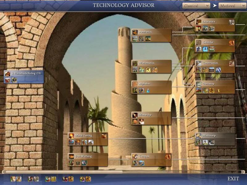
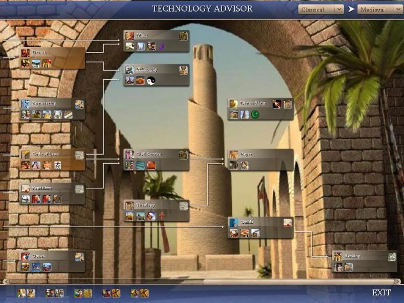
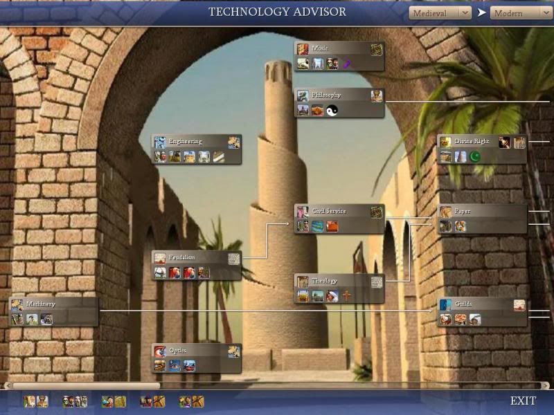
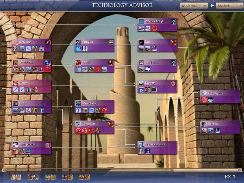
Advanced Tech Tree 2

In version 1, you can adjust the tech tree to show "up to" X Era, for instance "Up to Classical", or "Up to Future"

Now I let you decide the starting era as well.

Classical to Medieval
Class0000_zpsa97e50cb.jpg

Class20000_zps3886f0e8.jpg


Medieval to Modern
Medieval0000_zps7ac6c633.jpg

Modern0000_zpsadffcb75.jpg


Only in Ultrapack
 
Revolutions:

1) Shifted Culture Transfer code to avoid potential CTD
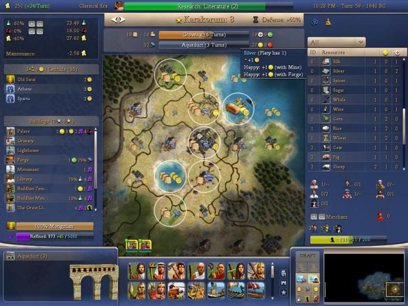
2) Added Stability bar to City Screen
 
CityScreen0001_zpsb23924d8.jpg


New Specialist Table
1) Got rid of all the +/- buttons since one pair is enough.
2) Displays up to max rows defined (5), after which you get a scroll bar.
3) Displays Count/Max instead of just Count
 
Icons which are added as pure buttons can be adjusted for any size.

Icons added into tables can only be up to certain size, because the code to increase table height does not work as advertised.
So... for tables, you can increase icon size but it will be truncated.

The sad thing is, the easiest way to arrange things neatly plus scrollbar, is tables.

P.S.
The other way of arranging things with icons and text with scrollbar, will be something like the promo pedia page, for the list of combat class.
That icon can be adjusted to any size.
 
Yeah I figured that might be an issue..

It is a shame in that current configuration (with the 3 rows of specialists and also the resources images) is that there is some nice left over space between things that could be filled up nicely by larger 'prettier' (more detail and such) icons as because of scroll bars, height is not an issue.

Are the resource images from game font or buttons? (I am just curious as we have some rather prettier resource buttons and changing the game font is a big old pain.. :D

forgive me i am sleepy, I can't visualise what truncated would look like... My brain is not being active enough to dredge up the definition for truncated :D

you mean it would crop the image to the normal size 'space'? i should really go online dictionary and remind myself of the definition for truncated! :D
 
See the big unit icons there? Cover half of it and you get the idea.
Resource icons are buttons so that it does not screw up the sorting
 
Cool, yes that was what I was thinking I would be seeing if the images were made bigger.

Now is this because each one is contained in an 'invisible box' like the cells of a spread sheet that are fixed at a certain height size,
or
are you taliking like if they were made bigger you would see 1 and a half buttons, because of the overall size of the 'scroll bar box'.

if it is option 2, then I (and those with me) could fiddle with the sizes till you hit the display sweet spot.

If one, damn... unless the 'cell height' can be fiddled with till you reach the display sweet spot hehe

also, resource. buttons. yay! :D
 
Ultrapack

1) Fix bug in Bonus Table, Health and Happiness mixed up
2) Increase Icon Size for Specialists
3) Simplified Great People Bar, with more info in hover text
4) Simplified Current Research codes
5) Current Research can now list all available, with scrollbar instead of capped at 19
6) Great People and Research Bar scales with resolution
 

Attachments

  • New 20000.JPG
    New 20000.JPG
    152.1 KB · Views: 166
  • New 30000.JPG
    New 30000.JPG
    141.9 KB · Views: 178
Since you're tweaking the Ultrapack, have you considered making your scoreboard group vassals right after the respective masters?
 
Ultrapack Score Board

1) Simplified codes
2) Vassals placed directly below Masters
3) Removed Golden Star Icon for Masters since no longer necessary, Silver Star Icon for Vassals remained
4) Added 2 buttons to adjust score board width to display more/less details.
The table, although invisible prevents clicking stuff on the map, so you can adjust the width for that.
 
Back
Top Bottom