Blue Monkey
Archon Without Portfolio
I know you're investing an enormous amount of work in this project. It's truly appreciated.
So much of the unit being gold ends up looking flat and hiding the riders who are also in gold. Adding the texturing should help. I don't know anything about lighting, etc. in the setting up & rendering. Is it possible to reduce the shadowing of the riders without ruining the way the rest of the unit looks?
I always worry about critiquing too much, when I'm happy that you are doing this at all.
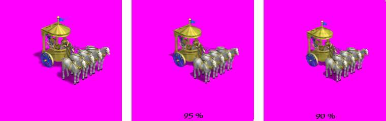
It's a tricky balance between letting the human figures be seen and having the size of the unit not overwhelm others in-game. Here are some comparison images. Probably the 90% scale puts it more in balance next to other units. Imagine the size next to an elephant unit.The upperleft image is at civ-scale, and the next two provide some detail.
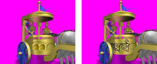
I'm not sure what is transparent on it. It's a good texture, but at civ-scale most of it looks too subtle to me. And the most interesting part is hidden behind the horses. At first I was thinking that moving the circles to the side would improve it (left side picture). I think the texture needs to be really strong to be visible. Perhaps the Arya symbol can be used as the basis for a texture (on the right). I feel sheepish making the suggestion because I really have no idea how textures are made. And my quick paste jobs really don't do justice to what you can accomplish.-How is the texture/pattern on the body of the ratha? The 'transparent' part look alright?
The chattra does look nice as is.-The bit of texturing on the chattra also work? I think it breaks up the gold a bit at least.
If it simplifies rendering, etc. one bar between the central 2 horses & the ratha should be sufficient, I think.-Notice I did add a bar connecting harnesses to the ratha between every other horse (comes through at some civ-angles and not others)
Perhaps a "dappled grey" texture would work better and still leave them light enough.-The white horses...I don't have a hide texture better than this one. They look kind of 'flat' or something. I'm not entirely sure how to improve upon that
The reins look fine to me.-Reins look alright?
So much of the unit being gold ends up looking flat and hiding the riders who are also in gold. Adding the texturing should help. I don't know anything about lighting, etc. in the setting up & rendering. Is it possible to reduce the shadowing of the riders without ruining the way the rest of the unit looks?
I always worry about critiquing too much, when I'm happy that you are doing this at all.
") But what do you mean its in civ scale? It looks huge.
But what do you mean its in civ scale? It looks huge.
") )
)

