UI Modifications / Unit & Resource Layer Pips

I have a few observations about the font tga file to share in case others find it interesting.

1. The height of the text glyphs and icon glyphs is different in the file even in stock BTS. The text rows are 18px whereas the icons are 21px including the purple guide/frame things.

Screenshot 2023-07-10 065758.png
Screenshot 2023-07-10 065738.png


2. I noticed one row of icons in the Realism Invictus GameFont.tga had extra pink guides above it. Typically, those icons are 21px tall including the 1px pink separator at the bottom. That fourth row if of icons in the screenshot below has an extra pink line on top. It's near the bottom of the atlas and only for part of that row. I was curious how the engine handles this. Does it load those icons anyway, on the basis that all icons rows have the same height and it already decided to use 21px from a previous row? Does it skip over those icons in the row but load the later ones that are the correct height? Does it fail to load the whole row? I couldn't figure out how to render those in the game to check how the game loaded them.

Screenshot 2023-07-10 065931.png


3. This seems to be the character set for the text in the GameFont atlas file.

Code:
!"#$%&'()*+,-./0123456789:;<=>?@ABCDEFGHIJKLMNOPQRSTUVW
XYZ[×]^_`abcdefghijklmnopqrstuvwxyz{}~\ẞÀÁÂÃÄÅÆÇÈÉÊËÌÍ
ÎÏÐÑÒÓÔÕÖØÙÚÛÜÝÞŸßàáâãäåæçèéêëìíîïðñòóôõö÷øùúûüýþÿ¿¡«»°Š
ŒŽšœž™©®€£¢“‘”…’

At some point it'd be cool to be able to feed that text to a program that rasterizes each character into separate images of uniform height so they can be assembled into a new GameFont.tga file.
 
1. The height of the text glyphs and icon glyphs is different in the file even in stock BTS. The text rows are 18px whereas the icons are 21px including the purple guide/frame things.
Indeed, but there still seems to be something hardcoded there - the engine has some "expectations" when it comes to height. When I increased the cell height by 8 for font files, the rest of the icons were misaligned until I increased their height by 8 as well. So the height difference is there, but it's likely hardcoded.
2. I noticed one row of icons in the Realism Invictus GameFont.tga had extra pink guides above it. Typically, those icons are 21px tall including the 1px pink separator at the bottom. That fourth row if of icons in the screenshot below has an extra pink line on top. It's near the bottom of the atlas and only for part of that row. I was curious how the engine handles this. Does it load those icons anyway, on the basis that all icons rows have the same height and it already decided to use 21px from a previous row? Does it skip over those icons in the row but load the later ones that are the correct height? Does it fail to load the whole row? I couldn't figure out how to render those in the game to check how the game loaded them.
Easy, icons in those rows aren't in use, so I never noticed those rows were broken. :lol:
Most likely, they aren't read at all.
At some point it'd be cool to be able to feed that text to a program that rasterizes each character into separate images of uniform height so they can be assembled into a new GameFont.tga file.
I'll leave that to someone more competent in coding. Meanwhile, I've done my bit. Here is a text file with enlarged fonts. I didn't opt for 200% size in the end, as it was hard to make it work with the rest of the interface elements. I've increased the height by 8 px, roughly 150%, and used 24 pt font. Chose BBC Reith Sans Condensed as a generic-looking compact gothic font, though it can now easily be substituted as the proper grid is in place. The grid itself was very tricky to figure out; you will notice that bits of it are different heights - some unchanged from vanilla, some increased. A lot of trial and error. I suppose one might copy this to a non-RI file, but I'm afraid one would have to play with the sizes of other cells too.

The city billboard and the sign required some tweaking to work well with the new font sizes. I got rid of some contouring altogether, as they didn't scale well with the progress bars. But overall, I am quite satisfied with how it turned out, even if I put in much more effort than anticipated.

1689023543723.png
 

Attachments

  • GameFont.zip
    226.2 KB · Views: 10
  • Citybar.zip
    5.3 KB · Views: 10
I suppose one might copy this to a non-RI file, but I'm afraid one would have to play with the sizes of other cells too.
Thanks! Copy-pasting the letters and moving the rest down seems to have done the trick. Better, but still not really readable for me. I may have to try a less narrow font and a blue hue. And the population count is bit too large for my taste; I'll try experimenting with the Scale values in the nif. Mouse-over works fine, I guess the BUG modders just didn't know how to accomplish that. Would you happen to have an idea what they were missing (causing the mouse to interact only with the area corresponding to the original billboard? If it's a simple thing, I could fix it in my fork of BULL. But your nif looks discouragingly different from the BUG version ...
 

Attachments

  • advc_lg_gamefont.jpg
    advc_lg_gamefont.jpg
    368.5 KB · Views: 29
Thanks! Copy-pasting the letters and moving the rest down seems to have done the trick. Better, but still not really readable for me. I may have to try a less narrow font and a blue hue. And the population count is bit too large for my taste; I'll try experimenting with the Scale values in the nif. Mouse-over works fine, I guess the BUG modders just didn't know how to accomplish that. Would you happen to have an idea what they were missing (causing the mouse to interact only with the area corresponding to the original billboard? If it's a simple thing, I could fix it in my fork of BULL. But your nif looks discouragingly different from the BUG version ...
The problem with going for a larger font is that you inevitably have to make the billboard even larger for it to fit. Also, if you upscale the font but not the icons, the defence % readout starts looking weird, as it uses both an icon and some characters. I guess it can be seen as an acceptable trade-off, but I personally didn't like the look. Also, I don't think it's possible to scale the font characters individually, so any further upscale would make the population digits even larger (happy to be proven wrong on this one, but my experiments yielded no results).

As for the billboard, I can't give a precise answer at this point, as I modified the one that was in RI all this time, and that was first added years ago, and likely not by me. I simply rescaled each individual element of the nif by 1.2 except for the progress bars (for some reason when scaled to anything more than 1, they start being painted over other elements, which doesn't look pretty at all). But one thing I can say is that there was no code, dll or python, involved at the point of addition, so it must be achievable simply by modifying vanilla nif.
 
Mock-up tests with different fonts and a blue or green tint have not been encouraging. Not easy to improve on your work (which should come as no surprise). Maybe I'll thoroughly compare the BUG and new RI city bars at some point, but, for now, there's apparently no easy fix for the BUG bars. Thanks, still.
 
That new font file is a big improvement. I wish I knew what the citybar was doing. The population display looks like it scales up the text a bit and it looks kind of funny sometimes, like the "9" looks cropped on the right side. I'm being super nitpicky.

I imagine there's a way to configure the size and scaling of textures in the nif? But every time I do anything with the nif file it does something wild and not what I expect. You made it line up well with the increased font size though.

When I increased the cell height by 8 for font files, the rest of the icons were misaligned until I increased their height by 8 as well. So the height difference is there, but it's likely hardcoded.

That's interesting. I still don't really understand what's going on. Like, the test grid I made seems to "work" for GameFont_75, sortof. But if I make innocuous changes to that image, like cropping out "unused" pink regions on the right and bottom, then the game doesn't start. It's weird. But I still want to figure it out.

I've attached a tool for making a the text portion of the atlas. It's just a webpage so I hope it's not too freaky. Doesn't load anything from the web. I haven't used it _too_ much yet because I can't do much to the GameFont files without crazy things happening. So I don't know how useful it will end up being if the font loading turns out to be more finicky than I expect. I'll play around with it more but in the mean time I can share it here in case it's useful. (I really hope adding a text shadow solves a lot of the contrast issues with white on orange text -- and matches the rest of the game more.)
 

Attachments

  • atlast.zip
    5.3 KB · Views: 10
In a bit of a rush but I made a bit of progress changing icon sizes in GameFont_75 so trying to leave a small update.

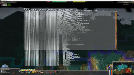
Here are some screenshots where icons are 25px visible (or 26px rows with the pink frame). I took some liberties with the file trying to figure things out. I had to remove six icons after the first three icons (tile yields) and before commerce icons; I don't know why. The resources/bonus are also offset by ten iirc. I don't really know where that offset begins or what it's caused by. The duplication of icons in that file is a bit confusing and I still don't quite know how the icon's are mapped. There seems to be a few different things going on? There's a screenshot of the FontSymbols ordering cause I figured those might show what icons are in relation to each other but that doesn't seem accurate.

One big issue is that the vertical alignment isn't great. I tried stretching the icons taller with empty space at the bottom but it didn't change anything. It looks like they're just drawn top to bottom instead of centered in the line or along a baseline at all. Adding the teal baseline pixel didn't help either. I removed them for all icons here and that helped a bit, most had a baseline 3 or 4 px above the bottom. (Again, I'm using increased line heights and font sizes and the goofy ScaledScreen.py script so there are a number of things going on.)

Also I was pretty sure there was supposed to be a great general icon on the progress bar that I _think_ is also missing in the stock version of RI? Maybe? (Or maybe it's one of those things because of my steam exe?) So I filled in the transparent cells with numbers to help track it down.

Anyway, I just thought I'd mention this cause you guys have a lot more experience with this and might be able to explain some things I'm seeing. I'm still not sure why the resources are offset, I am pretty sure changing the number of rows didn't affect it? I tried wrapping and unwrapping some rows a bit to allow for the icons to fit without exceeding the original image dimensions. I think it doesn't behave if that image is not 2048x460, which is maybe different from how GameFont.tga is treated but I don't rememeber.
 

Attachments

  • GameFont_75.zip
    492 KB · Views: 8
  • Screenshot 2023-07-14 110117.png
    Screenshot 2023-07-14 110117.png
    587.6 KB · Views: 25
  • Screenshot 2023-07-14 105914.png
    Screenshot 2023-07-14 105914.png
    2.4 MB · Views: 22
  • Screenshot 2023-07-14 105824.png
    Screenshot 2023-07-14 105824.png
    6.3 MB · Views: 24
  • Screenshot 2023-07-14 100934.png
    Screenshot 2023-07-14 100934.png
    9.4 MB · Views: 26
I've been playing around with adding a text shadow to GameFont.tga. I think it helps a bit with readability.

1689925940348.png


This is 25px BBC Reith Sans. I also tried serif but sans works okay here. I found the kerning is jarring with some sans fonts, "i" and "l" characters end up very narrow but other characters like "r" or "W" have a freaky amount of space after them. So the there's lots of variation in the kerning. Whereas the narrower text is a little wider in serif fonts from the little serif duders so the variation isn't as significant. And the letter spacing is worse when trying to add a text shadow because now each text glyph needs room for that shadow. Anyway. I think it looks not bad. It's probably a touch bigger than it needs to be.

Screenshot 2023-07-21 002413.png
Screenshot 2023-07-21 002714.png


I ran into problems with different row heights between text and icons in GameFont.tga, so I added whitespace to the rows similar to what you did Walter.

I wrote a command line program to help unpack the TGA files into individual PNG images along with an index.html to describe the image ordering, rows, and baseline pixel positions. Also to repack the TGA from those images and the index. So for those fonts, I unpacked the GameFont.tga from Realism Invictus, then used the text atlas tool I posted earlier to generate the font portion of the atlas for the Reith font, and unpacked that over top using `--patch-index` on the command line so that when the images for the Reith text overwrite the Realism Invictus images, the index.html is updated with new baselines instead of the index being overwritten entirely.

I put it on GitHub if you want to check it out https://github.com/sqwishy/civ4-atlast. I updated the text atlas web thing a bit and put it there as well.

I used another program called chaiNNer to resize the icon images from the Realism Invictus atlas in batch; adding transparent padding to the top or bottom of the icons so they match the height of the text. I was playing around with chaiNNer to see about some machine learning upscaling for the icons. I've never done that before though, I've just heard of people doing that for some older game restoration projects. I guess some of the icons have larger versions in dds files somewhere, like maybe the base religions, or some custom resources in RI are tastefully pilfered from other games :) but I don't know if hunting those down is worth it. Anyway, chaiNNer seems pretty okay even at some larger batch image operations like resizing or adding transparency to edges. So if you wanna try this on your own, that could be useful.
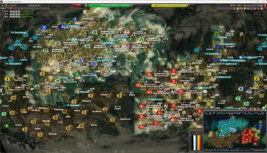
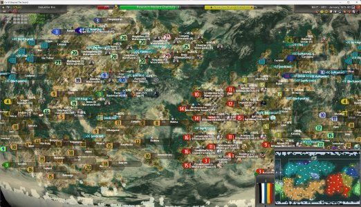
I attached the two serif and sans-serif TGA files used and a citybar.nif similar to the one Walter made.

I think the text shadow stuff can also help a bit with the citybars in Civ IV Remaster, which I think look kinda cute.

Edit: Another thing, you can make atlases with small capitals by putting "small-caps" at the start of the font field in that atlas.html tool.

1689933677804.png
 

Attachments

  • reith 25px fonts.zip
    511.4 KB · Views: 9
Last edited:
I can, for once, read the names at my normal playing distance with the shadows – though they look pixel-y and busy that way, also for the population counts, which are essentially bolded and too large – to state the obvious. small-caps look promising, and your enlarged city bar seems to work flawlessly. I've toyed around only a little bit with your updated HTML file. Somehow I doubt that I'll arrive at better results than yours. Thanks again for making all those tools available.
 
I put it on GitHub if you want to check it out
Thank you very much for the tool! It was tremendously helpful. Here's what I ultimately went with:

billboard.png


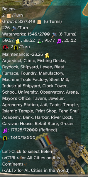
Cuprum, 24pt - a very readable yet compact font (wide fonts look horrible with even a moderately long name/production to display, so the narrower, the better). 2pt vertical shadow for better legibility, no horizontal shadow (again, compactness). Numbers (and % sign) use bold 20pt font instead - so no oversized population number, and they also look better in the upper symbol string for city defence (as all the icons stayed the original size, 24pt numbers dwarfed them). I also darkened the colours for food & production yields to:
Code:
<ColorVal>
            <Type>COLOR_YIELD_FOOD</Type>
            <fRed>0.80</fRed>
            <fGreen>0.46</fGreen>
            <fBlue>0.13</fBlue>
            <fAlpha>1.00</fAlpha>
        </ColorVal>
        <ColorVal>
            <Type>COLOR_YIELD_PRODUCTION</Type>
            <fRed>0.35</fRed>
            <fGreen>0.45</fGreen>
            <fBlue>0.60</fBlue>
            <fAlpha>1.00</fAlpha>
        </ColorVal>
Since the text is invariably white, the darker the background, the better - and it actually looks better in all other places the UI uses that (such as in the city screen).

I'm attaching the resulting gamefont file (didn't even touch the gamefont_75, as I don't think font symbols from there are used anywhere, unlike icons) and the city billboard and sign nifs with only changed textures.
 

Attachments

  • GameFont.7z
    183.5 KB · Views: 8
I'm glad you found the tool useful! I gave up on a text shadow because I wasn't happy with how it rendered in the city population text. As f1rpo, it looks pretty bolded and crunchy when it's black text against black shadow. Though, if it bothers you and you're feeling adventurous, I bet you could change it up a bit in `CvCity::getCityBillboardSizeIconColors`, even setting kTextColor to something greyish instead of solid black might still provide good contrast.

I can't be bothered to parse out the Makefile to figure out how to recompile the DLL, and also I don't want to diverge from RI too much, so I haven't tried changing any of that stuff. I've been playing around with redoing the citybar and moving the progress bar vertically. It's based roughly on tomekum's Civilization IV Remaster citybar.nif.

examples-quicksand-500-smallcaps.jpg


That's using 26px(?) Quicksand weight 500 (between regular and bold) small caps. I wanted to try small caps because it usually looks super goofy for some letter pairings like the "Wa" in "Waterworks". This case wasn't _too_ bad but I'm also not convinced the novelty is worth it lol.

Below is Cuprum 26px with no shadow.

Screenshot 2023-08-14 075040.png
Screenshot 2023-08-14 075753.jpg

Downsides is that citybar is off-center, because I can only seem to rotate and scale the production bar not translate it, and that it's maybe not as informative anymore because of its size. It looks a little crunchy because, as I noted in the Civ IV Remaster thread, there is scaling going on all over the place for each text element and the citybar base textures as well. For UI elements with straight lines or text it just smudges everything and makes any baked in anti-aliasing so much blurrier. I haven't found a way to control that. So partly I'm just hoping for a design where the loss of detail from scaling has less perceptual impact.

Anyway, the tldr is adjusting the colours on the progress bars like you did works surprisingly well and is a lot easier than redesigning the citybar to move the progress bar around.

P.S. If you find some symbols like 1, 2, 9 look a bit chopped off, consider setting "Trim Left" and "Trim Width" both to zero when making your GameFont.tga. Those options mostly just try to render the glyphs narrower than they say they are, but I guess with this font (and probably condensed fonts in general) that isn't super desirable. Here's an new screenshot with those options zeroed to compare to the above if you're curious. Not sure how it looks at the font size you're using though; might be fine.

Screenshot 2023-08-14 081728.jpg
 
Three more things:
  1. I realized you're right; numbers don't need shadows. So my gamefont now has the numbers (and only the numbers) without a shadow. It doesn't look too jarring in-game to me, and it certainly looks better on population numbers.
  2. Whenever you have a nif element that you seemingly can't move by moving its node, that's because the engine (the animation, to be precise; I believe city billboards are also governed by a primitive "animation", though I couldn't find kfm/kf files for it) sets its position directly instead of modifying it. There is an easy way to get around it - create a parent node for it, and move that around. Basically, insert a node between it and its original parent, and enjoy moving it around however you like. Any node is still affected by transforms you put on its parents.
  3. There is a way to make the city billboard use regular fonts, same as in all other places in-game - CITY_BILLBOARDS in CIV4ArtDefines_Misc.xml. The problem with it, it has a limited (and very very narrow) space for actual text, and the rest it simply cuts off. I haven't been able to do anything with that by modifying the nif (I don't think it's actually a part of the nif - even if I move the whole billboard, that text stays in place), nor could I find any reference to it in the DLL, but since coding isn't my strong suit, maybe someone savvier (f1pro?) could find a way to modify it wide enough to actually be useful.
 
I like that citybar design, with semicircle instead of a circle - care to share?
Ya attached are the files including an svg source file; it's a bit messy still as it's a work in progress but I'm sure you can figure it out. I was _hoping_ it would be easy to scale the root node down a bit to accommodate smaller font sizes but haven't tested that at all.
There is an easy way to get around it - create a parent node for it, and move that around.
Cool, I should try that out. As it is now it's a bit close to the city and clips with the unit models sometimes; looks a bit freaky.
There is a way to make the city billboard use regular fonts, same as in all other places in-game - CITY_BILLBOARDS in CIV4ArtDefines_Misc.xml.
Oh yeah, for some reason I thought this configured it to use GameFont_75.tga instead but it looks like, at least for the city title and production it uses the ttf used in the rest of the interface like you said. Might be worth looking into. Thanks.
 

Attachments

  • citybar.zip
    1.6 MB · Views: 8
Top Bottom