This is fair. And I'll be honest about my bias here, simply as an aesthetic choice, I personally find realism uninteresting. I sort of feel like the invention of the camera made "realism" less of an artistic choice and more a decision not to make a choice. That's why the invention of the camera literally sparked Impressionism, which I honestly don't particularly love, though I like some Post-Impressionists like Van Gogh. But I particularly like art that makes strong stylistic choices like the Pre-Raphaelite Brotherhood. For that matter, I adore Medieval Art with its quirky perspectives and interesting color choices.
This is definitely interesting. In games I like both realistic and less realistic styles. The same is true for paintings. Impressionism is a style that I find to be pretty, likable and interesting, but I don't think many of the works in that style
really captured me. On the other hand, both Pre-Raphaelite and Medieval art appeals strongly to me. Pre-Raphaelite art was something I knew I liked a lot, long before I knew anything about art history. As far as my memory goes, it is a very realistic style in the sense that people are very detailed and look like people. And they usually are very beautiful too. But it is also a
very expressive style, so to be able to achieve that they probably did forsake some aspects of realism. And the paintings are very colorful. I can't remember much about their ideology now, but I think they were enamored with Medieval times, and the name does suggests going back to before Raphael. I can't remember ever seeing that in the paintings though, I remember them to be generally as realistic as Renaissance paintings, but I never studied art history seriously, I only read about it for my own pleasure.
Medieval art is less realistic. The weird perspectives can give it a magical feeling. Like in those Mediterranean stone cityscapes where there are gargoyles flying in the air. Or more harmonic and beautiful, like in that famous collection of illustrations that represents the 12 seasons. I don't know why it looks so appealing, but maybe it is a mixture of the evocation of medieval times, the strange perspectives, and in some illustrations; the strong colors. I do know that I really like the style.
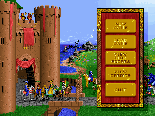
I don't know if you are familiar with this game, but I would recommend you to have a look at the first Heroes of Might and Magic, if you haven't see it. Perhaps by watching someone play it on youtube. It isn't purposefully trying to evoke medieval art, and it does look a lot more modern in most ways. At the same time, the unusual style does look a bit like a mix of illustrations for children's books and medieval art to me. And since it is a strategy game from 1995, it does have some unnatural perspectives as well, which adds to the medieval flavor. The gameplay is very good, but not as good as in the second and third iteration of the series.
Real, non-modified screenshots taken by players for Heroes of Might and Magic

www.mobygames.com
The second game in the series is also very colorful, and a good candidate both for the best looking game and the best strategy of all time in my book, but it isn't as "medieval", "cartoony" and caricatured as this one. Both these games were really outstanding for their use of animation, sound design, music and artwork in the strategy genre in their time.
Not necessarily. A limited or earthy color palette can be beautiful; I just don't think Civ5 is.

As an example, Morrowind has a very limited, earthy palette (interrupted by bursts of color like the Ascadian Isles), but I think it's art style is absolutely gorgeous (and the only Elder Scrolls game I could play without mods). By contrast, Oblivion is extremely colorful and, while it has some pretty vistas, is in my opinion much less beautiful than Morrowind. So I don't think the broadness of the color palette is directly related to my aesthetic appreciation. In Morrowind vs. Oblivion, Morrowind clearly has a clearer, stronger art direction, which may go a long way towards my preference there.
Back to Civ5, I grant I'm probably simplifying and probably couldn't quite put my finger on why I hate Civ5's aesthetic so much, but I have a visceral reaction to Civ5's map. I think it's genuinely, profoundly, deeply ugly. It's aged poorly, but I thought so at release. (The UI is gorgeous. The leaders look good in stills--not my style but technically very impressive and unquestionably superior to Civ6/7 in their setting and lighting--but very bad in motion.)
That is definitely fair
")
I can relate to not at all liking Civ 5's aesthetic and having a visceral reaction to it, since it is the same way I feel about Civ 6. I much prefer that to the comments about Civ 5 "not aging well", because I interpret that as needless technological snobbery. Morrowind still looks great as you mention, no need for mods. In fact I'm not much of a fan of fan mods that supposedly "improve" visuals in games in general. Or so-called remasters. But that is a totally different topic where I have many offensive opinions, Better to let that lay for this time. Oblivion is a game I haven't played yet. It looked really impressive to me when it was new. Almost like Heroes of Might and Magic 2 from the first person perspective. Maybe it was the mix of those soft unforested mountains and the knights in shiny armor. Usually I don't think visuals age that much. If I liked how it looked when it was new, I tend to like how it looks when it is old. And it still looks pretty good, but it is certainly is much less impressive looking now, then back when it was new. And a reminder that although technological advancement in graphics have slowed down, it hasn't stopped. But I am mostly thinking about those forests with the mountains in the background and some shiny metal. Those lava landscapes always looked very bland. I would like to play this game one day, but all the other games in the series, apart from the first one, are more interesting.
It is good that you liked the UI in Civ 5. It is one of the things which really stands out about the game. I would also say that the game emulates plays of light well, even if they are not quite as colorful as in Civ 6. Like the light pouring down between the clouds to mark your selected unit. Or the light playing upon the waves. The leaderscreens are great. I never noticed that there was anything wrong or lacking with the animation, but I will try to pay notice to that the next time I play it. I do think the leaders generally move their limbs and bodies around less than in Civ 4 and 6, but that is less important to me than great scenes, of which there are plenty in Civ 5.
In Civ 6 the fabric of the clothes that the leaders wears is really impressive, but if feels wasted, as the way the leaders looks doen't work at all for me. There's also a lot of attention to details in the envrironment on the main map, and it seems like they have taken this a lot further with Civ 7.