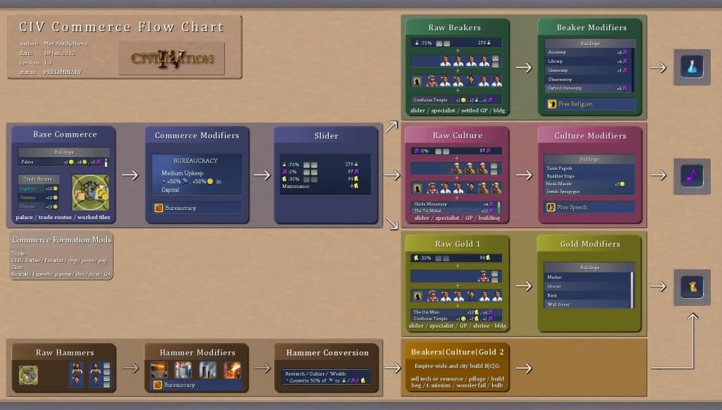
Thank you for the feedback everyone, it's good to hear you like it. I agree that it is missing some things, one of which I corrected already, see below. Some aspects might better be saved for a different chart, perhaps one for hammers. That might even be a place to address things like whipping and hammer bonuses for workers and related issues. That is where I would put the hammer bonus for building wealth, but perhaps it needs a mention here as well.
Are there any inaccuracies in it? Factual errors that need correcting? Is the format OK? Is it legible?
It finally makes sense! Thank you so much, this should be stickied somewhere. Like the strategy and tips forum.
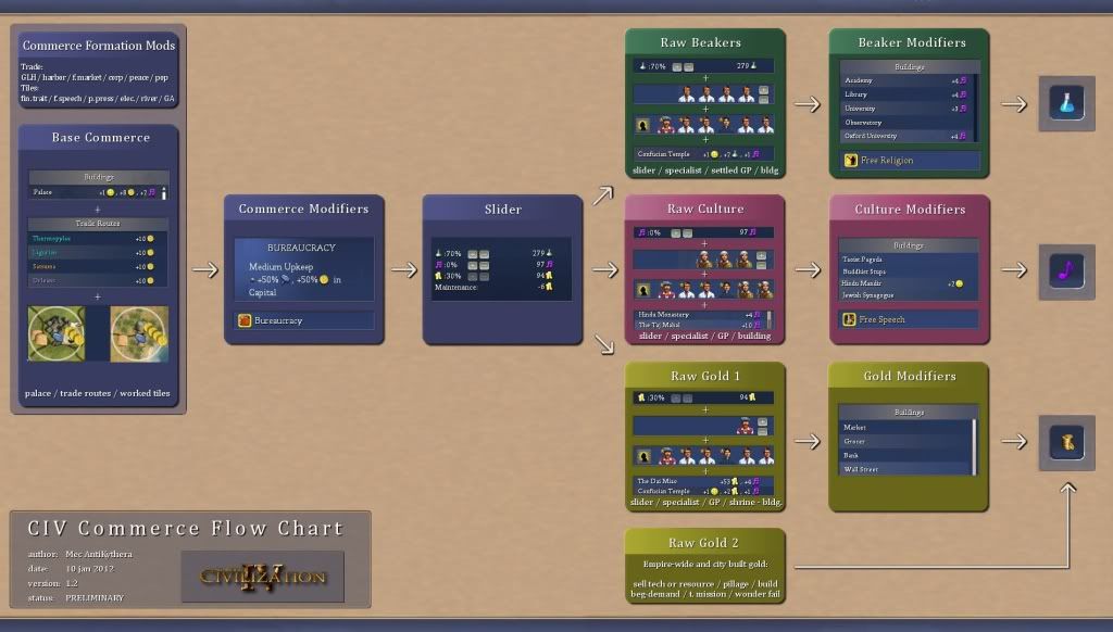
Thanks, I did it so that it would make sense to me and realized it might be good for others as well. I was never really sure what do to with Wall Street in a Culture game or how to maximize Settled Great Prophets. I thought Bureaucracy would boost their gold output, looks like that isn't so.
It looks good to me!

Thank you.
Very nice - your flowchart is much, much, better looking than mine
Remarks:
- Commerce tiles need not be cottages!
- Raw science can all also come from buildings (e.g. U Sankore)
- Wonder fail gold is another source of gold
- Gold from "build wealth" goes through hammer multipliers
- (Also do "build science" and "build culture" if they were to be shown)
- Espionage could perhaps be shown as a fourth kind of output (BTS)
Thanks for the remarks, you make some very good points.
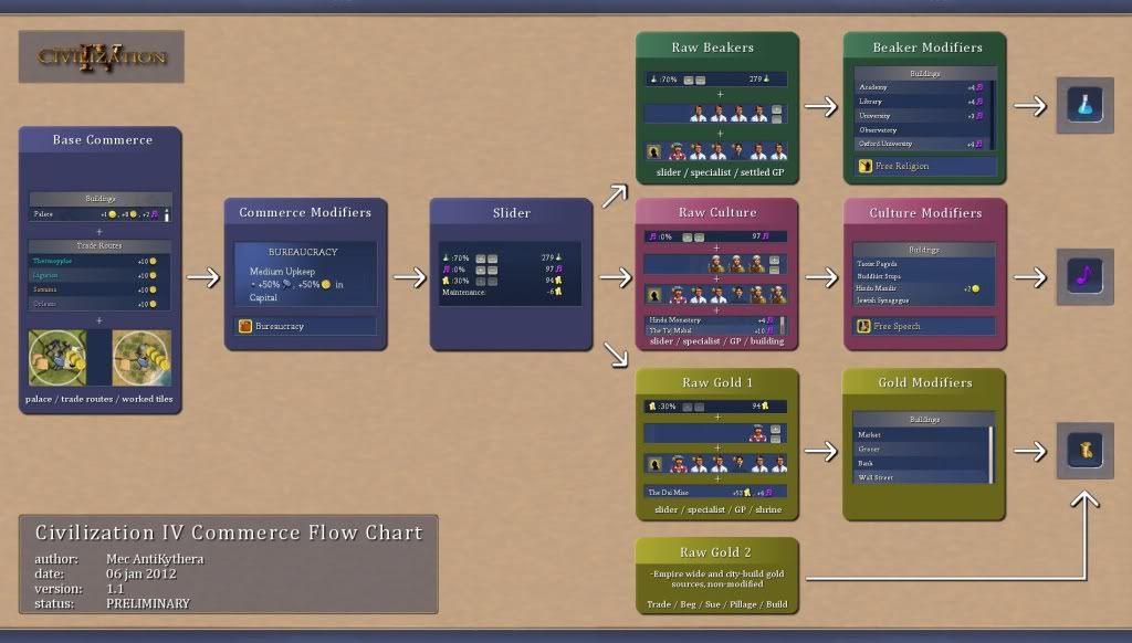
-Correct! I adjusted this in version 1.1, below
-True, I was basing it on Vanilla but I should worm that in too
-Fail Gold is an interesting subject that needs attention, didn't occur to me. Thanks!
-Yes, is that better on the companion Hammer Flow Chart though?
-Same
-True again, another branch could be added but I haven't played BtS yet. Not sure what to do with it at this time.
I think this chart shouldn't be too complex/detailed but I agree that the points in bold are definitely important enough to be worth inclusion.
I agree with your opinions here, keep it simple, but add a bit more information.
That's a nice chart.
Perhaps a second one to show where building wealth, etc works, to keep that one from being complicated, if you want - but that's a great chart. Some version of that should go somewhere.
I was indeed thing of making some companion charts, good idea there.
This should definitely be stickied. New players often have no idea about what the difference between commerce and gold is.
I know I didn't. I still make mistakes. It is a subtle difference between one coin and a stack of coins.
There's also the raw wealth and culture you can build with hammers that aren't affected by multiplier.
Very true. I am looking for space for that. It was first meant to be a pure commerce to gold chart so that's why the emphasis lies there.
Version 1.1:

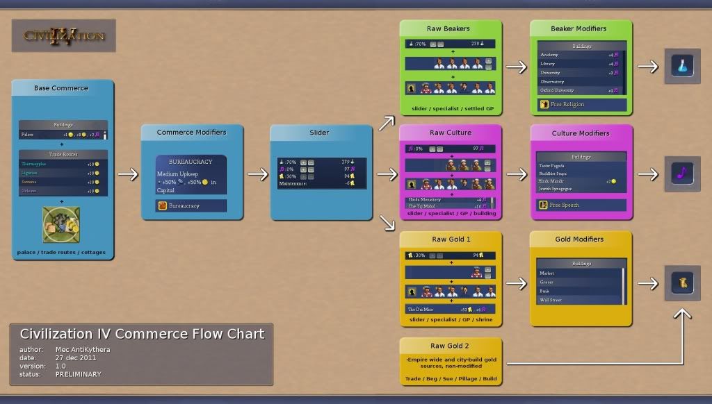
")