davidlallen
Deity
@ LT, It maybe too late for promotion icons, but deliverator would love your help on texturing the new thopters.
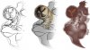
") . Maybe some color variation and contrast or a different picture would be better?
. Maybe some color variation and contrast or a different picture would be better?Are you sure that some pics are hard to understand?
@ LT, It maybe too late for promotion icons, but deliverator would love your help on texturing the new thopters.
		<BonusArtInfo>
			<Type>ART_DEF_BONUS_CRYSTAL</Type>
			<fScale>0.66</fScale>
			<fInterfaceScale>7.0</fInterfaceScale>
			<NIF>Art/Terrain/resources/crystal/markermanamined.nif</NIF>
			<KFM></KFM>
			<Button>Art/Terrain/resources/crystal/crystal.dds</Button>
			<FontButtonIndex>92</FontButtonIndex>
</BonusArtInfo>@ slvynn
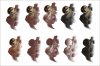
Before we declare the promotions project complete, could you make a sandrider one? You can see in my previous promotion box screenshot that it is still using the unit graphic which is light brown, instead of a nice chocolate colored one. You could just put up the one dds file, and I will put it into the release.
Also, one other good project for gamefonts is to fix up the icons for the bonuses. In the city screen, you can see which resources are connected to the city. Almost all of these are mixed up, and we do not have gamefont size icons for the bonuses. It is a little painful to create such tiny icons, but it would help the game look more finished.
The fonts are controlled by file assets/xml/art/civ4artdefines_bonus.xml. For example:
This gives the location of the button, which you can use as a starting point for the font. Also you see the font button index, which shows the position within the gamefonts file to be used. It may be that some of the gamefonts entries already exist, but the xml font button index is wrong; in this case you can just update the xml. But probably in most cases there is no game font entry for the bonus.Code:<BonusArtInfo> <Type>ART_DEF_BONUS_CRYSTAL</Type> <fScale>0.66</fScale> <fInterfaceScale>7.0</fInterfaceScale> <NIF>Art/Terrain/resources/crystal/markermanamined.nif</NIF> <KFM></KFM> <Button>Art/Terrain/resources/crystal/crystal.dds</Button> <FontButtonIndex>92</FontButtonIndex> </BonusArtInfo>
Would you be interested in cleaning this up?
When you planned realease?
Please also (important) refer to my post 586 (i think) in this thread, where i made new icon for Spacing Guild replacing greek helm but failed to insert it into a game via xml.
Please also (important) refer to my post 586 (i think) in this thread, where i made new icon for Spacing Guild replacing greek helm but failed to insert it into a game via xml.
@ koma13, I do not know how to guide Slvynn on this. Can you suggest?
@koma i dont understand what you actually talking about.
You dont want that help being replaced? You dont like icon?

As I said before, brown/tan as team colour was removed because it didn't stand out from the terrain. We don't want to bring it back.
I'm not sure matching the HUD to the team colour is that good an idea anyway - it will be too garish in many cases. Personally, I think a single HUD irrespective of what team you are playing is fine.