Dune Wars Art Thread

Actually i agree with Deliverator an this point, Should i try to do something with rugged? (To tell truth i like brownie mesa, hovever rugged can be darker than it is)

Another question (again i deep inside my developments) - Why BTl use that bright magenta colors. They are dark, shady civ. Can they adopt BTS Gilgamesh color, While Corrino will get their lighter color. As far as i seen Corrino been portrayed with purple color used on their flag, which is lighter than their civ color. Dark color for BTl will have much more sense, and also will fit into concept of Dark Biotech Civ (And my hud palette, which is bit gigerish (Giger) (Transparrent can with embryon inside, connected with beakers and arteries) for them) HUD.
 
The shaded sides of the mesa I think make them clear enough.

Evidently we need more votes here. I think the map is way too brown and it would not kill us to add some grey at the top of mesas. Slvynn agrees. Deliverator and Ahriman like brown a lot. Any other votes?

EDIT: ninja post. Slvynn does not agree anymore. Sigh.

EDIT2: If you want to rearrange the civilization colors again, I have no objection. The key point is to make the flags match, and to make sure that the set of colors is distinct. We used to have two similar browns, neither of which was visible on the terrain and not distinguishable from each other.
 
Will changing Rugged to dark warm gray color change situation? I think yes, and this is compromise, mesas vere portrayed brown in all series of Dune games, and movies. Even Dune II Battle for arrakis had brownie mesa. :P 
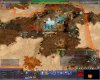
Arrakis is not planet that have richness of colors, all is yellow, orange and brown, and grey perhaps. Dusty. :P
I'll try to start iwth rugged to make a consensus, which can be achieved when all have satisfactory result :P

Edit:
EDIT2: If you want to rearrange the civilization colors again, I have no objection. The key point is to make the flags match, and to make sure that the set of colors is distinct. We used to have two similar browns, neither of which was visible on the terrain and not distinguishable from each other.

I made today extensive development in my sketchbook with pen on paper for hud themes and ornamental style for each civ. Atm i am ok with any color as it now , except BTl being so bright. This magenta not fit their concept at all. They may use Ragnar Warlords color (which match their religion icon color) (PALE) or Dark Violet (Gilgameshy) , because they are DARK. Current color is not Pale, neither Dark, and thats not sit well with BTl, imo.
 
Actually i agree with Deliverator an this point, Should i try to do something with rugged? (To tell truth i like brownie mesa, hovever rugged can be darker than it is)

I'll have another go at rugged to try and get it distinctive. It will be quicker for me as I'm familar with the files. I am happy for you to have a go at improving it once I'm done. I'm thinking something more greyish is the way to go.

Another question (again i deep inside my developments) - Why BTl use that bright magenta colors. They are dark, shady civ. Can they adopt BTS Gilgamesh color, While Corrino will get their lighter color. As far as i seen Corrino been portrayed with purple color used on their flag, which is lighter than their civ color. Dark color for BTl will have much more sense, and also will fit into concept of Dark Biotech Civ.

The Corrino flag is exactly the same purple at their team colour. It the Roman team colour. Purple says Imperial, but I don't think magenta would do. So I'd like to keep that one.

I don't mind the Tleilaxu team colour being changed, but you may struggle with the David Distinctiveness Test since Magenta was chosen in order to spread team colours across the spectrum. I don't think it is possible to have both thematic colours for all civs and have really distinctive colours for them all. The Sumerian Dark Indigo is very very similar to the Corrino purple. How about a dark navy blue?
 
Evidently we need more votes here.

I am fine with the current colors, but I also know that some (espically older) people have problems with low contrast terrain (I just have to watch my dad playing transport tycoon :lol:). Also, the_J linked a screenshot from DW in another forum and there was a reply that the current terrain looks confusing...
 
I am fine with the current colors, but I also know that some (espically older) people have problems with low contrast terrain

You will notice that I hardly ever use emoticons but ... :aargh: :old:

Also, the_J linked a screenshot from DW in another forum and there was a reply that the current terrain looks confusing...

I am interested to see any coverage from outside civfanatics. I am watching the site deliverator set up at moddb; if you have other links please post.
 
The mesa is much clearer in-game than in-screenshot IMO.

I am glad that Civilization is one of the few gaming arenas online where at 28 I am not old....
 
New Carryalls patch.

@David: I've appended '2' on the end of the unit folders, to help with the merging since I know you've done the renaming of folders. Please get rid of the old carryall and heighliner unit folders and then remove the 2s. I've made buttons for them in the DW style.

I think they look pretty cool - they probably look better in this mod than they did in Final Frontier itself.
 
Well my 1sty try - i made it too dark - my Corel colors shown in different way, but take a look and have your say. Its distinctive, thats for sure :D
(bit darky , accepting any critics :D )
 

Attachments

  • Civ4ScreenShot0103.JPG
    Civ4ScreenShot0103.JPG
    214.5 KB · Views: 53
  • Civ4ScreenShot0104.JPG
    Civ4ScreenShot0104.JPG
    272.6 KB · Views: 71
Honestly, I prefer the current carryalls to those. Those are awesome models, but they don't feel like transport units; they look like badass battlecruisers. The current carryalls (light and medium anyway) give a feel of being squad, slow, vulnerable transports - like a chinook helipcoptor or something.
http://en.wikipedia.org/wiki/CH-47_Chinook

These look like Frigates in Dune, not carryalls.

Maybe we could use these as suspensor destroyer/cruiser units instead of carryalls? The current suspensor units are kinda ugly.

@Sylvynn
Yeah I think that is way too dark. We still want rock and rugged to blend, not stand out sharply like that. Ideally the main difference between them would be in the texture, not the coloring.
 
take 2 is much better.

@Ahriman - Texture is already different, thats why contrast within blend needed ti distinct it. I think bit more brighter?

Re-colors for BTl - I think France color will be good. And its quite distincvtive from Roman Corrino color.
@Deliverator - can you please change it to see in wb Corrino and BTl borders?
 

Attachments

  • Civ4ScreenShot0106.JPG
    Civ4ScreenShot0106.JPG
    277 KB · Views: 67
  • Civ4ScreenShot0105.JPG
    Civ4ScreenShot0105.JPG
    191.3 KB · Views: 63
Honestly, I prefer the current carryalls to those.

I quite like the current dropship style Medium one - apart from the clinical white skin which I don't think fits Dune. The issue is it needs significant work to make it viewable in the viewport/pedia/Koma's funky new homeworld screen. The current Light one is a bit basic and not especially nice in my opinion. I think we should use these for carryalls for now as it will fix the varying height and invisible in the pedia issues. We can revisit later - I'll take you comments into account. The Suspensors need an overhaul, they're on my hitlist.

Well my 1sty try - i made it too dark

Darker is just not going to work. I've tried that route before. It needs to be lighter/greyer. I'm working on it.
 
Lighter grayer try 3
 

Attachments

  • Civ4ScreenShot0109.JPG
    Civ4ScreenShot0109.JPG
    276.1 KB · Views: 79
You will notice that I hardly ever use emoticons but ...
Hehe. Touché! :D

I am interested to see any coverage from outside civfanatics. I am watching the site deliverator set up at moddb; if you have other links please post.
Well, it's in german and only one post...
But you can always try googling for Dune Wars. There seems to be an attempt to translate our mod into chinese language. :cool:

Well my 1sty try - i made it too dark - my Corel colors shown in different way, but take a look and have your say. Its distinctive, thats for sure
(bit darky , accepting any critics )
Now it's the same color (black/violet) I made before Deliverator changed it... ;)

Honestly, I prefer the current carryalls to those. Those are awesome models, but they don't feel like transport units; they look like badass battlecruisers.
I agree with Ahriman... :eek:
They look cool but too dangerous for being simple carry alls.
 
Ok i am done with textures tell me if you want any of those. Also , koma, i progressed with our stuff today, posted some early raw materieal :P Now will fix all that stuff for gamefonts. Btw i going to make Slig just dark purple tinted pigs, because Sligs are Tleilaxu Breed Pigs. :D
 
I envisioned Slig as a giant pink slug. The meat is meant to be a great delicacy and I can't imagine something that is purple being that tasty...
 
@ Deliverator - on textures- i like more darker, but balanced version (try 2), on BTl color - Can you try France color for BTl? That seems to be more navish and very dark.
 
Fremen is also blue color. You can try these yourself, edit xml/civilizations/civ4civilizationinfos, field DefaultPlayerColor.
 
Back
Top Bottom